articles
Tricks and Trends in UX/UI

While good designs have always existed for each decade, they usually go through significant changes with time. The way UI/UX design is implemented is strongly influenced by the recent developments in technology, the shift from one device to another, and other factors of influence.
However, if everyone simply followed the current UI/UX design trends, how do we hope to create unique design trends in the future? It’s when people think outside the box that we advance in creating new design methodologies.
That being said, you can’t build successful products if you ignore the current UI/UX design trends and decide to pave your own path. Experimenting with new ideas for a couple of elements while building the others following sound design principles and trends is the secret to a successful design.
Main benefits of following UI/UX design trends
1. UI/UX design trends reduce costs.
It takes a lot of research, architecture designing, wireframing, usability testing, prototyping, and the ultimate implementation to create a robust UI/UX design. Trends in UI/UX design demonstrate what consumers are interacting with most during that time. Therefore, by adopting these trends, designers can significantly reduce the amount of time they spend refining and redesigning their products to satisfy the needs of their target market.
When it comes to cost-cutting, prototyping and usability testing are two phases of the web design and development process that have a significant influence on the cost of a product.
Usability testing allows designers to push past designs that are inconvenient to their users — like the size of their buttons and the readability of their fonts — thereby avoiding significant edits in the final prototype or product itself.
Prototyping is a technique used by UI/UX designers to determine how easy it is for their target audience to interact with the interface of their product and what technology is necessary and feasible to power the design.
2. UI/UX design trends help you stay fresh and original.
There’s a reason why new design trends come up virtually every single year — it’s because people get bored of the same old designs and are looking for something more fresh and innovative.
Here’s the thing.
When you follow design trends, your goal is not just to simply copy them. Designers who follow the current UX industry trends do so to gain inspiration and add their own ideas to create unique trends.
3. UI/UX design trends help increase ROI
We are all guilty of favoring one website over another despite the fact that they both provide the exact same range of products, content, and prices. The reason is that we prefer the user interface of a site, which plays a huge role in converting customers.
Let’s dive a little deeper and understand why you should follow trends.
When a design is trending, brands quickly adapt the strategies that have produced the best results.

This means your users will have a relatively similar experience as they move from one site to another. Their exposure to the same type of navigation and UX design patterns makes them accustomed to it.
If your site differs drastically from the experience they’ve had with their other favorite websites, there is a chance that they may not enjoy the change.
However, that doesn’t mean you’re to use the same homogeneous designs. Simply ensure you aren’t straying too far away from what is popular with people now.
Main UI/UX Design Trends
Use of dark mode
Dark theme is a visual trend that is taking off again in 2022. It is designed to alter the contrast and brightness levels to ease the visual strain. More than just a UX design trend, the dark mode has become an industry standard with big names like Google, Apple, and Meta, making it so easily accessible to their users.
Dark mode does not equate to black. In fact, user experience trends show that a darker shade of gray is a predominant surface color since it’s less contrasting than light text on a black background.
Here are some major advantages of using dark themes:
- Reduced eye strain. After staring at a screen for long hours, nobody can refute visual fatigue. Increased exposure to bright screens can cause blurred vision, stinging eyes, neck pain, and headaches.
- Increased visibility in low-light areas. People who work during night hours or in dimly lit rooms can experience stronger symptoms with prolonged exposure to bright screens. Dark themes dramatically reduce these adverse health effects, making the experience healthier and safer.
- Accessibility. The dark mode is no longer just a perk; it has become a necessity. People who experience severe migraines or suffer from visual disorders need dark themes to overcome the challenges they typically face after using light themes for a long stretch of time.
- Enhanced focus. Sure, dark themes make it easier for people to concentrate without splitting headaches and neck pain. However, that’s not all. If you use the right colors, it’s easier to make the right things pop on a dark surface with light elements.
- Managing expectations. People have come to expect the dark and light mode toggle with all applications they use. Furthermore, it helps enhance your brand image since people often associate dark themes with elegance, sophistication, and mystery. High-end platforms like Netflix and Spotify have helped accentuate this image in people’s minds with their well-executed dark themes.
Minimalism
UI/UX design trends have evolved enough for businesses to understand that it’s not just about building feature-heavy products. The primary purpose is to make applications leaner and boost their functionality.
As a web-design strategy, minimalism is more of a user-friendly UI/UX design trend. It aims to simplify user interfaces by eliminating unnecessary components, thereby making the user experience more purposeful and intuitive.
Furthermore, the sleek and sophisticated aesthetic definitely increases its desirability factor in UX. It combines functionality and design in the simplest way possible by only including the most needed elements that help users navigate intuitively.
Apple is a brand that has embraced this user experience trend to a T. Every single element they include within their web design portrays a necessity — and you would be hard-pressed to find something that doesn’t belong there.
However, it’s not just about the visual appeal it holds. A minimalist interface means a fast loading speed since your product doesn’t require a lot of resources. Additionally, it’s easier to adapt the design to varied device sizes.
Here are some things you should keep in mind while implementing minimalism within your product:
- Don’t be afraid of empty spaces. The primary purpose of leveraging negative spaces in a minimalist design is to draw your user’s focus to what’s essential and guide them through your website. It helps limit distractions and allows web designers to define a strong focal point. The Google search page is one of the best examples of brands making powerful use of white space to do anything but what they want you to do — type into the search bar.
- Limit choices. Deliberately eliminating choices ensures your visitors are not distracted by things that may take their attention away from the primary goal of a page. This could be asking them to sign up for a newsletter or book a consultation call. Landing pages that include a single CTA are the best examples of leveraging minimalism the right way. The clear next (and only) step ensures users are super-focused on what is expected.
- Bold typography. Minimalism paired with bold typography is a trendy choice that won’t look forced or overdone. UI/UX designers use big, bold lettering to highlight the content on a web page. One of the few elements that designers use to dominate empty spaces is text. Therefore, it’s no surprise that it holds high value as a graphic element. Bold typography offers a strong contrast in minimalist designs, helping draw the visitors into the content.
Smooth color gradients
In the age of flat design, color gradients were a huge no-go. That’s because people often associated color gradients with the ’90s designs. However, smooth gradients are a design trend that has made a powerful comeback in 2022.
Color gradients help introduce dimension and depth to your design, like the Instagram logo. While flat colors are a staple, oftentimes, they stifle the potential of a design. Color gradients allow room for creativity and offer limitless opportunities. They help designers create striking visuals by blending colors.
Big names like Microsoft, Meta, and Google have all created gradient-based designs.
Augmented and Virtual Reality
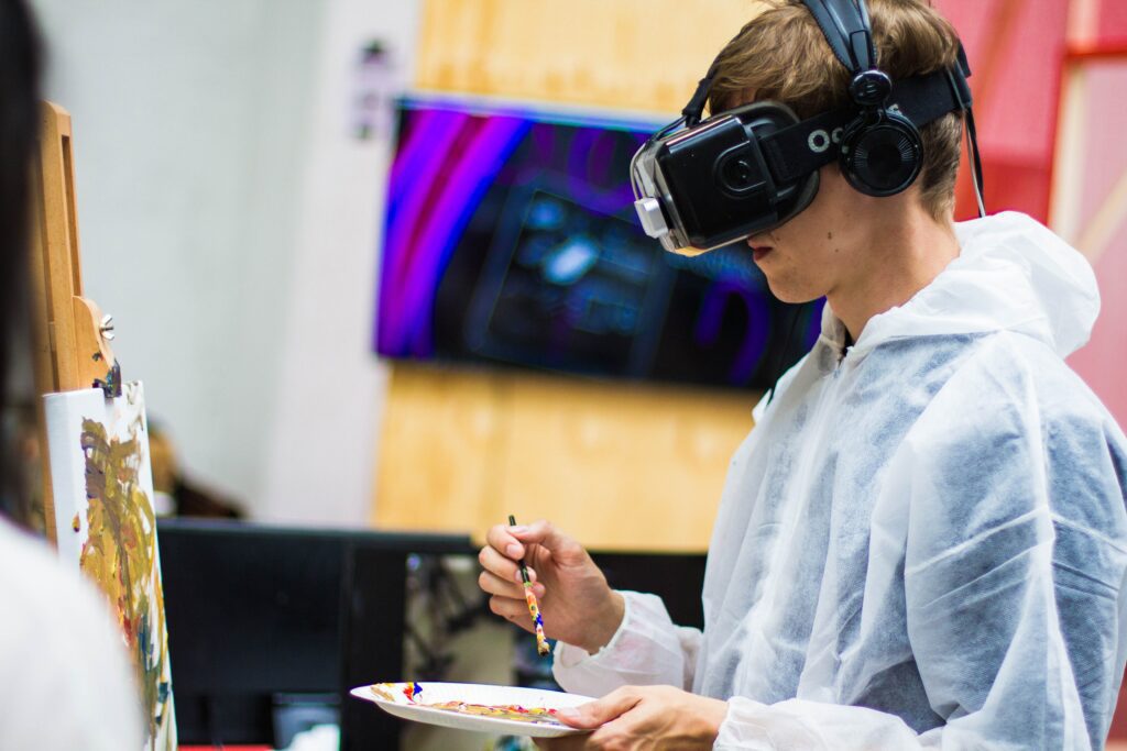
The shift towards augmented reality (AR) and virtual reality (VR) has been imprinted as a major UX design trend because of Mark Zuckerberg’s Metaverse. There’s no doubt that these technologies will have a huge impact on UI/UX industry trends and the way brands approach design in the future.
Augmented and virtual reality-oriented designs have blurred the lines between the real and digital worlds. The specialized, immersive, and extraordinary alternative environments raise the bar for user engagement.
The goal of AR and VR-focused designs is to react more quickly and directly to people’s demands and surroundings, taking user engagement to new heights. Moving away from a screen-oriented interface has altered the way commerce works.
AR and VR-based designs benefit sectors like real estate, interior design, fashion and retail, healthcare, and gaming, to name a few.

Use of 3D Graphics
One of the hottest UI/UX industry trends is 3D graphics which has skyrocketed to the top amongst other creative experiments. The primary reason it gained this level of popularity is due to the inspiration it draws from the principles of photorealism which helps boost user engagement.
When paired with cutting-edge technologies like augmented and virtual reality, it can be a powerful force for designers to create highly-engaging 3D graphics. These complicated motion design illustrations help websites stand out and make it easier to capture and hold the visitor’s attention and make them memorable.
However, creating 3D illustrations requires an artistic eye as well as dedicated skills. It’s a time-consuming process that may also drag down your website speed unless you optimize it well.
Final Thoughts
UI/UX design trends are constantly changing, and businesses need to keep up with them to create successful products. Design trends have become popular for a reason. Any designer worth their salt would study and analyze them to create brilliant and engaging designs.
Brands like Google are excellent at adapting to new trends while playfully skirting around them to challenge the status quo with their innovative designs.
After understanding your target audience's needs, motivations, goals, and pain points, you can leverage the UI/UX design trends for 2022 that we’ve listed in this blog to create a product with a high potential for success.
If you’d like help incorporating these UI/UX design trends within your brand identity, you can book a free consultation call with our experts at Wandr today!


