


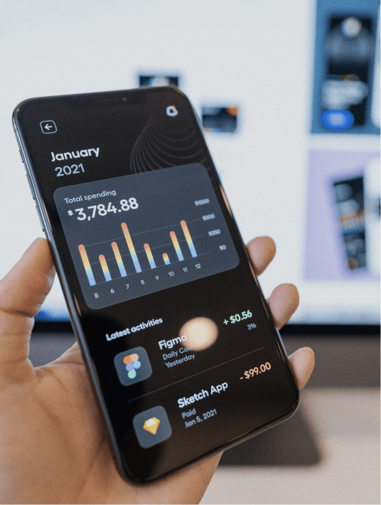
This year in Fintech it’s all about how does your brand stand out from the rest? Are you reaching new audiences in 2022? What methods can help you reach that new audience?
From adding personalized interfaces to something as simple as adding bright colors, in this article we’ll talk about trends for 2022 that we recommend every UX designer should be utilizing, especially in financial technology. Elevating your brand’s space and voice in today’s market is an essential part of reaching new demands, and a constantly changing technological world. In creating a more dynamic, functional and up to date website and/or application, brand’s can increase engagement with their audience and provide a well rounded product.
Read along for 4 UX Trends to modernize your brand, grab user attention, and increase conversions.
1. Personalized Interfaces
A personalized interface can go a long way in elevating the online experience of your users. When you are able to design an interface that caters personally to each individual user, you can better provide for your users without them even having to ask for it. Methods such as giving them options to simply customize their profile page, or offering different browsing modes can familiarize users with your site. Setting their preferences and personalizing the interface allows users to create a more memorable experience than before.
Another point to note, is when you create more opinion based interactions and choice activities or polls on your site. Options and interactions like this add to the element of the interface being personable, and enthralling your users to visit your website or application.

2. Unusual Screen Loader
In the past we tended to overlook the potential that a loading screen has, but in recent years it’s proved to be another fun and interesting opportunity to create engaging design. The job a screen loader has is to simply distract, entertain, etc.
Skeletal loading screens are empty pages that are gradually filled with information through the user’s interaction with them or following a given algorithm. Unusual screen loaders are a unique way to grasp our user’s attention or have them continue to engage with your content. Designers have used these moments in loading screens to entertain users with animations, provide further informative material, or even promote products. The possibilities are limitless with screen loaders, and they are a great way to keep your users engaged at all times during their visit.
Purrweb UI/UX Studio - Dribbble
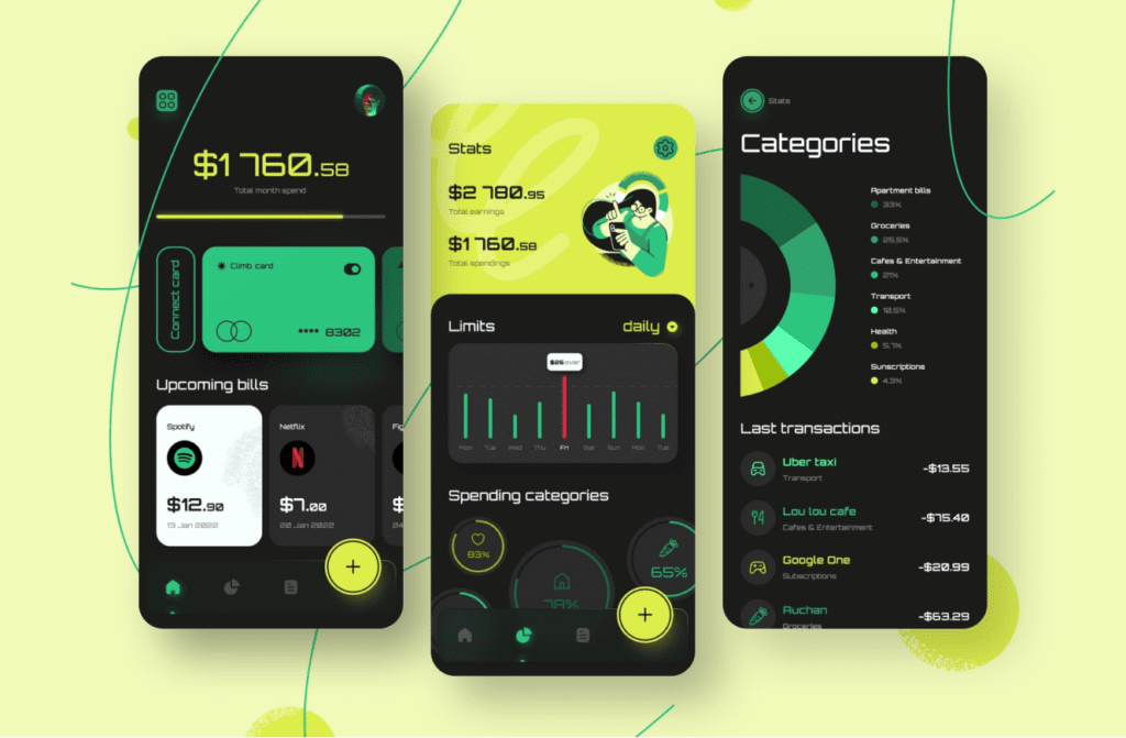
3. Bright Colors
Bright interfaces, backgrounds, and illustrations are becoming increasingly popular in current trending design methods. Implementing them can increase the beauty of the resource, influence the mood of the user and create a strong association with the brand, product, or service. When a brand creates a vibrant and specific color palette, users can easily identify the brand’s overall tone and voice. These color selections can further engage your audience and capture their attention unconsciously as they browse through your site and applications. When the color palette is memorable for them, it can stand out from the rest.
It’s important to note that a bright color palette must be chosen selectively and carefully in order to avoid drawing too much attention causing a distraction from the overall content you are promoting. While the colors should standout, they should also mend seamlessly with your content and match the tone you intend to be read at. This is why following proven successful color theory and combinations is an essential part of this process. Once you can master the right balance of bright interfaces and easily conveyed content, you can leave a lasting impression on anyone who visits.
4. Blurry Backgrounds
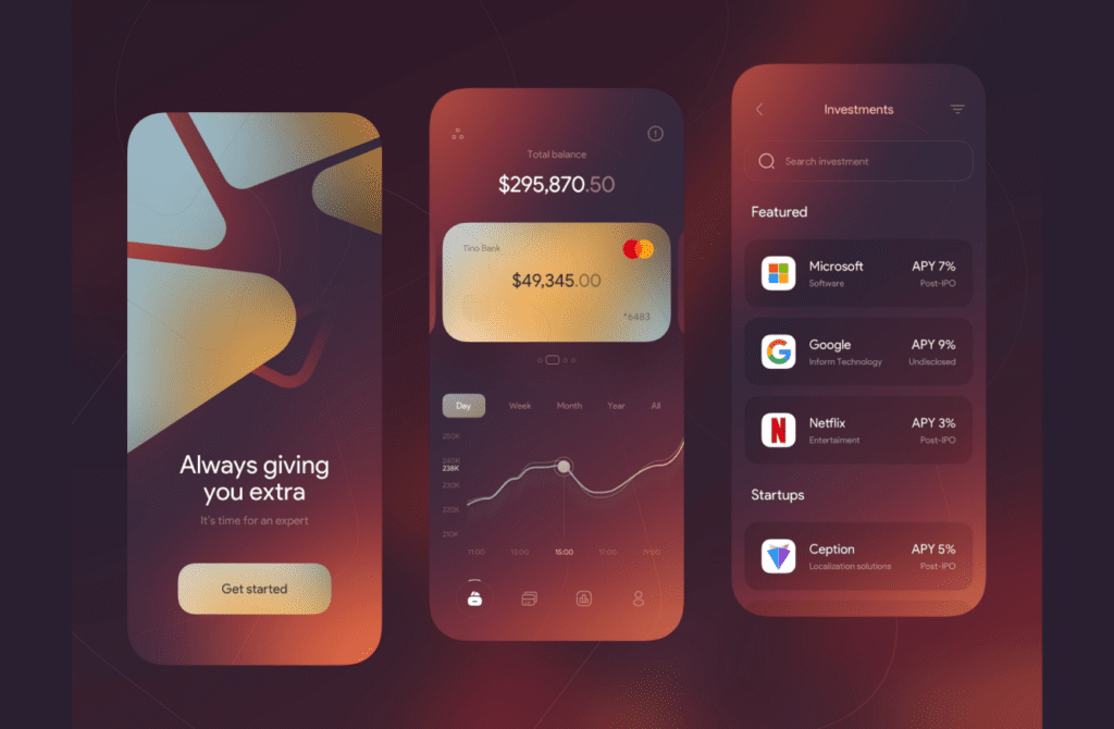
This trend creates a catchy yet comfortable effect for the eyes, it also brings focus to the foreground where the object or text is. When designers utilize the blurred backgrounds we can even emphasize content and create a focal point around specific details. Another common method within this trend is “glassmorphism”, which is the illusion of a physical glass-like texture using a semi-transparent background with a outline or shadow. Glassmorphism allows designers to utilize these colorful backgrounds while also subduing them to create easily readable important content.
The blurred background method can work for various types of media, photo, animation, text, and video. When users are able to easily identify important content or messages, they can focus on the details at hand quicker. The benefits of utilizing blurry backgrounds all lies within good design, creating engaging and effective interfaces.
In Conclusion
Design in 2022 is all about standing out and leaving a lasting impression with your users. In designing for Fintech, it’s crucial to create designs that not only keep your audience engaged, but also design in a way that is easily comprehended and friendly. You want users to be able to understand your business’s intentions, while also creating a positive experience.
What Questions Do You Have About the Best UX Design Trends for Fintech 2022?
Let us know in the comments below.
Talk to us on LinkedIn, Instagram, Facebook, or Twitter.
