

Review website UX best practices and real examples of the best UX websites — curated by WANDR, an award-winning product strategy and UX design studio.
In today’s online-first world, your website is often the first and most important product experience users have with your brand. Without a strong user experience, even the best products and services struggle to convert, retain customers, or build trust.
The best user experience websites don’t rely on aesthetics alone. They combine clarity, usability, performance, structure and sometimes gamification to help users complete tasks efficiently — without friction or confusion.
In this guide, we break down:
- What website UX really means and why it matters
- Core UX best practices for websites
- Examples of websites with great UX
- Why these UX website examples continue to perform well
TL;DR — What Makes The Best UX Websites Stand Out
- The best UX websites prioritize clarity, speed, and ease of use over visual complexity
- Strong website UX makes it easy for users to understand value and complete key actions
- Great UX websites reduce friction, guide users naturally, and build trust
What Is Website UX (And Why It Matters)?
Website user experience (UX) refers to how users interact with and navigate a website and not just how it looks.
In practice, website UX determines whether users can quickly understand what a company offers, feel confident exploring the site, and complete key actions without friction.
A strong website UX includes:
- Clear information hierarchy so users know where to focus
- Intuitive navigation that makes finding content effortless
- Fast load times that prevent drop-off
- Accessible design across devices and connection speeds
- Logical user flows that guide users toward meaningful actions
The best UX websites reduce confusion and cognitive effort. They help users immediately grasp value and take the next step — whether that’s signing up, purchasing, or learning more.
This is why website UX matters: even with strong traffic, poor user experience can prevent a site from achieving conversion, retention, and trust goals.

What Are UX Best Practices?
UX best practices are actionable design principles used to improve usability, clarity, and task completion — based on how real users behave, not internal assumptions.
Rather than focusing on aesthetics alone, effective UX best practices prioritize outcomes: helping users move through a website efficiently and confidently.
Across industries, the most effective UX best practices include:
- Start with a clear value proposition
Users should immediately understand what the website offers and who it’s for, without needing to scroll or interpret complex messaging. - Design around primary user tasks
Navigation, page structure, and content hierarchy should support the most common actions users want to take — not internal org charts or feature lists. - Reduce cognitive load at every step
Limiting unnecessary choices, form fields, and visual noise helps users move forward without hesitation. You can plan ahead on how users move between pages and tasks seamlessly through a strong UX flow. - Use consistency to build familiarity
Repeating patterns, layouts, and interactions across pages allows users to learn the interface quickly and feel in control. - Optimize for performance and accessibility
Fast load times, responsive layouts, and accessible design are foundational UX best practices — not optional enhancements.
When a website fails to meet business goals, the issue is often not traffic — it’s usability. Evaluating how users move through a site, where they hesitate, and where they drop off is the foundation of improving website UX.
Evaluating how users move through a site, where they hesitate, and where they drop off can be uncovered through a thorough UX audit for uncovering critical friction points.
How WANDR Evaluates The Best UX Websites
At WANDR, we don’t evaluate website UX based on trends, aesthetics alone, or surface-level polish. Our approach aligns with foundational user experience principles established by Nielsen Norman Group. We look at how effectively a website communicates value, guides behavior, and removes friction, often without users realizing it’s happening.
When reviewing UX website examples, we consistently evaluate them across the following core dimensions:
1. Unique, Purpose-Driven Design
We look beyond generic layouts and predictable patterns in a website. Strong UX doesn’t mean being different for the sake of novelty… it means using visual hierarchy, interaction, and layout in intentional ways to relay information more clearly and memorably.
The best UX websites use design to:
- Communicate complex ideas quickly
- Guide attention without overwhelming users
- Create moments of clarity or delight through interaction
Uniqueness matters when it improves understanding and not when it distracts.
2. Seamless, Intuitive Calls to Action
Great UX doesn’t feel pushy or sales-driven even when it’s highly intentional.
We evaluate how naturally users are guided toward a primary action. On the best UX websites, CTAs feel like the obvious next step rather than an interruption. Users don’t feel “forced” into a flow; they feel supported through it.
This often shows up through:
- Visual cues and hierarchy
- Trust signals and reassurance at decision points
- Micro-interactions that reduce hesitation
The goal is momentum without pressure.
3. Minimal Friction Before Commitment
One of the fastest ways to lose users is to hide the product or value behind early sign-ups, paywalls, or long forms — a pattern we frequently identify during UX audits.
We consistently see that the best UX websites:
- Show users enough of the experience to build confidence
- Let users explore, preview, or interact before asking for commitment
- Reduce unnecessary barriers in early-stage journeys
When users understand what it feels like to use a product (even if it’s just a sneak peek) they are far more willing to sign up, share information, or convert later. Great UX earns commitment rather than demanding it.
4. Clear Value Communication Above the Fold
Before users scroll, click, or explore, they should understand:
- What this product or service does
- Who it’s for
- Why it’s worth their time
We evaluate how effectively websites communicate value immediately, using a combination of messaging, visuals, and interaction and not dense copy or abstract claims.
Clarity beats cleverness every time.
5. Alignment With Real User Intent
We pay close attention to whether a website is structured around how users actually think and behave — insights typically uncovered through user research and usability testing.
Strong UX aligns navigation, content, and flows with real-world intent:
- “I want to compare”
- “I want to understand pricing”
- “I want to see how this works”
- “I want to decide quickly”
When UX mirrors user intent, friction disappears almost automatically.
6. Confidence and Trust at Key Decision Points
Especially for products involving money, time, or personal data, trust is part of UX.
We evaluate how websites:
- Reduce uncertainty
- Signal credibility and transparency
- Reinforce confidence at moments of hesitation
This can show up through design restraint, social proof, clear feedback, or simply not asking for too much too soon.
The best UX websites perform consistently across these dimensions. While execution varies by industry and audience, the underlying principle remains the same: guide users with clarity, reduce friction, and earn trust through experience — not persuasion.
The Best UX Websites
Below are UX website examples that demonstrate how strong user experience principles are applied in practice. These websites represent different industries, audiences, and product types, but all share a commitment to clarity and usability.
1. Wise – Product as the Hero, Not Marketing Fluff
Best for: Transparent fintech website UX
Core UX Pattern: Product-first interaction before sign-up
Why it Works: Users understand value immediately through interactive tools, reducing friction and building trust before commitment
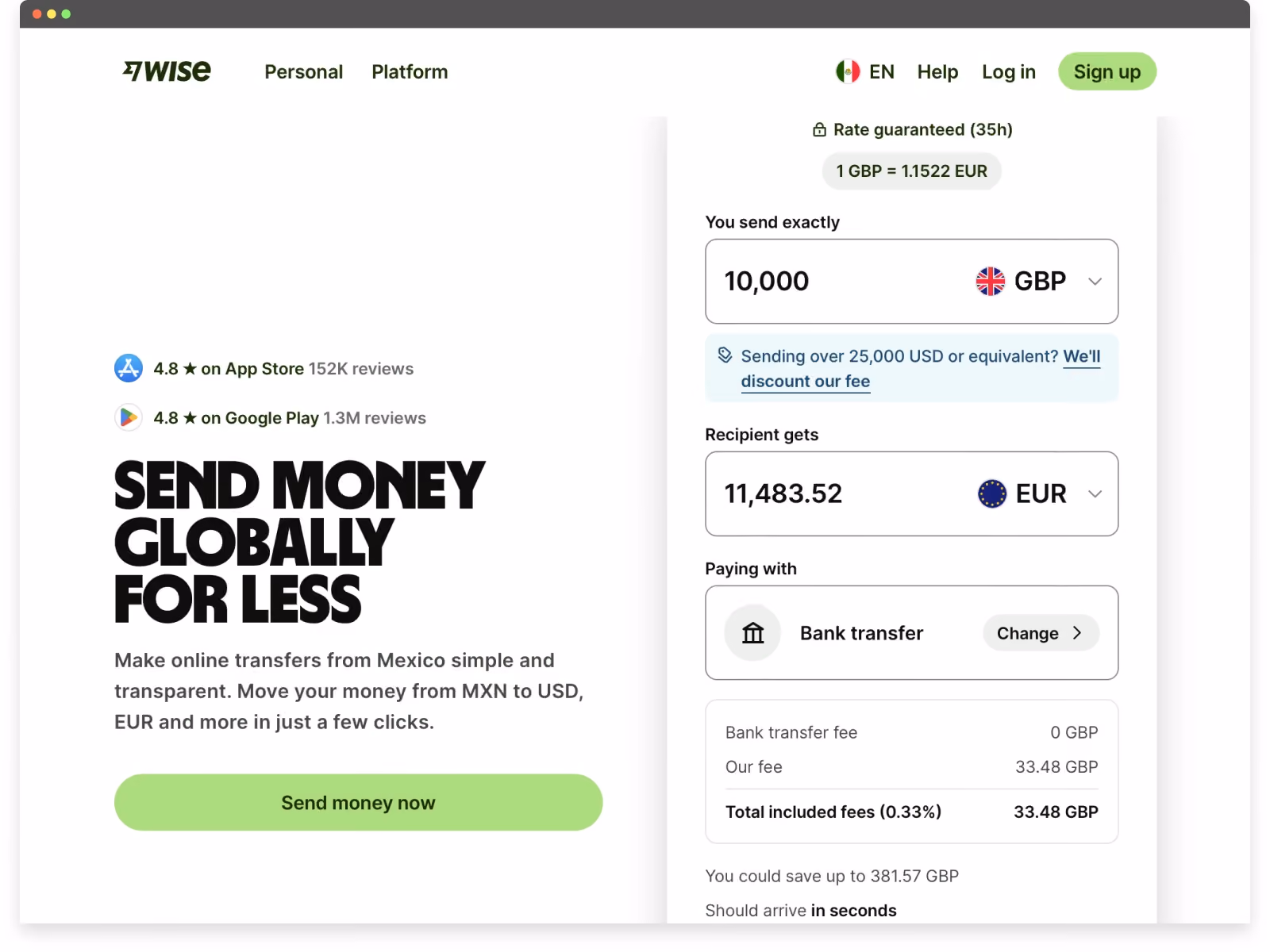
Wise is a strong example of how great website UX can simplify a traditionally complex and trust-sensitive product.
From the moment users land on the site, Wise communicates its value visually and immediately. Instead of relying on abstract claims, the homepage features an interactive currency converter above the fold, allowing users to see real exchange rates and estimated fees in context. This reduces cognitive effort and builds confidence before any commitment is required.
Several UX decisions stand out:
- Clear, visual value proposition above the fold
The currency converter doubles as both a product demo and a messaging tool, helping users understand the core benefit within seconds. - Interactive comparison that builds trust
Wise uses a simple, almost gamified interaction to compare its fees against traditional banks and competitors. This approach makes cost transparency feel approachable rather than intimidating — a key UX win in fintech. - Low-friction calls to action
CTAs are designed to feel exploratory rather than transactional, encouraging users to engage with the product before being asked to sign up. - Simple, modern interactive design
Motion, transitions, and micro-interactions are used sparingly to guide attention without overwhelming the experience.
Wise demonstrates how the best UX websites don’t just explain value — they let users experience it. By combining clarity, interactivity, and transparency, Wise turns a high-trust financial decision into a straightforward, user-friendly journey.
2. Miro — Turning the Website Into a Product Preview
Best for: Collaborative SaaS and team-based tools
Core UX Pattern: Website as a lightweight product preview
Why it Works: Users interact with elements that mirror the actual product, making the experience feel familiar and lowering friction before sign-up
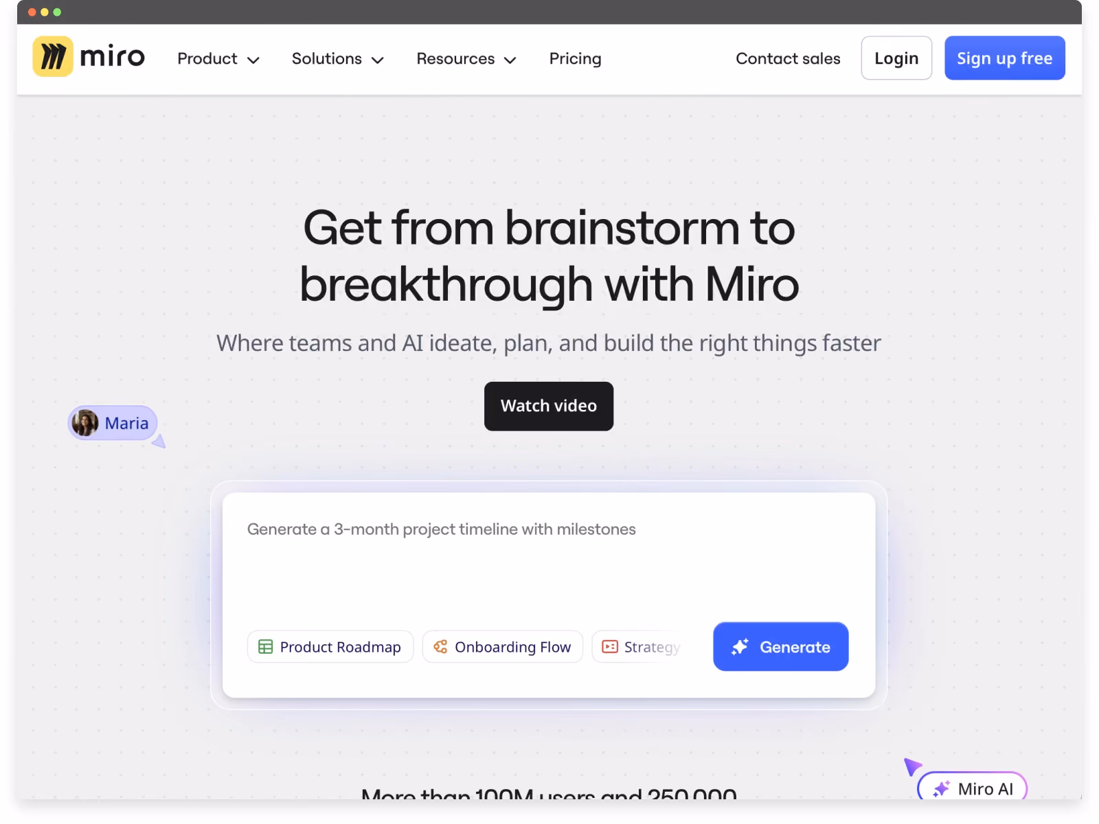
Miro is a strong example of great website UX because the site itself behaves like an extension of the product. Rather than separating marketing from experience, Miro uses interaction to help users understand what the platform feels like before signing up.
One of the most distinctive UX decisions appears immediately above the fold. The primary call to action looks and behaves like an AI-style prompt, inviting users to start “creating” right away. While this interaction ultimately leads to sign-up, it frames the action as doing, not registering — lowering psychological friction and encouraging engagement.
Several UX principles stand out:
- Interactive CTA that invites participation
The prompt-style CTA gives users the impression they’re already starting a workflow, which aligns closely with how Miro is actually used. This reframes sign-up as a continuation of interaction, not a barrier. - Homepage interactions that mirror the product
Users can move, manipulate, and interact with elements directly on the homepage, echoing the drag-and-drop nature of the Miro canvas. This provides a lightweight product preview without requiring download or account creation. - Consistent product language across the entire page
Every section of the homepage reinforces the same core idea: visual collaboration in real time. Layout, motion, iconography, and micro-interactions all reflect how the product works, creating a cohesive mental model. - Guidance without interruption
Subtle prompts and contextual explanations help users understand capabilities without pulling them out of the flow. This mirrors the in-product onboarding experience and reinforces usability expectations. - Clear hierarchy within a complex product
Despite offering many features and use cases, the site maintains focus by surfacing one primary action at a time, reducing cognitive load and decision fatigue.
Miro demonstrates how the best UX websites don’t just describe a product — they simulate it. By aligning interaction, messaging, and behavior, the website becomes a confidence-building introduction rather than a marketing layer users must decode.
3. Airbnb — Reducing Friction Through Visual Clarity and Trust
Best for: Marketplace UX and high-trust consumer decisions
Core UX Pattern: Exploration before registration
Why it Works: Users can browse, compare, and build confidence before being asked to log in or commit
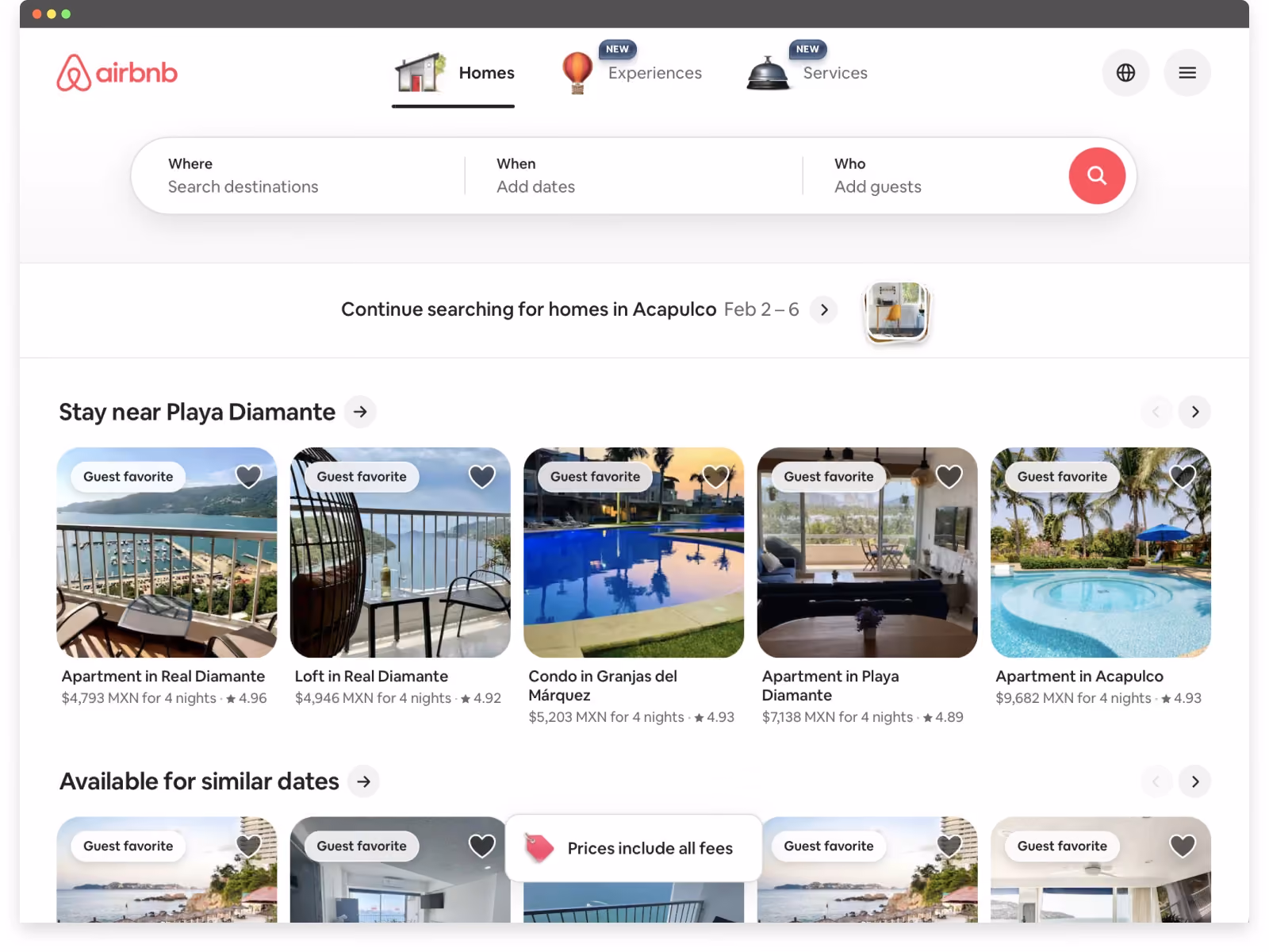
Airbnb remains one of the strongest examples of great website UX, particularly in how it removes friction and encourages exploration before commitment.
One of Airbnb’s most effective UX decisions is its choice not to gate the experience behind sign-up or login. Even as a household name, the platform prioritizes browsing and interaction first, allowing users to search, explore listings, and understand value before being asked for personal information. This lowers psychological friction and invites curiosity rather than resistance.
Several UX principles stand out:
- Immediate access to the product experience
Users can search destinations, dates, and experiences right away. By letting the product lead, Airbnb reinforces confidence and reduces early abandonment. - Strong visual hierarchy with minimal noise
The interface surfaces only what users need at each step — destination, dates, guests, and price context — without overwhelming them with secondary details. This clarity makes decision-making feel manageable, even in a high-choice environment. - Large, clear, and approachable CTAs
Buttons are visually prominent and easy to interact with, especially on mobile, without feeling aggressive or cluttered. This balance between usability and aesthetics is difficult to achieve and consistently well executed. - Visual storytelling that supports trust
High-quality imagery does more than inspire — it reduces uncertainty. Combined with reviews, ratings, and host details, visual elements help users feel comfortable making high-stakes decisions. - UX that adapts over time
Airbnb’s navigation and layout evolve alongside user behavior and market shifts, demonstrating that effective UX strategy is not static but responsive.
Airbnb shows how the best UX websites guide users through complex decisions by prioritizing clarity, visual simplicity, and trust. Rather than overwhelming users with information, the experience feels intuitive, calm, and confidence-building — even at scale.
4. Cinépolis — Clear Choices at Scale
Best for: High-traffic, decision-heavy consumer platforms
Core UX Pattern: Intent-based navigation paths
Why it Works: Users can choose how they want to engage (by movie or by time), aligning the experience with real-world decision-making
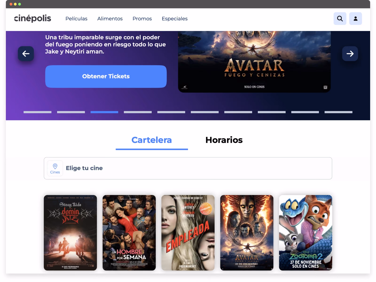
Cinépolis is a strong example of great website UX in a high-traffic, decision-heavy environment. As a global cinema brand, the site needs to serve a wide range of users quickly — from casual moviegoers to frequent visitors — without slowing them down or overwhelming them.
One of the most effective aspects of Cinépolis’ website UX is how clearly it prioritizes primary user actions from the very first screen.
Key UX strengths include:
- Clear, action-driven CTAs above the fold
Even with a rotating carousel of promotional content, the primary calls to action remain unmistakable. Users can immediately tell how to proceed, regardless of which slide is visible — a difficult balance that Cinépolis executes well. - Multiple entry points based on user intent
Below the fold, users can choose how they want to navigate the experience: by browsing a list of movies or by selecting showtimes first. This flexibility respects different mental models and reduces friction for repeat users who already know what they’re looking for. - Intent-based navigation rather than forced flows
Instead of pushing users through a single rigid journey, the site adapts to how people naturally think about going to the movies — either starting with what they want to watch or when they want to go. - UX clarity at scale
Managing content across locations, films, formats, and schedules introduces significant complexity. Cinépolis’ UX succeeds by surfacing the most relevant options early and progressively revealing details only when needed.
From a UX perspective, Cinépolis demonstrates how the best UX websites don’t rely on novelty — they rely on clarity, prioritization, and respect for user intent.
For additional context, we’ve published a case study outlining the challenge, approach, and outcomes behind the Cinépolis website experience.
5. Preply — A Funnel-Driven UX Built on Exploration
Best for: Conversion-focused onboarding flows
Core UX Pattern: Progressive engagement before account creation
Why it Works: Guided questions build user investment first, making sign-up feel like a natural continuation rather than a barrier
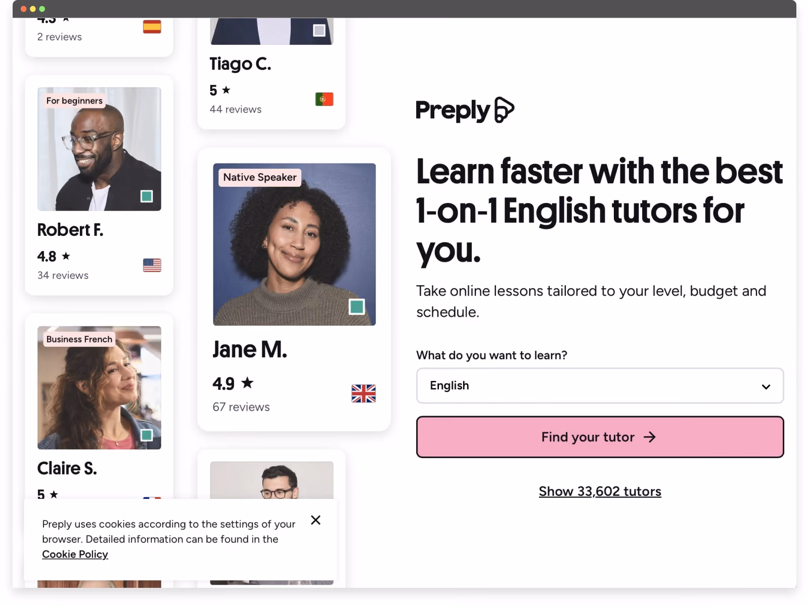
Preply stands out as a strong example of great website UX because the entire experience is designed as a guided funnel that builds investment before asking users to commit.
Rather than pushing users to sign up immediately, Preply invites them to start the journey first. After clicking the primary “Find your tutor” call to action, users are guided through a series of simple, visually clean questions about their goals, preferences, and learning needs. This approach shifts onboarding from a barrier into an engaging, low-friction interaction.
Several UX principles make this especially effective:
- Progressive onboarding before sign-up
By asking questions upfront, Preply encourages users to invest time and intent before requesting an account. When the sign-up prompt finally appears, users are already motivated to see their results. - Clear sense of progress and momentum
Each step feels lightweight and purposeful, creating a sense of forward movement rather than form fatigue. This reduces drop-off and increases completion rates. - Funnel-driven UX with a single goal
Every page, interaction, and CTA supports one primary outcome: helping users find a tutor. There are no competing actions or distractions, keeping focus high throughout the experience. - Visual simplicity that reduces cognitive load
Questions are presented in a clean, approachable format with clear choices, making the process feel intuitive rather than demanding. - Expectation-setting through interaction
By learning about users before showing results, Preply frames tutor recommendations as personalized rather than generic — increasing perceived value and trust.
Preply demonstrates how the best UX websites use interaction and momentum to guide users naturally toward conversion. Instead of forcing early registration, the site builds confidence and intent first, making sign-up feel like the logical next step rather than an interruption.
6. GOAT — Designing for Trust, Status, and Loyalty
Best for: Community-driven e-commerce and resale platforms
Core UX Pattern: Trust and exclusivity-driven interactions
Why it Works: Clean design, offer-based purchasing, and authentication signals reinforce credibility and encourage repeat engagement
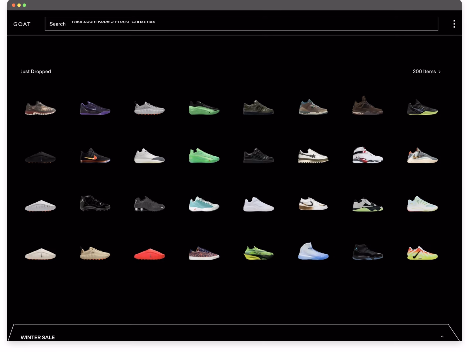
GOAT’s website UX stands out by understanding its audience deeply. Rather than optimizing purely for fast transactions, the experience is designed around exclusivity, trust, and long-term engagement — all critical for sneaker collectors.
The interface is intentionally minimal. Clean layouts, restrained color usage, and strong product photography keep attention focused where it matters most: the sneakers themselves. This simplicity elevates the perceived value of each item while reducing distraction.
Several UX decisions reinforce loyalty among sneaker enthusiasts:
- Clean UI that puts the product first
The design avoids unnecessary visual noise, allowing rare and high-value sneakers to feel premium. This clarity reinforces confidence in the marketplace. - Exclusivity as a UX strategy
Limited availability, drops, and curated collections are surfaced intentionally, creating a sense of scarcity without overwhelming the user. The experience feels selective rather than transactional. - “Make an offer” instead of instant purchase
Allowing users to submit offers introduces negotiation and anticipation into the buying process. This interaction mirrors how sneaker culture operates offline and increases emotional investment in the platform. - Trust signals built into the flow
Authentication messaging, seller verification, and condition transparency are integrated naturally throughout the experience, reducing anxiety around high-value purchases. - UX designed for repeat engagement
Browsing, tracking prices, and waiting for offers to be accepted all encourage users to return regularly — turning the site into a habit, not a one-time checkout.
GOAT demonstrates how great website UX can strengthen community and loyalty by aligning interface decisions with user identity and culture. By balancing simplicity, exclusivity, and interaction, the platform creates an experience that feels curated, credible, and worth returning to.
7. Suno — Letting the Product Speak Instantly
Best for: AI-powered creative tools
Core UX Pattern: Immediate product interaction through prompts
Why it Works: Users experience the core value instantly, making a complex AI product feel accessible and intuitive
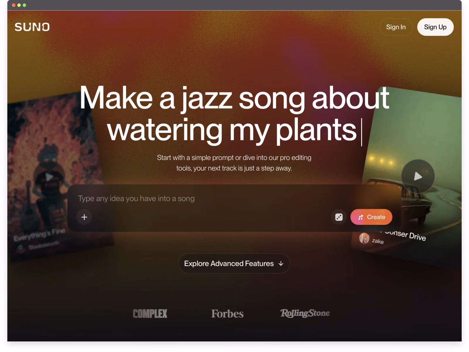
Suno’s website UX stands out for how quickly it communicates value with almost no explanation. The experience is intentionally minimal, visually calm, and interaction-first — making a complex AI product feel approachable within seconds.
From the first screen, Suno avoids heavy copy or feature lists. Instead, the site leads with a simple AI prompt-based call to action, giving users a small but meaningful preview of how the product works. This turns curiosity into immediate understanding without asking for commitment.
Several UX decisions make the experience especially effective:
- Clear, operational messaging above the fold
The headline doesn’t just describe the product... it functions alongside it. Users immediately understand that Suno generates music from a simple prompt, and they can see and feel that promise in action. - Interactive visuals that invite exploration
Background elements aren’t purely decorative. Users can click into them to listen to music, reinforcing the idea that the site itself is a playable surface, not a static marketing page. - Product preview through interaction, not explanation
By allowing users to engage with generated music before signing up, Suno reduces uncertainty and makes the product feel tangible right away. - Visual simplicity that supports focus
Clean layouts, restrained color palettes, and generous white space keep attention on the experience itself rather than distracting UI elements. - Low-friction entry into a complex tool
AI products can feel intimidating. Suno’s UX strips away that anxiety by presenting a single, understandable action that leads directly to value.
Suno shows how great website UX can make advanced technology feel human. By prioritizing clarity, interaction, and immediate feedback, the site transforms a powerful AI capability into something users can grasp and enjoy almost instantly.
8. Notion — Showing Value Through Interaction, Not Explanation
Best for: Flexible productivity and knowledge tools
Core UX Pattern: Learning through visual and interactive explanation
Why it Works: Animated previews and interactive pricing reduce uncertainty and help users understand value before committing
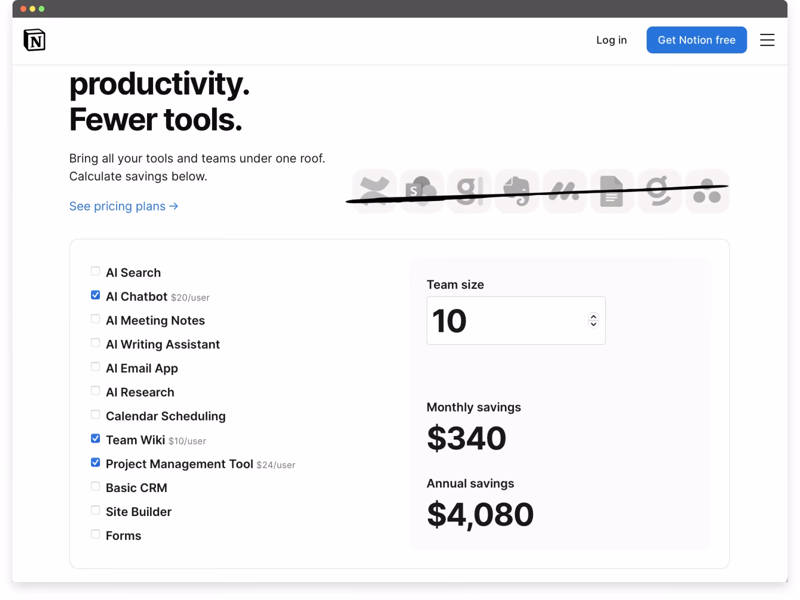
Notion’s website UX excels at helping users understand the product through interaction rather than abstraction.
Instead of relying on long explanations, Notion’s site consistently shows what the product does and how it fits into different workflows. From the first screen, users are given visual and interactive cues that make the value of the platform immediately clear.
Several UX decisions stand out:
- Animated product visuals above the fold
A clean, lightweight animation peeks above the fold to demonstrate how the product works in practice. As users scroll, these visuals transition seamlessly into more detailed explanations, reinforcing understanding without overwhelming the experience. - Interactive pricing that removes uncertainty
Notion’s pricing page allows users to add or remove features, adjust team size, and instantly see how those choices affect monthly costs and annual savings. This interactive approach turns pricing into a transparent, low-friction exploration rather than a static comparison table. - Clear use-case framing instead of feature dumping
The website organizes content around how different teams and individuals actually use Notion, making it easier for users to map the product to their own needs. - Consistent visual patterns across devices
Familiar icons, layouts, and interaction patterns carry through the site, reducing cognitive load and reinforcing usability whether users are on desktop or mobile. - CTAs that support learning, not pressure
Calls to action encourage exploration (“Try,” “See how it works”) rather than pushing immediate commitment, which aligns well with the product’s flexibility and learning curve.
Notion demonstrates how great website UX helps users build confidence before making a decision. By combining visual storytelling, interactive pricing, and clear use-case communication, the site reduces friction and makes a complex, flexible product feel approachable.
9. Apple — Visual Clarity at Scale
Best for: Complex product comparison and purchasing UX
Core UX Pattern: Visual decision-making with progressive disclosure
Why it Works: Users can compare, customize, and purchase products with confidence through clear visuals and structured flows
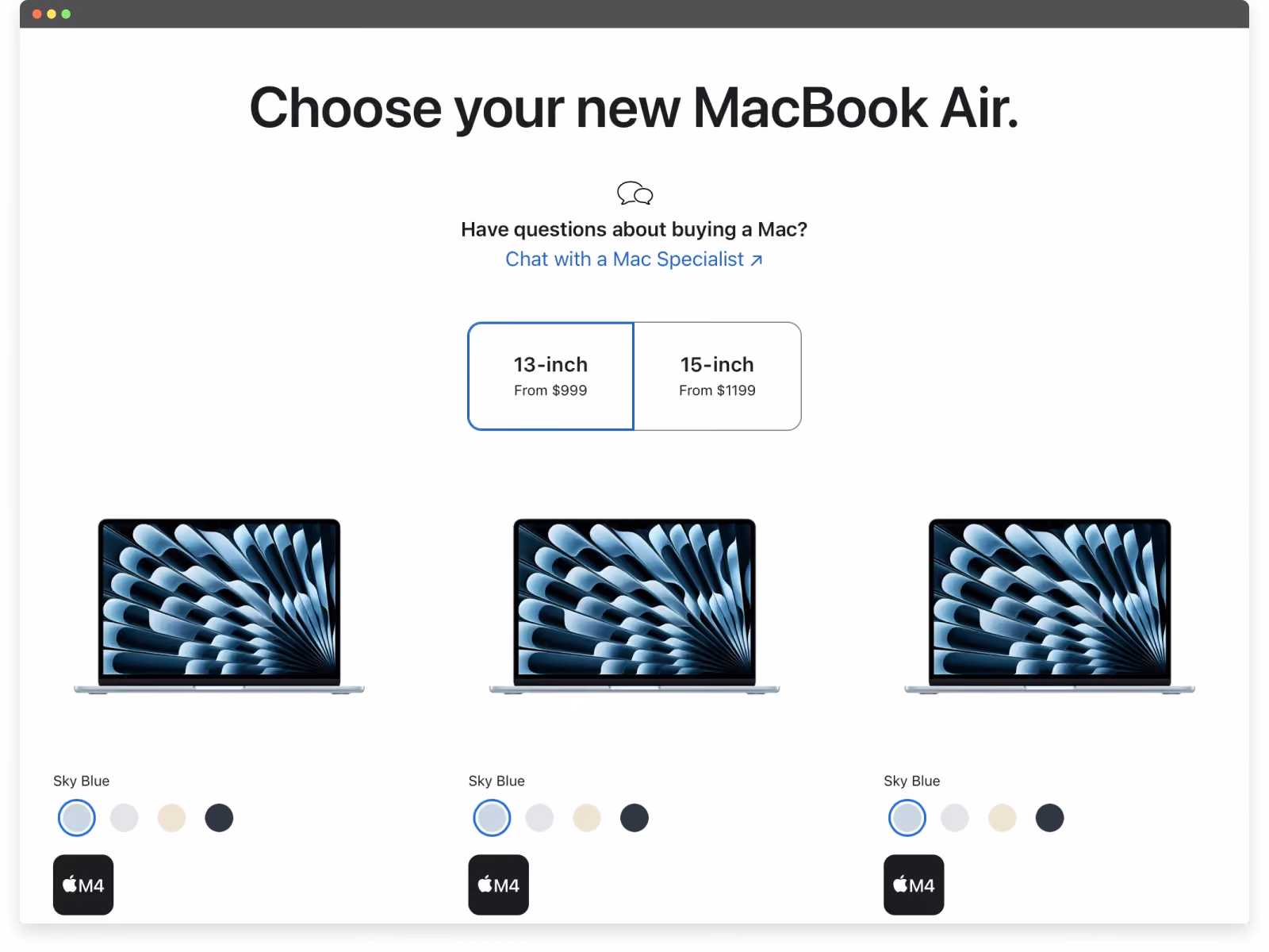
Apple’s website UX is a benchmark for how to present complex product ecosystems with clarity and restraint. Across devices, models, and configurations, the experience prioritizes visual understanding over technical explanation — making comparison and decision-making feel effortless.
One of Apple’s strongest UX patterns is how product visuals are used as functional tools, not decoration. Users can compare models, explore features, and preview customizations in real time, reducing uncertainty before purchase.
Several UX decisions consistently stand out:
- Visual product comparison that replaces specs overload
Instead of forcing users to interpret dense technical tables, Apple uses imagery, layout, and progressive disclosure to help users understand differences between models at a glance. - Real-time customization feedback
As users configure devices (storage, finishes, accessories, etc.) visual updates reflect those choices immediately. This reinforces confidence and makes the purchase feel intentional rather than transactional. - A purchase flow designed for momentum
The buying experience is seamless, linear, and visually guided. Upsells such as AppleCare, accessories, and delivery options are integrated naturally into the flow rather than interrupting it. - Consistent interaction patterns across the ecosystem
Whether browsing a Mac, iPhone, or Watch, users encounter familiar layouts, gestures, and navigation logic. This consistency reduces cognitive load and speeds up decision-making. - Minimal copy, maximum clarity
Apple relies on short, precise language paired with visuals to communicate value. The absence of clutter reinforces trust and keeps attention focused on what matters.
Apple demonstrates how great website UX scales across products, audiences, and regions without sacrificing simplicity. By aligning visual storytelling, interaction design, and commerce, the site turns complex purchasing decisions into calm, confident experiences.
10. Temu — Gamification Optimized for Order Value
Best for: Conversion-driven e-commerce UX
Core UX Pattern: Gamified incentives tied to spending thresholds
Why it Works: Urgency, rewards, and low-friction interactions increase average order value, even without refined visual design
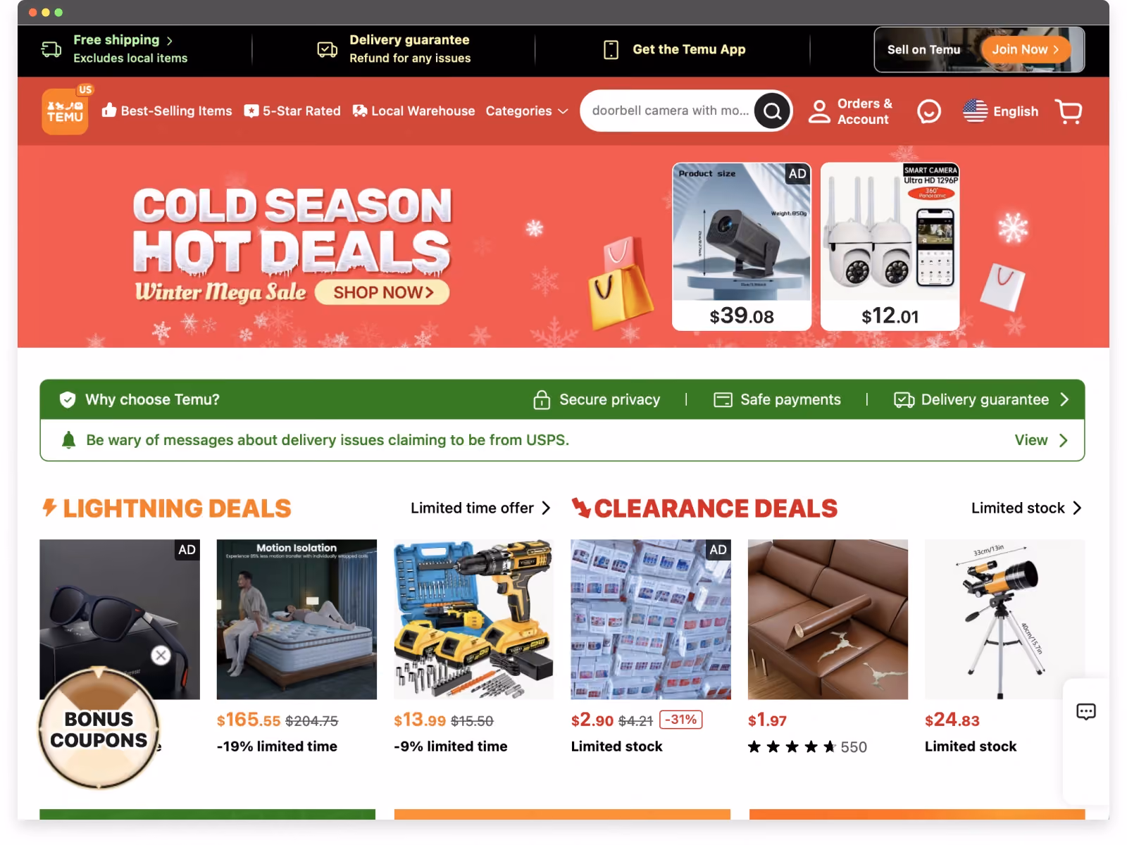
Temu is not an example of beautiful or refined visual design. In fact, the interface can feel loud, dense, and overwhelming. However, when UX is evaluated by its intended outcome (i.e. increasing engagement and average order value) Temu is remarkably effective.
Rather than prioritizing aesthetic calm or brand storytelling, Temu’s website UX is engineered around behavioral mechanics that encourage users to buy more than they initially intended. The experience is unapologetically transactional, optimized to keep users interacting, adding items, and chasing perceived value.
Several UX patterns drive this behavior:
- Gamified incentives tied directly to spending thresholds
Users are prompted to add more items to unlock free products, deeper discounts, or limited-time rewards. This reframes purchasing as progress toward a goal rather than a cost. - Constant urgency and FOMO signals
Countdown timers, “last chance” messaging, and deal expiration cues create pressure to act quickly, reducing deliberation and increasing impulse decisions. - Psychological anchoring through “free” value
The promise of free gifts or extreme discounts makes additional purchases feel justified — even necessary — to avoid “wasting” the opportunity. - Low-friction paths to checkout
Large product visuals, simplified choices, and fast transitions minimize pause points where users might reconsider their cart. - Mobile-first UX designed for rapid interaction
The interface supports quick scrolling, tapping, and repeated actions, reinforcing habitual engagement rather than thoughtful comparison.
Temu demonstrates that great website UX is not always about elegance. In this case, UX is deliberately optimized for volume, urgency, and order size. While this approach may not align with brands focused on trust or longevity, it shows how UX design can be tuned precisely to influence user behavior at scale.
Common UX Patterns Across the Best Websites
Across these examples of websites with great UX, several patterns appear repeatedly:
- Clear value propositions above the fold
- Minimal cognitive load during onboarding
- Strong trust signals in decision-making flows
- Fast, reliable performance across devices
These patterns are transferable across industries and are foundational to creating effective website UX.
Final Thoughts
The best UX websites are not defined by trends or visual complexity. They succeed because they respect users’ time, reduce friction, and guide action clearly.
Studying strong UX website examples is a valuable starting point, but real impact comes from applying these principles to your own users, goals, and constraints.