articles
Layouts in UX: Wireframes

When creating a product, especially when working in UX/UI there are many key steps to take to make it successful. We know the importance of mockups, but what about wireframes? Wireframes are a critical component in the beginning stages of designing a product, but you may be asking how exactly they fit into the design process.
What Is a Wireframe?
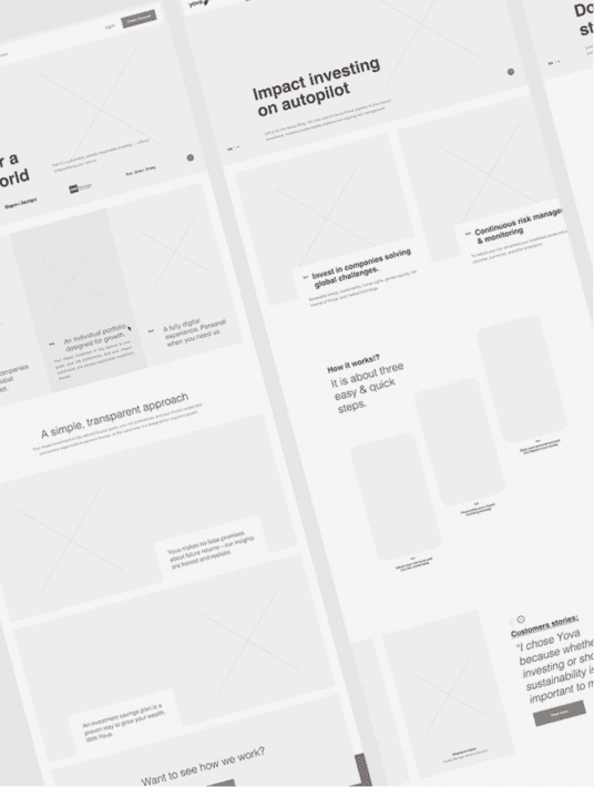
First, you’ll need to understand what is a wireframe in UX/UI design specifically. A wireframe is a diagram created early in the development process to represent the structure and navigation of a website or app. While this does sound similar to mockups, wireframes differ in perspective, for with wireframes we are looking at how the information will be displayed within a product as opposed to just the overall look and feel of a product.

For example, say we have an idea for a health management application for users. In the mockup phase, we can show how this application would look to users visually, the color schemes, the fonts, and various other design application choices. With a wireframe, we then include a general idea of the information that would then be provided per page, and how designers would categorize or section out this information throughout the application.
What Are Wireframes For?
Wireframes are used to present the information displayed on each page. Think of them as well-thought-out and intricate plans with specific descriptions for each intended piece of information on said pages. Wireframes also show the structure and layout of the interface, which helps guide the design team in the direction of how the UI will look and function. They provide critical information towards the business objectives as well, in acting as a visual representation of a design team's ideas for stakeholders/clients.
FiftySeven® - Dribbble
Why Use Wireframes?
The use of wireframes incorporates feedback and collaboration between client and designer, which is key to ensuring the final product meets each party's expectations. You wouldn’t want to find there are any amount of alarming issues post-production and need to backtrack on the design.
Wireframes also put more focus on usability. Displaying the details per page, acting as a skeleton, allows designers to test the usability in a practical and actionable way. Instead of viewing the intended information to be displayed, we are seeing how it will be laid out in the end result.
Focusing on usability, receiving feedback, and various other benefits with the use of wireframes. Benefits also include saving time, money, and fewer future problems.
Displaying wireframes can help paint a clearer picture of a product with clients, as we mentioned. Having clear communication of ideas early on in the design process leads to fewer issues later on, therefore saving time and money.
Boro | Yehor Haiduk - Dribbble
In Conclusion
Wireframes are a great step to take in the development process of a product and lead the team forward in the right direction. They should typically be done at the early stages of product development, to ensure client satisfaction and result in saving you time and money later on.
Check out our article on Layouts in UX: Mockups.
Product goals? Let’s make it happen. Book a free consultation call with our team.
What Questions Do You Have About Wireframes?
Let us know in the comments below.
Talk to us on LinkedIn, Instagram, Facebook, or Twitter.


