Reading Time:
8 minutes
Category:
B2B
Bad website design is not just a visual problem — it is a business problem that quietly costs companies leads, trust, and revenue one lost prospect at a time.

Bad website design is not just a visual problem — it is a business problem that quietly costs companies leads, trust, and revenue one lost prospect at a time.
When I look at a client's website for the first time and immediately know it's bad, it's not a checklist moment. It's a gut reaction.
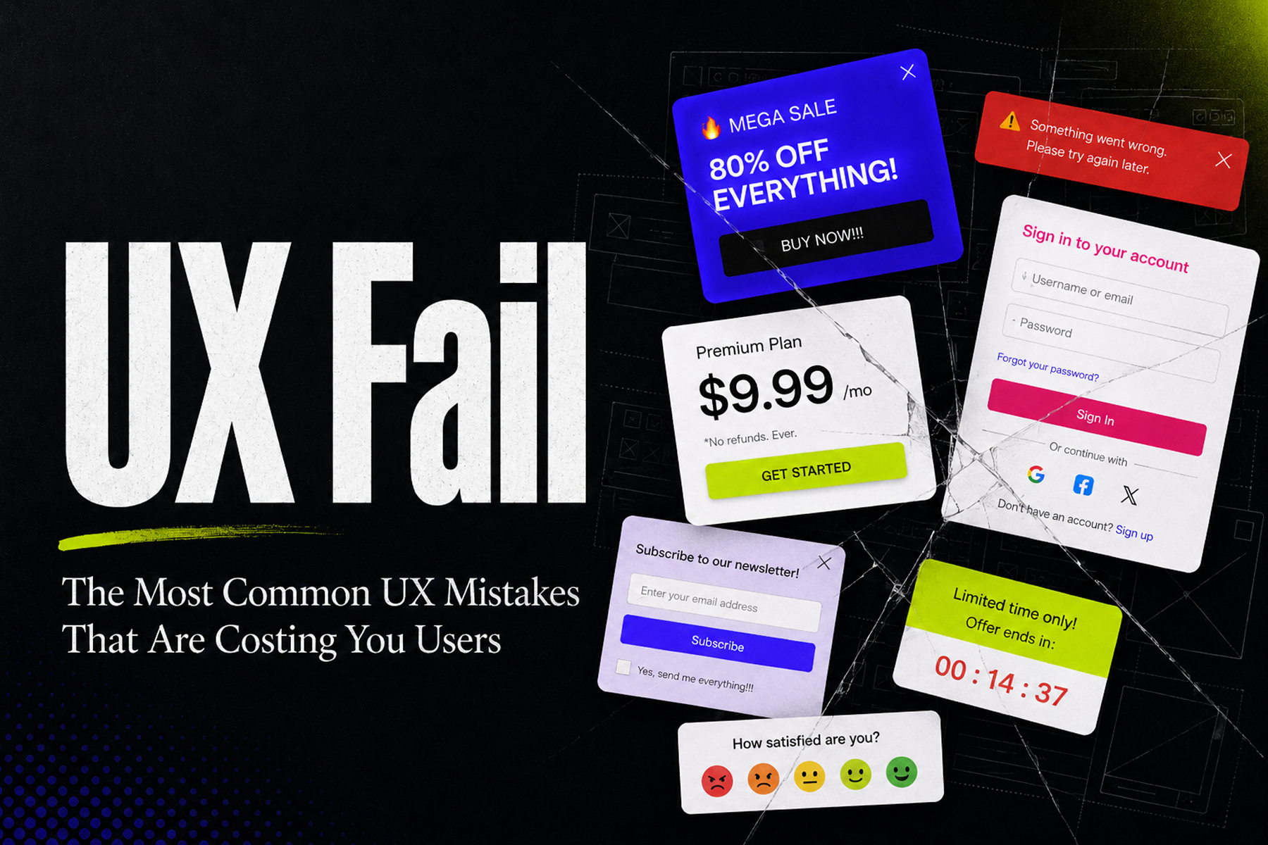
Lack of visual harmony. Colors fighting each other. Bright buttons that belong on a different website entirely. Outdated stock photos that signal to every visitor that nobody has touched this thing in years. Text that's either too small, too light, or sitting on a background that makes it nearly impossible to read. The whole thing just feels off — and visitors feel it too, even if they can't articulate why.
That feeling costs businesses real money. And most of them don't know it's happening.

Bad website design isn't just a visual problem. It's a conversion problem, a trust problem, and in some cases an existential problem for the business. The most common mistakes — visual disharmony, unclear messaging, animation-heavy pages that load slowly, and designs that haven't been touched in years — don't just frustrate visitors. They actively push potential customers, donors, and partners away before you ever get the chance to make your case.
The fix isn't always a full redesign. But it does require being honest about what your website is actually doing to the people who land on it.

The most common thing I hear from B2B companies with bad websites is some version of: "We're relationship-based. That's how we get clients. The website doesn't really matter for us."
My response is always the same: so then why are we on this call?
Because here's what actually happens. A warm referral comes in. Someone mentions your company to a potential client. That person goes to your website. And what they find — an outdated layout, stock photos from 2015, copy that sounds like it was written by committee — immediately undercuts everything the referral built. The relationship got them to your website. The website lost the deal.
B2B companies are not immune to first impressions. They're just slower to feel the consequences, which makes it easy to convince themselves the website isn't the problem. It almost always is.

Most articles about bad website design point to extreme examples — websites so chaotic they're almost funny. That's not useful. The bad website design that actually costs businesses money is subtler than that.
Here's what I see consistently:
Visual disharmony. This is the first thing I notice and it's usually the most obvious to fix. Mismatched colors, inconsistent typography, buttons that don't relate to anything else on the page visually. The website doesn't feel like it was designed — it feels like it was assembled by different people at different times with no shared vision. Which, in most cases, is exactly what happened.
No clear conversion path. A visitor lands on your homepage and can't immediately answer: what do you want me to do next? The page has information but no direction. Navigation has fifteen options. There's no hierarchy. The website is trying to serve everyone and ends up serving no one.
Animation and JavaScript overload. This one is a designer trap. Heavy JavaScript interactions and entrance animations look impressive in a demo. In practice, they slow the page down, frustrate users on slower connections, and often obscure the actual message. I've seen websites where you can't even read the hero text because it's still loading. Cool in theory, damaging in practice.
Outdated visuals. Stock photos from ten years ago. Headshots that look like they were taken in 2012. A color palette that made sense when it was chosen but now reads as dated. Visitors make trust decisions instantly. Outdated visuals signal that nobody cares enough to maintain this thing — which makes them wonder what else you're not maintaining.

Mercy For Animals came to WANDR with a problem that looked, on the surface, like a design problem. Their website wasn't converting supporters into donors at the rate the organization needed to sustain and grow its global advocacy work.
But when we dug in, the real problem was more specific — and more fixable.
MFA had expanded internationally and ended up with six separate regional websites, each with different UX patterns, different messaging, and different information architecture. Supporters landing on any one of them got an inconsistent experience. The emotional story MFA needed to tell — the one that turns a casual visitor into a committed donor — was fragmented across platforms that didn't speak to each other.
What's more, the donation flow itself was asking for commitment before trust was established. Visitors were arriving emotionally engaged with the mission and then hitting friction at exactly the moment they needed clarity. The data showed a 90% drop-off at the primary donation decision point. That's not a design preference issue. That's a structural failure.
WANDR rebuilt the donor journey from the research up — unifying the six platforms into a single global framework, simplifying the donation flow, and grounding every messaging decision in what we learned from actual donor interviews. The result was a 17% increase in supporter actions and donations, and a page creation process that became 78% faster for their internal team.
The website wasn't bad because it was ugly. It was bad because it wasn't built around what donors actually needed to feel in order to give. That's the version of bad website design that most businesses are living with and don't know how to name.
You can read the full breakdown in the Mercy for Animals case study →
You don't need an agency to tell you your website has problems. These are the signals that something is wrong:
Visitors are landing but not converting. Traffic exists, but inquiries, signups, or purchases don't follow. This is the clearest sign that the problem is on the page, not in the channel bringing people there.
You're embarrassed to send someone to your website. If you hesitate before sharing your URL with a prospect, you already know the answer.
Your website doesn't reflect what your company actually does today. If your site still describes services you've evolved past, or doesn't mention capabilities you've built, it's actively misrepresenting you.
Mobile experience is an afterthought. More than half of web traffic is mobile. If your website wasn't built with mobile as the primary experience, a significant portion of your visitors are getting a broken version of your brand.
The last time anything changed was more than a year ago. Websites aren't launch-and-forget assets. They require ongoing attention. An unchanged website signals stagnation — to visitors and to Google.

The businesses that take their website seriously aren't the ones who can afford to. They're the ones who understand what a website is actually doing — qualifying or disqualifying every prospect who encounters it, building or eroding trust before a single conversation happens, converting or losing the attention that every marketing dollar worked to earn.
Bad website design isn't a visual failure. It's a business failure that happens quietly, one lost lead at a time.
WANDR helps B2B companies, nonprofits, and product organizations diagnose what's actually broken and redesign from the inside out — starting with research, not assumptions.

The clearest signs include low conversion rates despite adequate traffic, high bounce rates, an outdated visual aesthetic, unclear navigation, and a mobile experience that feels like an afterthought. The most damaging bad website design is not always obvious — it is the kind where the page looks passable but fails to move visitors toward any meaningful action.
Yes, and this is one of the most persistent myths in B2B. The referral or relationship gets someone to the website, but what they find there determines whether the trust built through that relationship holds up or falls apart. A bad website does not just fail to help — it actively damages credibility at a critical moment in the sales process.
The cost varies but is measurable. For Mercy For Animals, a fragmented and poorly structured donation experience contributed to a 90 percent drop-off at the primary conversion point. A 17 percent improvement in conversions after the redesign represented a significant and direct financial impact. For B2B companies, a single lost deal from a prospect turned off by the website can dwarf the entire cost of fixing it.
Update when the core structure and messaging are sound but the visual layer has become dated. Redesign when the information architecture is broken, the conversion path is unclear, the platform cannot scale, or the site no longer accurately represents the business. When in doubt, a UX audit is the most reliable starting point for determining which approach is right.
The five key warning signs are visitors landing but not converting, embarrassment about sharing the website URL with prospects, a site that no longer reflects what the company actually does today, a mobile experience that was clearly an afterthought, and a website that has not been updated in over a year. Any one of these signals a problem worth addressing immediately.