articles
Layouts in UX Design: Mockups

Mockups in UX design are the prequel to prototypes and should be created at the very beginning of any project for maximum benefit. Every facet of design typically utilizes mockups in one way or another, but how does UX use mockups, and what benefits come with creating them? We’re here to answer these questions.
What Is a Mockup?
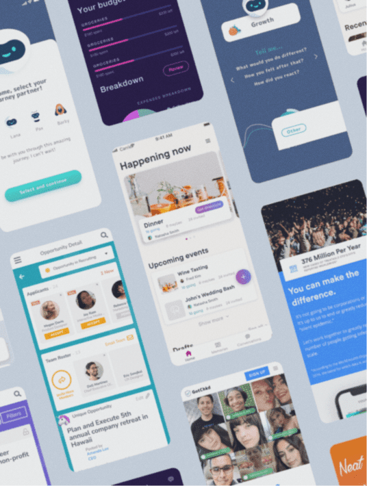
A mockup in UX design is a static, high-fidelity simulation of the finished product that delivers the visual look of the product design. Different from prototypes in the way that mockups are used for internal purposes, providing a visual representation for the design team to work with. Not to be confused with wireframes as well, which are more of a placeholder for designs at the earlier stages in the design process.

What Are Mockups For?
Mockups are focused on the visuals of a product and touch upon the basic functionalities. Visuals such as color options, typography, and other standard design elements to be considered. They assist in design implementation, any editing to be done before engineers approach the technical side of things, and give designers a chance to step back and analyze any underlying issues that are revealed in the mockup.

Why Use Mockups?
Mockups are an effective way to explore the brand’s visual identity. They allow designers to communicate and understand what the final interface should look like, and bring their ideas to form. Designers can then use mockups as a rough blueprint for what the final product should look like overall and even help them build upon the current design.
Another benefit to using mockups is they offer a more realistic perspective to stakeholders of the design and style choices. Oftentimes it’s a challenge to communicate ideas from a designer to stakeholders. While presentations and explanations can paint a convincing picture of ideas, it’s actually having a mockup, something for them to explore and see firsthand a rough result of those ideas that stakeholders can fully understand it’s capabilities.

In Conclusion
At the beginning of a project when the ideas are flowing, mockups are the best way to communicate those ideas. Visually mockups are a necessity for viewing the design decisions before the work that goes into creating a product. Acting strictly as a visual aid to designers and even stakeholders, mockups tell us what we need to about the overall look and feel of a project. Utilizing mockups are a great and effective way to start a project and ensure the design process goes smoothly.
Check out our article on 5 UX Methods & Trends to Follow in 2022.
Product goals? Let’s make it happen. Book a free consultation call with our team.
What questions do you have about mockups?
Let us know in the comments below.
Talk to us on LinkedIn, Instagram, Facebook, or Twitter.


