articles
UX Style Guides For Top SaaS Products

A lot of folks ask us what’s the difference between UX Style Guide and a Design System. The answer is simple, while a UX Style Guide is a set of guidelines on how things should look in a variety of scenarios, a Design System tends to be a lot more comprehensive and usually includes a UX Style Guide.
Even though the A UX Style Guide is not as exhaustive as a Design System, given that SaaS companies should maintain a distinct visual style and experience across multiple customer touchpoints, it is sometimes the most appropriate solution.
Characteristics of Great UX Style Guide
You’re probably wondering what the qualities of a great UX Style Guide are. So we’ve created a quick guide to help you work with your design team to either create one or evaluate and improve the one you already have.
A great UX Style Guide is:
- Flexible
- Easy to use
- Consistent with the Design System
1. Flexible
Flexibility is one of the essential characteristics of a UX Style Guide. It allows the brand to adapt to any situation. In our diverse tech ecosystem of devices, resolutions, and aspect ratios, brands need to be able to retain their distinctiveness in a wide gamut of situations.
You can’t anticipate every scenario for which you will have to use your brand. But you can ensure the rules in UX Style Guide are bendable to adapt to as many environments as possible.
You can make your UX Style Guide flexible by defining what you can’t do rather than what you can do.
You can provide general rules such as what styles to use over a dark background. (Read Dashboard Web Design: 3 Trends that Meet Business Goal)
It’s a good idea to provide fallbacks for fonts as well. A fallback is a style that you can use when the primary style is not available. Make sure the fallbacks you choose are widely available by default on Windows and Mac.

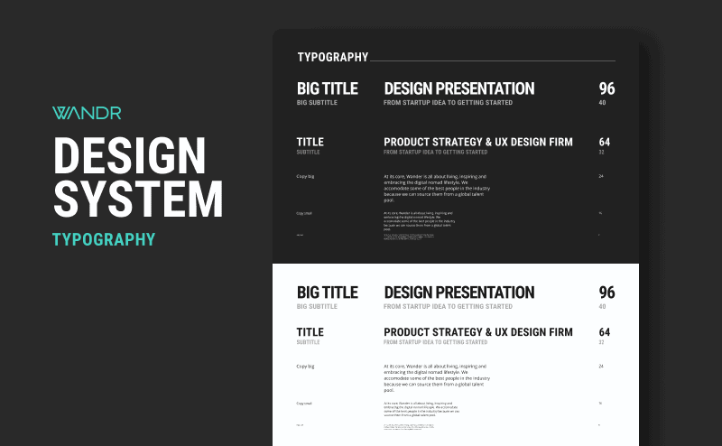
For example, here at WANDR, we use Roboto Mono Condensed in all caps for our headings and titles. That font is not available on MacOS’s Pages by default. So our fallback is Impact, which comes pre-installed on all Windows and Mac machines.
It’s essential to have a flexible yet clearly defined set of UX Style Guides. Yet, it won’t serve much unless everyone can use it.
2. Easy to Use
One of the great things about good UX Style Guides is that they are simple and easy to use. They are like “lite” versions of your Design System.
As you probably know, not everyone working on your SaaS product experience is a designer or a developer. Your UX Style Guide should adapt to the needs of people outside the product development team.
You can export your UX Style Guide as a PDF rather than a code repository or build a simple website rather than a gigantic design file. The less friction there is, the higher the chances of them sticking to it.
If you do things right, your UX Style Guide will allow everyone to maintain your brand’s design principles on stuff like marketing assets, sales materials, and internal documentation, which takes me to the next point.
3. Consistent with the Design System
A good brand is consistent across all customer touchpoints.
Consistency creates familiarity, which helps users operate your product without friction. Figuring things out takes away precious mental energy that your users need to complete a task, making it feel more complicated than it is.

The more consistent an experience is for your user, the easier it is for them to assimilate it. And remember that your user experience doesn’t begin and end with your product. The experience is everything from the colors of your logo to the language your customer support rep uses.
This is the reason why your UX Style Guide and your Design System should be two of a kind. It’s the only way to ensure a truly seamless user experience.
Examples of Great UX Style Guide
Now that we know what a great UX Style Guide looks like let’s look at a couple of UX Style Guides from two of our favorite SaaS products.
Spotify
A great example of UX Style Guide flexibility is Spotify. I’m personally a big fan of how Spotify’s logo guidelines provide simple-to-follow instructions without being too restrictive.
Instead of telling you exactly how to use it, Spotify provides specific examples of what not to do, leaving you room to adapt the brand to the particular situation to need to solve.

Zoe Financial
Apart from creating a Design System for our client Zoe Financial, we also made a simple PDF UX Style Guide for their marketing team.
In this particular example, the colors in the PDF can be copied and pasted into any slides-making software or email newsletters, allowing them to very easily apply consistent colors without having to delve into the Design System.

Keep in mind that, while PDFs can be easy to share and use, they are static and quickly become outdated as the Design System evolves. Alternatively, you can get creative and use something like a public Figma prototype, Notion page, or a simple website.
You can read Zoe’s case study here.
Conclusion
UX Style Guides are handy tools for designers, marketers, and developers striving for consistency. Unlike Design Systems, they are much quicker to produce and have a lower entry barrier for non-technical people. Ensure your UX Style Guide is usable by everyone, and don’t forget to update it whenever you make changes to your Design System.
Drop us a comment below or talk to us on Instagram, Facebook, LinkedIn, or Twitter.


