articles
PayPal Case Study Research Project

Rebecca Fan, one of our newest Product Designers to join the WANDR team after completing a design internship with WANDR. Rebecca brings an effective and fresh perspective to challenges, staying curious about the capabilities of design and visual language to bring communities together, solve problems, and broaden inclusivity.
In this blog, we outline Rebecca’s research project on PayPal as a part of her time as an intern at WANDR. Rebecca utilizes a process that heavily emphasizes the value of user research and testing.
About PayPal
PayPal is a multinational company that operates online payments and online finance transfers. PayPal is one of the leading services to offer an easier way to send and receive money digitally, accounting for more than 350 million users and being a widely known option in the market for decades.
In this research project, Rebecca explores the reasons users may be experiencing a negative user experience using PayPal’s products and services. From analyzing the web applications to the mobile versions, which in the current market is one of the most important aspects of a successful fintech product.
Problems to Solve
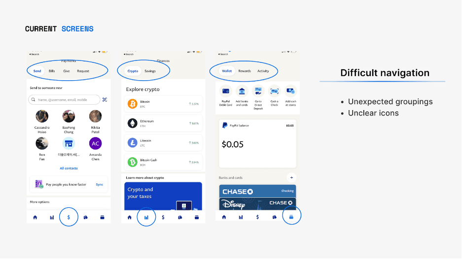
Due to the app having so many functions... the experience is not intuitive to navigate and the design constricts the discoverability and usability of these features. The home screen does not resonate with users and is not very useful.

Problem 1: Create a more engaging home screen that prompts users to want to use the app and find it fulfilling.
Problem 2: Reduce uncertainty about the account information (activity, which card is being used, balance) and happenings
Problem 3: Reduce confusion around navigation i.e. flows, icon meanings, and location of desired resource or content.
Research
Secondary White Paper Research
14 external sources were collected to understand more of the most prominent fintech users, successful fintech trends, and Paypal’s goals. After synthesizing the research, it was noted that the aspects of navigation, personalization, and visibility were some of the most important to a successful fintech product.
Competitive Analysis
As fintech is exponentially growing in this more digital age, many are opting for mobile banking and payment apps. With so many options, it was essential to see other competitors to understand current market trends and strengths. A thorough competitive analysis was conducted on the following popular fintech apps and their strengths were noted:
Skrill - Simple navigation
Payoneer - Good visibility
Google Pay - Shows insights
Apple Pay - Mimics real world
This competitive analysis allows designers to see what users were drawn to and aids in inspiring and validating the redesign.
User research
During the user research process, Rebecca found that 10% of task failures were due to bad information architecture. Users were unable to seek out the information they needed in a timely matter. Along with this finding, it was also revealed that generally, 67% of users leave a website when frustrated with the mobile website.
Utilizing research procedures such as user interviews and user testing feedback, the results were as follows:
The Findings:
- The home screen should be more engaging and helpful, a personal space for the user to manage their finances.
- Navigation should be simplified and features should be made easy to find -- the user was unsure about what icons meant.
- Visibility is important to reduce confusion which in turn eases user flows and builds trust; the user was unsure about the balance.
- The user likes practical and simple designs and uses other fintech apps and digital wallet pay.
With the user pain point findings and synthesized research, some goals for the redesign were defined and validated. Once defined, Rebecca was able to implement these goals within the product.
The Goals:
- Create a more engaging home screen that prompts users to want to use the app and find it fulfilling.
- Reduce confusion about the navigation such as icons and location of features.
- Reduce uncertainty about the account information, balance, card in use, etc. with easy visibility.
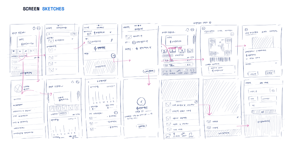
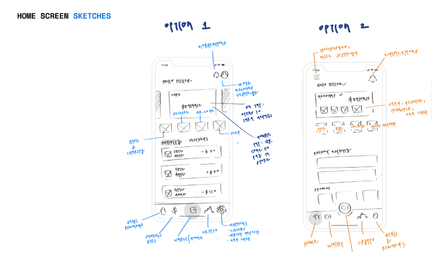
Ideations and Wireframes


Design Overview + Solutions
In the redesign the next step is to insert images of final designs and remind users of the previous 3 problems mentioned during the user research process, and account for how they were solved.
Problem 1: Create a more engaging home screen that prompts users to want to use the app and find it fulfilling.
Key Solutions: Personalized Experience
Insights make the home page more personalized, and the user feels more connected to the app based on research Feature creates a more engaging, helpful experience. Previously marketing was replaced with more account activities
Problem 2: Reduce uncertainty about the account information (activity, which card is being used, balance) and happenings
Key Solutions: Home + Wallet
Home and wallet are in one Instant see cards and provide similarities to their real-world wallet. Balance and notifications are clearly displayed.
Account Display
Having a simple and clear display of which card is being used during each step, along with straightforward indicators to guide the users.
Problem 3: Reduce confusion around navigation i.e. flows, icon meanings, and location of desired resource or content.
Key Solutions: Clear Bottom Navigation
Easy to use the navigation bar, comprehensible icons, labels, pages with their own estate, and no hidden tabs.
Adding a Card
Adding a card to an account will be easily accessible on the home page for users immediately when added, preventing confusion about location and accessibility.
Grouping for Easier Discoverability
All other money/account-related actions are grouped together while previously some were on certain pages or the hamburger menu.
Concluding:
User Testing Feedback
“I feel like this experience is easier than the current one. I would use this every day without issues.”
Results from Testing:
After testing, it seemed like the new model:
- Matches user’s mental models and expectations
- Takes into consideration other competitor’s patterns and offers a more up-to-date experience for today’s current user needs
- Offers a more engaging, personalized experience
- More visibility to build trust
- Simplified navigation to ensure better discoverability and use of features
Next Steps and Learnings:
- Retesting again to see if the concerns brought up from the testing were resolved (or conducting a/b testing)
- Further testing the experience with more users to ensure saturation of findings and naturalness of layout
- Explore ways to further streamline the experience such as testing what users want.


