articles
Zoe Financial Case Study

About Zoe Financial Inc.
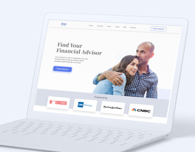
Zoe Financial is a marketplace that connects customers of a certain net worth with professional financial advisors. Users go through an assessment and the system matches them with the best advisor for their particular financial situation and goals.
Zoe has developed a rigorous vetting process to ensure all their advisors are of the highest quality. Once onboarded, they have a suite of tools to simplify the process of client acquisition and advising.
However, as many companies may know, a fast rate of growth, albeit desirable, comes with a few challenges. Zoe was presented with two main problems.
- Once you’ve achieved product-market fit, you have to rapidly scale your product and your team. How do you do that while maintaining a consistent experience?
- FinTech is a sensitive market that requires a lot of brand trust. People judge by the cover, so how do you capture a large portion of the market as a new startup?
Our work with Zoe Financial has had three phases over the course of 8 months:
- Phase 1: Redesign marketing website to increase brand trust
- Phase 2: Redesign of customer onboarding to increase conversion
- Phase 3: Design for the advisor dashboard and experience
The Challenges
- Enable the scalability of the product while ensuring consistency and speed
- Build trust through a refreshed visual branding
Phase 1: Marketing Website
Demographic and Psychographic Research
As usual, the first step was to learn as much as possible about the user.
We spent the first week going through all the demographic information Zoe already had collected from their existing customers. We complemented that with our own secondary research for psychographic profiles.
Information Architecture
The next step was to map out the structure of the current website. This allowed us to visualize the number of pages and user flows.
We then conducted a card sorting exercise with Zoe to very quickly group related ideas. These types of exercises are great to organize the information of an entire product or website into clusters of content. They can be conducted in person or remotely through a digital whiteboard like Miro or Bluescape or even Figma, and it only takes a couple of hours!
After a few days, the WANDR team proposed a new architecture for the website based on what we learned about the users values and interests and what the marketing data suggested were the most important pieces of information for them.
Wireframes
Now that we’ve rebuilt the new structure to optimize the user experience, the next step was to start wireframing each individual page of the new website.
The wireframes allow us to more accurately arrange the content on each page page. They are also very useful for quickly rearranging elements inside the page to make sure there’s a cohesive flow of information.
To select how to organize the pieces of content on each page, we prioritized the information based on feedback from Zoe’s marketing and sales teams. They key here is to understand what content brings the most value to the user to attract their attention. This keeps them engaged as they learn more about the company.
For graphics and illustrations, we used placeholder images related to the content of each page to help the decision process. These were later replaced for the final versions.
Visual branding exercise
With all the content organized into pages and sections, it was time to start working on the visual design.
All the research we did at the beginning of the project suggested a few conditions for what the new visuals needed to be to build trust but we also wanted to have a lot of input from the Zoe marketing team. So we utilized another exercise from our brainstorming repertoire: This, Not That.
This, Not That
During the exercise, we ask our clients to come up with as many adjectives that represent the brand if it were a real person. We timebox this to keep it short. Then we repeat the process but focusing on what the brand is not. At the end of the activity, we have a collection of brand attributes that our art director can then translate into visual directions.
We distilled the information from the initial research and the This Not That exercise into 3 fundamental traits for the brand. Zoe should be perceived as:
- Trustworthy
- Transparent
- Knowledgeable
Our visual metaphor was, if Zoe was a person, it would be George Clooney on a day off:
Visual Direction And Design System
Armed with this information, our Art Director came up with a couple of visual proposals for the art direction. After a couple of iterations we arrived at a style we all agreed represented Zoe.
Visual aesthetics play a major role in whether a customer perceives a brand as trustworthy. As humans, we are attracted to visually pleasing images. Our brains evolved to associate symmetry, proportion, and good contrast in nature to food and overall well being. Moreover, the adoption of a serif font for titles, which are traditionally linked to newspapers and books, send a message of earnestness and trustworthiness. We ended up combining aspects from both visual proposals.
Our team then began working on the design system. This is the collection of components that governs Zoe’s visual aesthetics across all platforms. Having a clear manual of how the brand should look allows marketing and the development teams to keep a consistent look and feel on all communications and the product. It’s an essential step towards a more mature and trustworthy brand.
The two main advantages of a design system are:
Efficiency and speed: Having components for the great majority of functions, there was little to no necessity for ad-hoc front-end code. With less code to write, developers can work faster, reducing the amount of work needed to develop new pages and making for more efficient release cycles.
Scalability: As Zoe hires new developers, they can all use the same constituent components from the system and start pushing new pages and features to production in a fraction of what it took new hires prior to our collaboration.
Phase 2: Customer Onboarding
One the website was done, it was time to start working on the second phase of the project which focused on increasing the conversion rate of the customer onboarding.
The Goal
The goal of the customer onboarding is to have visitors complete a set of questions in an online form and schedule an introductory call with at least one financial advisor.
Auditing the existing experience
We started the second phase by looking at the existing experience and identifying usability hurdles and potential areas of improvement.
We weren’t surprised to find that one of the biggest drop-off points was when users were asked for more personal information like phone number, zip code, and email address. In our experience, this happens when the product fails to deliver enough value before asking for more sensitive data.
To address these issues, we did two things:
- Redesign the visual style of the form to match the new style, show consistency and build trust
- Shift the order of the form so that the sensitive questions appeared at the end, so the user feels more invested in the process and therefore is less likely to leave
Onboarding Form Before And After:
Testing the Form
Our team created a design prototype of the initial onboarding flow redesign to put it through its paces with real people. We conducted qualitative interviews with open-ended questions using the prototype. The feedback we got gave us a lot of insight around how to ask the right questions and what was the best order for them. They also gave us some ideas of things we would want to A/B test once the new design was in production.
Conversion Improvement
Self schedule conversion rate after the redesign, Rolling 4-week average.
Phase 3: Advisor Dashboard
After a few months of work on the customer-facing part of the experience, the third phase was centered around the internal product for the financial advisors.
Zoe not only makes it very easy for people to connect with excellent financial advisors, but it also provides a platform that facilitates the communication between them.
The goal of this phase was to design a set of tools that would make the work of the advisors easier, while keeping the interface clean and intuitive. This included a dashboard, two chat modules, one email module, a video call interface, a pipeline and a CRM.
Another challenge we encountered was translating the web interface of the dashboard into mobile. We wanted to make sure the experience was optimized for the smaller screens without sacrificing functionality.
After exploring a few alternatives, we came up with a navigation system that allows the financial advisor to focus on one module at a time, freeing the interface from unnecessary distractions and making it easy for them to quickly find the information they need at any given time.
Conclusion
Marketplaces are complex products. To be sustainable, they need to strike a balance between supply and demand of a particular set of goods and services. WANDR has helped many companies build their products and, even though they always require custom solutions adapted to their industry and customer base, our approach is always the same. We start by deeply understanding users and finding the intersection between what creates value for them and what profitable from a business standpoint.
As a result of our methodology, we‘ve helped many of our clients drive growth through world-class experiences that convert and retain customers.


