Data Visualization in Education
Learn the power of data visualization in education & its benefits. Simplify complex data for better insights!

Data visualization has grown to become a critical asset for educational institutions. It has the power to transform how students, faculty, and universities access, present, and utilize data. Educational institutions are fueling the adoption of data visualization to help people communicate more efficiently.
In this blog, we’ll talk about what data visualization is, the advantages of data visualization in the education sector, and some best practices.
What is data visualization?
People learn and analyze information in different ways, and one of the most effective ways to absorb data is through data visualization. The definition of data visualization can be as simple as the representation of data in a visual way, like bar graphs, pie charts, heat maps, or even XY plots.

While data visualization may result in an image or a figure, it shouldn’t be just seen as a graphical product. It is the process of employing a variety of presentation technologies, communications techniques, and media formats to graphically explain the meaning of data to viewers.
The goal of data visualization is to make data easy to digest, help people identify patterns and trends, and allow them to gain insights from the data itself. The primary objective of data visualization is to precisely uncover and communicate the meaning of a data set that otherwise wouldn’t have been detected.
Advanced data visualization is a powerful tool for finding and understanding the stories hidden within vast chunks of data and presenting them to people in a simple way.
Academic use of data visualization
Educational institutions have realized the importance of leveraging data visualization and analytics within the education system to gather in-depth insights from large amounts of data and make well-informed decisions.
It is essential for people at every level to have access to the same data and reports in real-time in order to improve educational programs, student curricula, and more — in a way that delivers quicker results efficiently.
Data visualization can help executives analyze how their decisions can impact the future and fully prepare for any consequences that may come their way due to the decisions they make today.
Pairing advanced data visualization with other techniques like statistical analysis and data mining can help educational institutions gain exceptional insights. University of Massachusetts Boston uses data visualization to understand the enrollment data and identify trends within the student population.
Data visualization techniques can also be useful for educators to keep track of students at risk of failing or dropping out and proactively get in touch with them to see what they can do to help.
Furthermore, data visualization helps everyone — even people who may not have strong analytical skills — to explore insights gained by different methods.
How can we apply data visualization correctly in education?
Data visualization has great potential for several industries. Businesses worldwide can be benefitted from making their data easier to interpret. The bottom line is how you utilize the data you’ve gathered, not the numbers themselves.
The need for data visualization is continuing to rise as more industries realize how beneficial it is to present information visually to both expert and non-expert audiences. Educational institutions are no exception.

One good example of how data visualization helps the educational sector with decision-making and identifying trends is research conducted by the National Student Clearinghouse. It shows the impact the pandemic had on enrollment rates.

Can data visualization help us measure teacher performance or learner progress?
Yes, in the educational sector, data visualization can help us analyze teacher performance and student engagement effectively. Data visualization methods like graphs and charts can allow instructors to gain clarity about their student’s performance and help them make quick and informed decisions.
Like every other business, educational institutions gather tens of thousands of data points about students each day. It’s critical for institutions to make use of the information they collect by analyzing and drawing valid conclusions.
Data visualization allows instructors and administrators to identify patterns and trends and better comprehend this information. Administrators can take a look at the course-taking and enrollment information to craft effective class schedules. It also helps them assess the quality of instruction and curriculum work by carefully examining the outcome data.
Allowing teachers and administrators access to the right data visualization dashboards will enable them to process information themselves instead of waiting months to get a rough estimate of their student’s progress. This promptness helps instructors spot knowledge gaps, customize their instruction methodologies, and make better decisions to help students succeed.

Data visualization allows the members of the school committee to analyze financial data to ensure resources are distributed equally across all campuses. It also empowers parents with the knowledge of graduation rates of different schools and colleges before making critical decisions.
Benefits of data visualization
1. It makes data easier to consume.
Rows of endless data may look like gibberish at first glance, but when the same information is presented in the form of diagrams and pie charts, it makes it easier to understand.
Humans have been using pictures to communicate since prehistoric times. Cavemen would share stories about their hunting exploits on the walls of their caves.
Advanced data visualization allows us to analyze enormous amounts of data in a clear and concise manner through graphical representation. This helps people comprehend large amounts of data, draw viable conclusions, and see information from different perspectives.
In today’s world, people have become heavily dependent on their smartphones, significantly affecting their attention spans. Therefore, receiving information in the form of a ‘snapshot’ is much more helpful than long, cumbersome, difficult-to-understand reports.
Design operations (DesignOps) and data visualization allows decision-makers in educational institutions to quickly produce and consume critical indicators. It helps them streamline their operations to ensure that their decisions are in line with the data they’ve gathered. If any of these indicators aren’t going the way they assumed, they can pinpoint the reason behind the anomaly and make decisions to counteract the situation.
2. It makes identifying relationships easier
Understanding and identifying the connections between different types of data is critical for administrators. When presented visually, even massive volumes of complex data will begin to make sense and help administrators identify varying data links. Some correlations would be extremely straightforward to locate, while others may not.
The bottom line is that data visualization allows people to identify connections and helps business leaders focus on areas most likely to impact their goals.
However, it’s challenging for people from different backgrounds to recognize all the various links between different parameters. For example, an accountant may understand financial data much better since they would be able to identify the connection between admission rates, course fees, and taxes. Executives in other departments may not be able to detect these key connections easily.
Data visualizations have six primary analytical functions:
- Distribution: This emphasizes the distribution of the data as well as the form and focal point of the information gathered.
- Comparison: It aids in determining the hierarchy, magnitude, or correlation between various aspects.
- Change over Time: It demonstrates how the data has evolved over time.
- Flow: It investigates the data’s progression from one point to another.
- Spatial: This highlights patterns that are primarily related to the location and position of data points.
- Part-to-Whole: This shows how many of the total data points a particular segment comprises.
Data visualization allows educational institutions to remove the background noise from critical data and helps leaders, regardless of their background, recognize key connections between various data sets.
For example, while the COVID19 pandemic has had a huge impact on the enrollment rates, this data visualization chart shows how the pandemic has affected students of different ethnicities in terms of undergraduate enrollment.
3. Facilitates decision making
Research by 3M Corporation has shown that people can process visuals nearly 60,000x faster than written text. Therefore, graphical representations like charts and graphs are much easier for our brains to process than to read and mentally visualize a written blog of text — which may not always be accurate.
Data visualization helps speed the decision-making process by allowing business leaders to identify emerging trends swiftly and make decisions based on their observations.

Our ability to quickly understand and interpret visual data makes it easier to identify data points that are closely related. This ease of identifying trends and patterns makes it easier for business leaders to make swift decisions without wasting time on manual analysis.
Educational institutions can use real-time information to make time-sensitive decisions that significantly impact the business by utilizing data visualization technologies.
For example, educational institutions can better understand which campaigns and initiatives work best to get students more interested in a particular subject and accordingly adjust their approach for better results.
4. Easily modifiable
People working within different departments have different priorities and needs. Data visualization allows educational institutions to easily modify the visuals to suit different audiences.
The same data that has been gathered about the students can be represented visually in different formats.
For example, the administrative board may like to see a graphical representation of the passing and failing presentation of each grade to see the big picture. On the other hand, homeroom teachers may want an in-depth look at the class they’re responsible for.
Final Thoughts
In this blog, we’ve explored what is data visualization in detail, how it can be applied to the educational sector and the benefits associated with it.
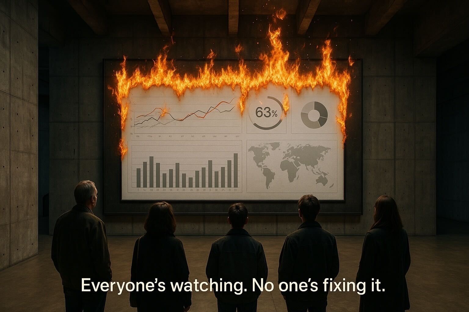
The data available to educational institutions can be overwhelming and distract people with the wrong set of numbers or confuse them with the complexity of data. Transforming massive chunks of data into graphical representations like bar graphs, heatmaps, scatter plots, and pie charts can help educational institutions represent complex numbers in a simple-to-understand manner.
Data visualization has the potential to unlock solutions to issues that may have been overlooked in the past.
If you’d like help building a strategic data visualization tool for your business, you can book a free consultation with our experts at WANDR today!


.png)


