
Reading Time:
4–5 minutes
Category:
Dashboard Design
A look at three powerful dashboard web design trends, animation, dark mode, and color harmony, that can improve usability, boost engagement, and reduce customer churn.

A look at three powerful dashboard web design trends, animation, dark mode, and color harmony, that can improve usability, boost engagement, and reduce customer churn.

Many factors influence the success of your product’s dashboard. We have identified 3 specific dashboard web design trends that will boost your product’s usability and retain more customers.
Movement is inherent to nature. Almost everything we can perceive with our senses is in a constant state of motion. Our brains evolved to be particularly sensitive to it and are really good at estimating the speed of something by just looking at it for a fraction of a second.
Animation is our way of emulating the characteristics of movement through technology. We can describe it as the transition between two states.
As for movement, we are very sensitive to animation. Animated graphics feel more natural to us. But its benefits go well beyond just feeling good.
The usage of animation in user interfaces has been linked to boosting learning and retention of information.
According to a study published by the Educational Technology & Society journal in 2018, animated graphics proved to be superior to static images for learning.
” The results indicate that students in the animations group perceived less extraneous cognitive load and achieved a better learning outcome than those in the static pictures group.”
Another study published in Computers & Education corroborates the findings:
“An overall positive effect of animation over static graphics was found.”
How does this affect business outcomes?
As we’ve stated in previous articles, cluttered, convoluted dashboards can actually make it really hard for customers to understand data and undermine their decision-making process.
This can lead to unnecessary support tickets from customers asking for information or, in the worst case, an elevated churn rate caused by frustration when using your products.
Conversely, using animations can help customers better process the information in your product, increasing their engagement and retention.
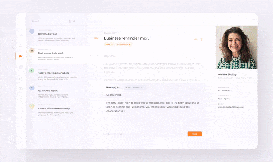
Animated design by Emil Samojło on Dribbble
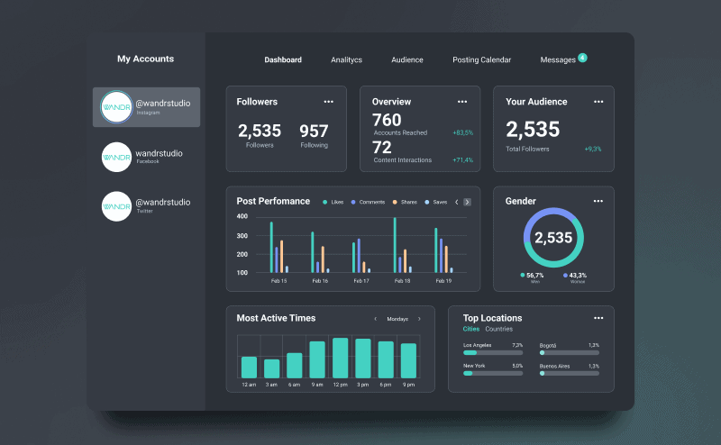
Dark mode can be described as a dashboard design template in which the regular white background of the user interface is shaped for a black (or near-black) color.
Companies like Apple, Facebook, and Google have embraced the trend after realizing an essential number of users prefer its aesthetics over the traditional white themes.
But dark more is not just a fancy web design trend. Depending on the type of display technology in use, it can dramatically reduce the amount of energy consumed by the user’s device.
As reported by Google, dark mode, when used on OLED displays, consumes up to 63% less energy than traditional LED devices. OLED displays are becoming increasingly common, particularly in mobile devices.
Another significant advantage of incorporating a dark mode UI in your dashboard’s web design is related to sleep quality.
While the research remains inconclusive, some scientists believe using dark modes at night can minimize the impact that many devices’ blue light have on melanin production and the human circadian rhythm.
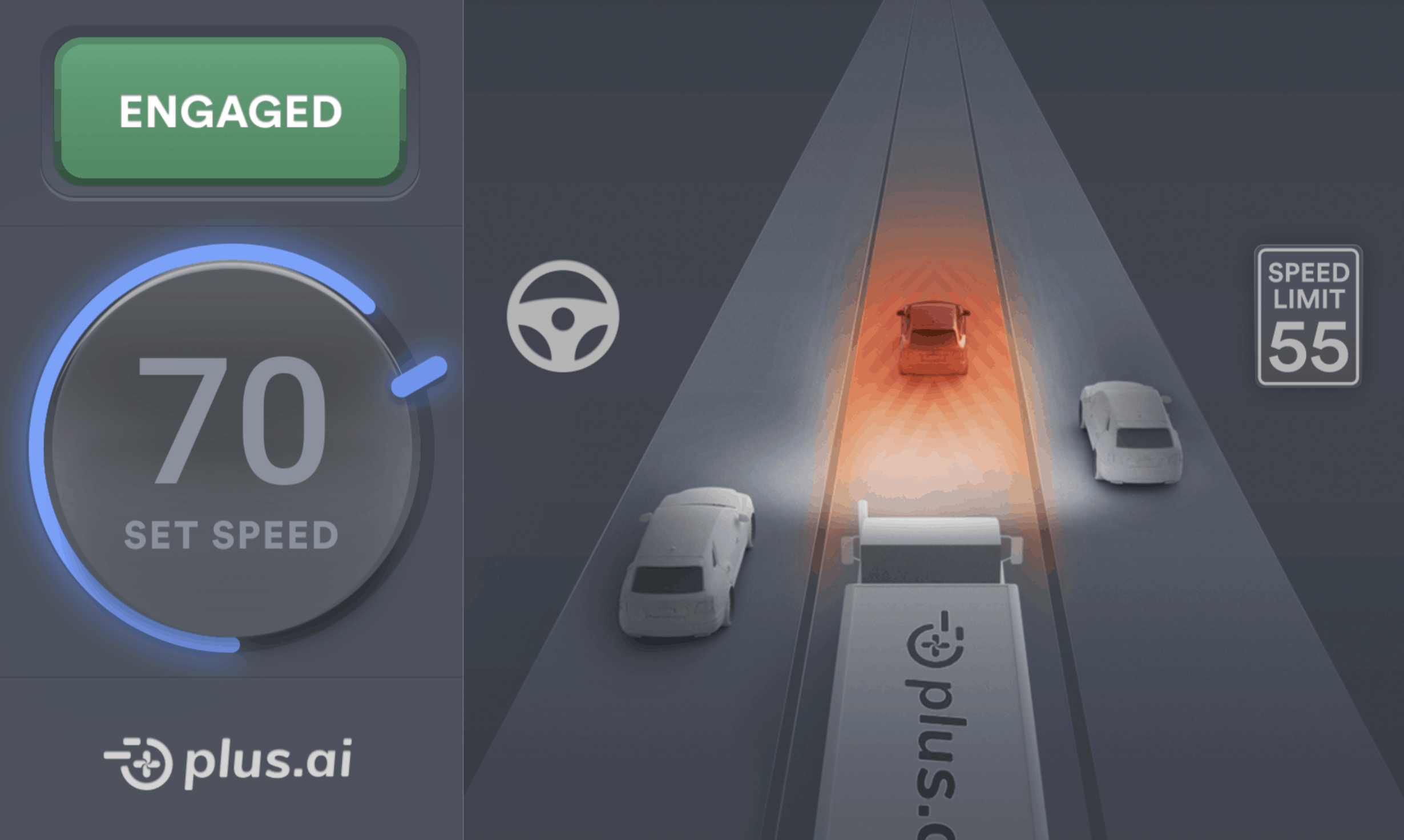
One of our favorite examples of dark mode was done by our team for one of our clients. The goal was to design a non-distracting interface for a self-driving vehicle.
Whether it affects sleep or not, dark mode can help your users extend their devices’ battery life and save your company a lot of money in kilowatts a year.
Color harmony in dashboard design principles is a property that describes the aesthetically-pleasing characteristics of specific color combinations.
Color harmony has been linked to better information processing and lower cognitive load, which are highly desired characteristics in digital products but more so in dashboard web design.
According to this study, the proper use of color increases attention, which stimulates memory consolidation
“Colour helps us in memorizing certain information by increasing our attentional level. The role played by Colour in enhancing our attention level is undisputable. The more attention focused on certain stimuli, the more chances of the stimuli to be transferred to a more permanent memory storage” [sic]
Moreover, consistent colors help users familiarize themselves with an interface more quickly. They can easily associate certain colors with specific tasks or bits of information such as tags or icons.
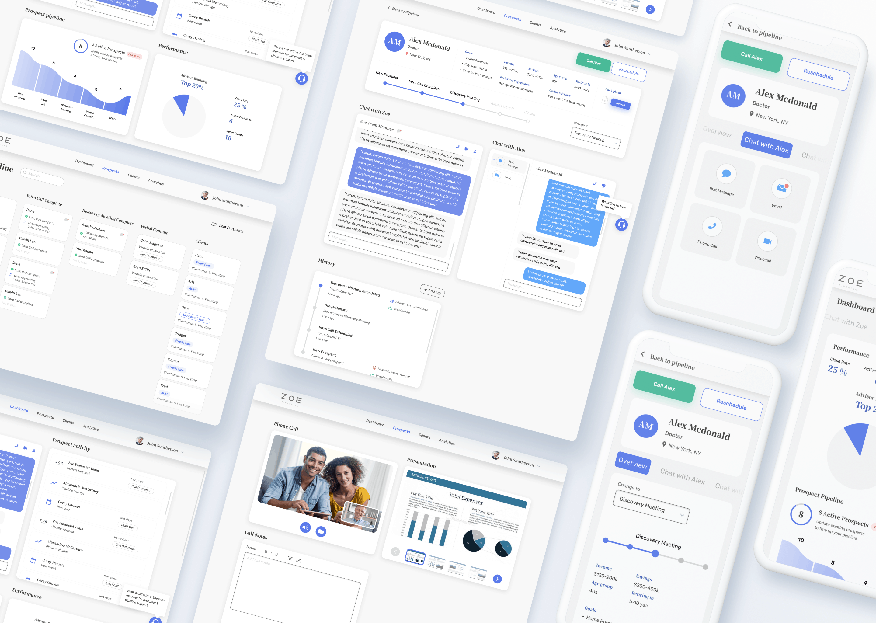
A great example of color harmony in dashboard design is the work we did for Zoe Financial. Their color palette combines different blue and steel gray hues to create depth while exalting the brand’s trust, reliability, and sophistication values.
Finally, the color scheme provides a way for users to recognize the product as part of the larger entity that is your brand. It allows them to see the product as part of their experience with your company, which should be a very positive one if you’re doing things right.
If you would like to learn more about our work with Zoe Financial or need help redesigning your Dashboard, schedule a call with our team.
Consistent brand experience and learnability are desirable factors in all digital products because they improve the user experience, which lowers the likelihood of churn and makes your overall product better.
While there are other factors that determine your product’s success, these are the main dashboard design trends that you should keep an eye out for to boost your product’s retention, increasing the effectiveness of your marketing and sales efforts.
The Best Dashboard Examples of 2021
5 Dashboard Design Principles Top Designers Use
3 Dashboard Ideas to Make your Business Smarter
SaaS Dashboard UX: Trends, Guidelines & Fundamentals
Corporate Web Design 2021: Everything You Need to Know About Your Next Website Redesign

A dashboard is often the primary interface through which users interact with your product every day. When it is cluttered, confusing, or visually inconsistent, users struggle to process information and make decisions. That frustration leads to support tickets, disengagement, and ultimately churn. A well-designed dashboard reduces cognitive load and makes users feel confident and in control, which keeps them coming back.
Animation guides attention, communicates state changes, and makes data easier to interpret. Because the human brain is naturally wired to respond to movement, animated transitions feel more intuitive than static jumps between states. Research has shown that animated graphics also improve learning and information retention compared to static images, which directly benefits users who rely on dashboards to make data-driven decisions.
Dark mode offers genuine functional advantages beyond aesthetics. On OLED displays, which are increasingly common in mobile devices, it can reduce energy consumption by up to 63% compared to traditional white interfaces. It may also reduce eye strain during nighttime use and help preserve battery life, making it a practical choice for both users and the businesses serving them.
Color harmony refers to the use of color combinations that are visually pleasing and cognitively supportive. In dashboard design, harmonious color palettes reduce mental effort, improve attention, and help users quickly associate colors with specific types of information, such as tags, alerts, or categories. Consistent color use also reinforces brand identity and helps users feel more familiar and comfortable with the interface over time.
When users cannot easily understand the data or navigate the interface, they turn to support channels for help. This creates a volume of avoidable tickets that costs time and money to resolve. Investing in clearer dashboard design, through better visual hierarchy, animation, and color, reduces confusion at the source and lowers the support burden significantly.