
Reading Time:
11 minutes
Category:
Dashboard Design
Learn the different types of dashboard design and explore the best dashboard examples for creating cleaner interfaces, better UX, and smarter data-driven decisions.

Learn the different types of dashboard design and explore the best dashboard examples for creating cleaner interfaces, better UX, and smarter data-driven decisions.

Learn about which dashboard design is best for you, and check out the best dashboard design examples of 2026. Brought to you by WANDR, ranked the #1 UX agency in Los Angeles.
At WANDR, we work with clients to build both internal dashboards and client-facing dashboards. While we cannot post our client work (due to NDAs), we’d love to share with you an overview of the types of dashboards and some examples for your understanding. If you have any questions about which dashboard is right for you, give us a call!
Reviewing dashboard examples allows us a chance to share with you what it takes to create a successful user experience (UX).
The design of the dashboard directly impacts the overall UX of any website or application.
Think of the dashboard as a homepage for your information. It often gives users a global overview of important data, controls, and functions.
The top dashboard design examples contain these common features:
Without these elements, users struggle to find relevant information. This limits the effectiveness of your data. The design should include a clean layout — directing the eyes to key information.
The type of information we choose to display is also important. The dashboard should include the most relevant data or controls without the need to navigate the application to find important updates.
Some of the best dashboard designs also include customization or personalization. These give the user the option to customize the layout or design. Not only does this increase usability, but also engagement.
With this in mind, check out some of the top dashboard design examples from 2022. Learn how these tools create a better user experience and better business decisions.
Dashboard examples come in a variety of styles. Each delivers a summary.
The 4 standard subtypes of dashboard design examples include:
Choose the type of dashboard based on:
Each dashboard has a unique interface, layout, and key performance indicators (KPIs).
Operational dashboards help track business operations. These are mostly used by supervisors or junior managers to monitor the performance of different departments.
Common operational dashboard examples include:
Operational dashboard design examples measure performance at a lower level compared to other dashboards. The information included is typically intended for a specific department.
Dundas Data Visualization offers a great example of an operational dashboard for IT operations. The layout is simple and includes essential data for IT monitoring, such as outstanding requests and the overall number of requests.
Operational dashboard examples often track data in real time. Additionally, an operational dashboard should provide an overview of key metrics to allow for more time-efficient decision-making.
One aspect that sets operational dashboards apart from other types of dashboards is that the data included on the screen depends on the department and industry. For example, a manufacturing operational dashboard may track the number of products manufactured and the number of returns or defects.
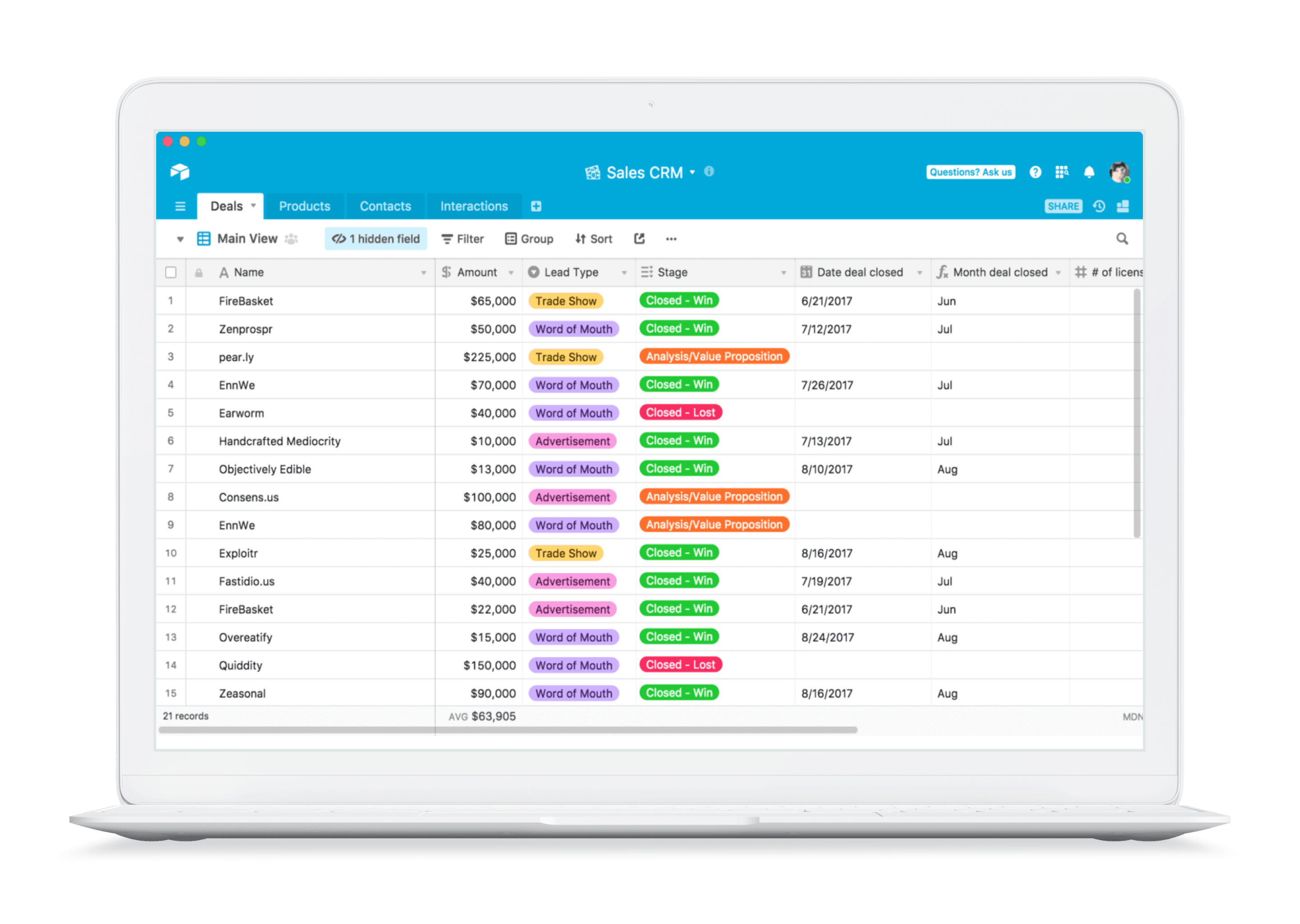
An example of a sales CRM operational dashboard is one of our clients, Tribyl. This dashboard allows sales reps to track + manage their accounts more productively in real-time while slashing ramp times.

Even though it is not your typical operational dashboard, Tribyl falls into the operational dashboards category. Also, it is designed to make every conversation count between reps and prospects through the following tools:
Strategic dashboards give users a higher-level view of business operations. Instead of focusing on a specific department, these dashboard examples focus on KPIs that impact the entire organization.
These include:
These metrics help senior managers develop more effective strategies. The information included on the dashboard may not require real-time updates. These dashboard design examples may feature hourly or daily updates. They provide a birds-eye view of the performance of the organization.
A strategic dashboard also gives upper management a quick overview of organization-wide goals and strategies.
To design the best dashboard for this category, we only include the most relevant KPIs. The dashboard needs to provide anyone within the company with a quick and concise summary that tracks performance against specific goals.
One of our own, Zoe Financial, breaks down the elements needed for the best strategic dashboard. Best practices include linking metrics to business objectives and adding insights to the overview.
Zoe Financial – Advisor Dashboard provides pipeline analytics, prospect activity, personal performance metrics, and chat support.
Zoe Financial is an advisor/prospect matching platform. Advisors benefit from a cutting-edge yet simple dashboard that highlights the 4 points needed to ensure the best match.
While strategic dashboards offer a broad overview of an organization, analytical dashboards focus on specific areas within a department. This offers more details for specific activities, such as marketing spend.
Analytical dashboards may compare metrics or measure the performance of individual actions. This may include analytics for an individual marketing campaign or an overview of the performance of your website.
The best dashboard UX for analytical review provides insight into specific questions that your target users need to answer. For example, a website analytical dashboard typically answers the following questions:
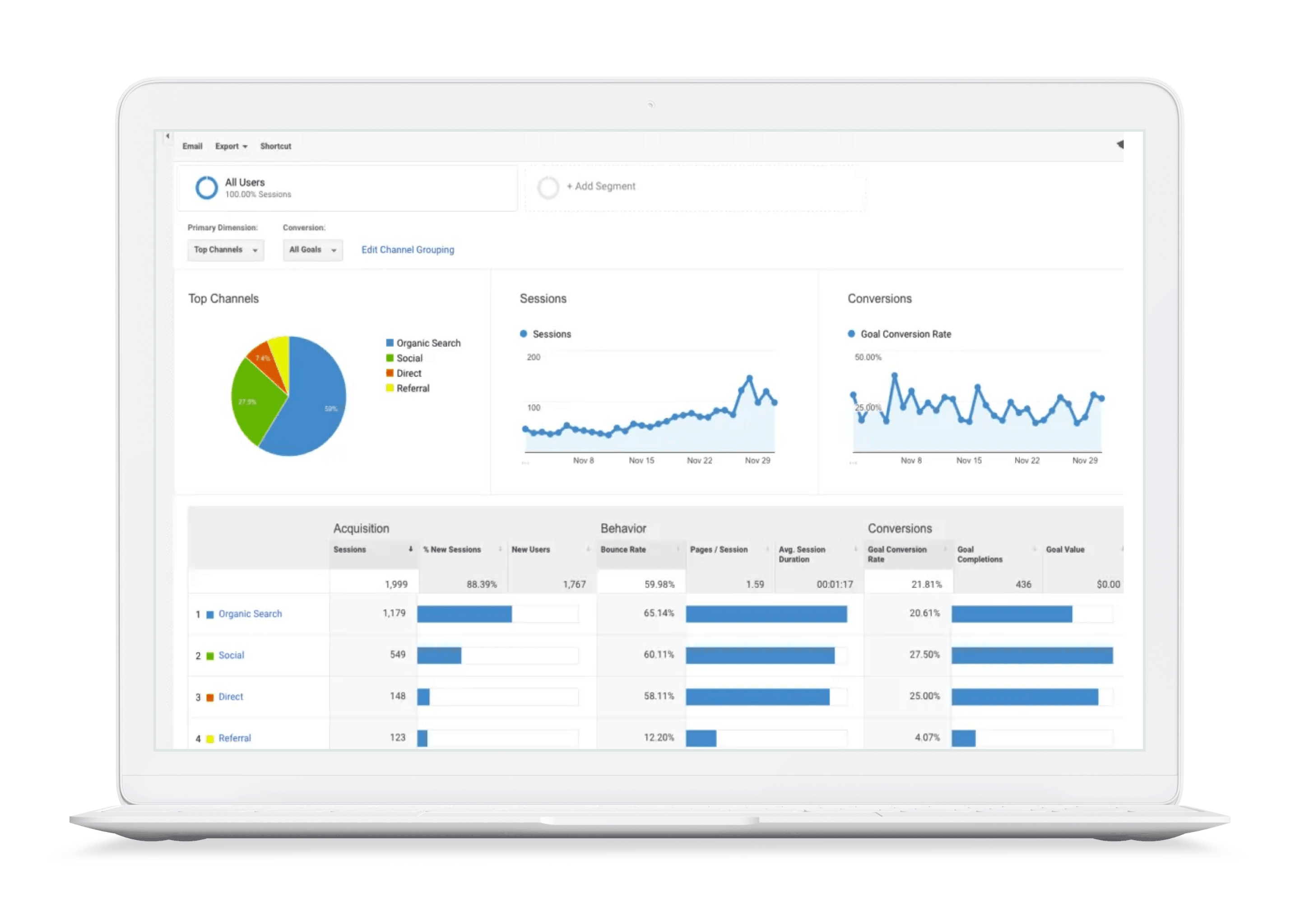
Google Analytics is the most well-known example of an analytics dashboard. It gives you a quick snapshot of the performance of your website. It allows you to drill down deeper for more insight.
A tactical dashboard includes many of the same features found in the analytical dashboard. Both dashboards track analytics for specific activities. However, tactical dashboards typically offer a higher-level view of activities.
For instance, instead of looking at the number of visitors to a website, a tactical dashboard may evaluate the efforts taken to increase visitors. This requires marketing and advertising campaign KPIs.
It is important to note that tactical dashboard design examples may also combine elements of the operational and strategic dashboards with a focus on a specific project or area of an organization.
One example of a tactical dashboard is an IT project management dashboard. Additionally, this dashboard may include a variety of data related to the project, such as:
The best dashboard for tactical analysis includes various metrics to help managers and supervisors maintain an efficient workflow, such as Airtable.
Airtable is a project-management tool our team uses, which is a prime example of a web-based tactical dashboard. It includes an executive summary of key metrics from multiple departments, giving managers an overview of key processes.
Ultimately, the design of your dashboard can make or break your business. If users or team members cannot access the information they need immediately, they may not enjoy the application or website.
Not only does designing the best dashboard provide your users with a better experience, but also with the opportunity to make intelligent decisions based on data.
In order to design a dashboard that provides a better user experience and makes intelligent decisions based on data, incorporating DesignOps principles can help streamline the design process and ensure that your team is working efficiently towards a common goal.
What are your internal business goals? What are the needs of your users? Answering these questions allows you to choose the right metrics for your dashboard.
After selecting metrics, we group the information into separate compartments. For example, sales metrics and marketing metrics may require separate sections on a strategic dashboard.
Along with the dashboard design examples discussed, some dashboards may use a hybrid design. These contain elements from multiple dashboard categories. Above all, in order to build the best dashboard for your project, focus on the needs of your users.
Leave us a comment below or on social media.
Product goals? Let’s make it happen. Book a free consultation call with our team.
Talk to us on LinkedIn, Instagram, Facebook, or Twitter.

Dashboard design is the process of organizing and presenting data, metrics, and controls in a clear and user-friendly interface to help users make informed decisions quickly.
A good dashboard includes clean layouts, easy navigation, immediate access to key data, intuitive visualizations, and personalization options.
An operational dashboard tracks real-time business activities and performance metrics, helping teams monitor day-to-day operations efficiently.
An analytical dashboard focuses on detailed data analysis, trends, and performance insights for specific campaigns, products, or activities.
Strong UX ensures users can quickly understand data, navigate efficiently, and make decisions without confusion or unnecessary friction.