Streamlining Dashboard UX: Actionable Tips
Learn how to reduce cognitive load and highlight key functions in your dashboard. Improve user experience now!
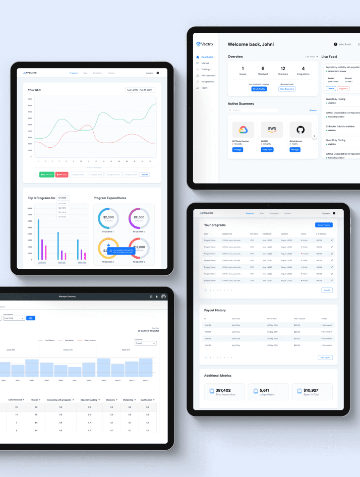
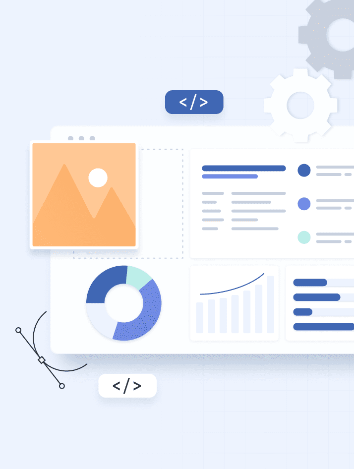
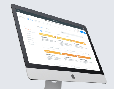
When these dashboard ideas are brought to life, you are left with a dashboard with quick and easy access to the insights a company can use to make smart, data-driven decisions.
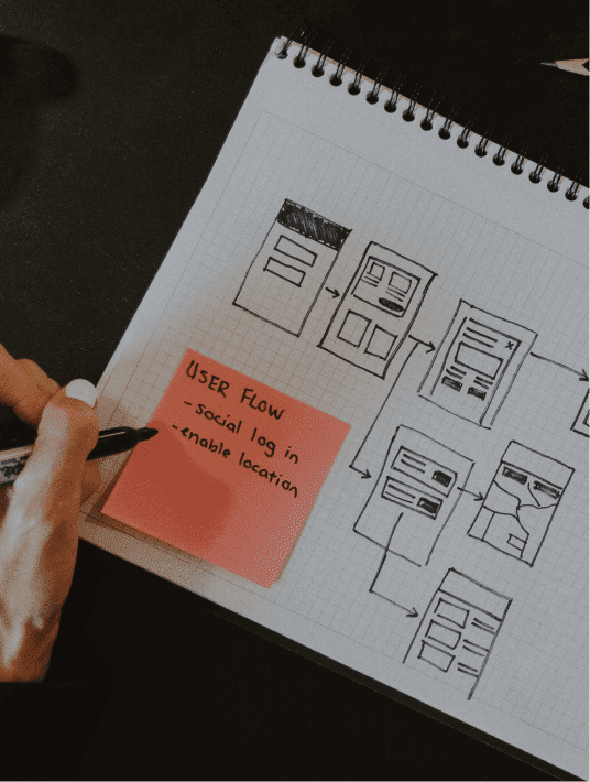
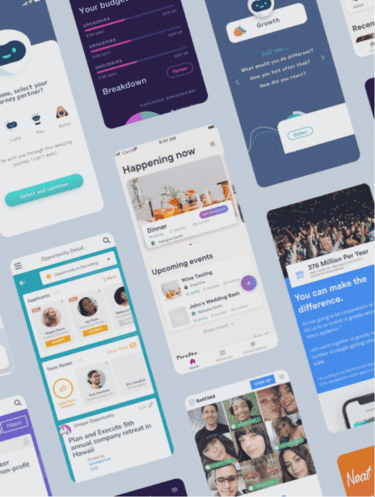
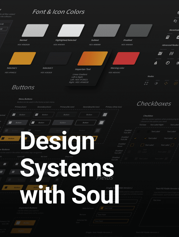
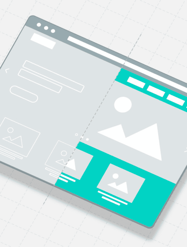
Dashboards are an essential part of CRMs and SaaS products. They allow people to analyze and quickly make sense of the data generated by the organization. However, a lot of them are poorly designed which drastically reduces the value they bring to your business. There are a few dashboard ideas I want to share here to make sure you are designing the best dashboard possible.
Good user experience is not only for consumer applications, but it can also have a major positive impact on the effectiveness of your employees and the way they interact with data. Cluttered, and convoluted dashboards can actually make it really hard for people to understand and slow down the decision-making process.
At WANDR, we have been improving the user experience of SaaS products for many years and we have come up with three simple but effective ways to make sure your product’s dashboard is easy to understand and work with.
Without further ado, here are some actionable tips on how to improve the user experience of your dashboards to help your team make smarter business decisions with their data.
Reducing Cognitive Load
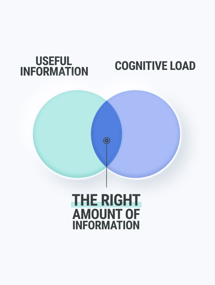
Great design finds solutions amidst multiple constraints. One of the most important constraints in Human-Computer Interaction design is the amount of information a person can keep in their short-term memory at any given time.
This information load is referred to as the cognitive load.
Research suggests that most people can hold between 5 and 9 pieces of information in their head before they start forgetting details and getting frustrated.
A great way to improve the value that your dashboard brings to your business is to reduce the cognitive load it poses to your employees.
Below are the 3 main ways to reduce cognitive load.
1. Remove the Non-Essential
A lot of the interfaces we redesign feature trivial information at all times. This information doesn’t add any value and adds to the cognitive load of the user. When our clients justify that “this is important information,” we remind them that when everything is important, nothing is important.
“Simplicity is a bliss that makes one comprehend.”
― Criss Jami, Killosophy
2. Progressive Disclosure
Our brains are geared for energy conservation, that is, they are lazy. You can hide non-essential information behind buttons, menus, pages, and windows that will display more content upon interaction. The progressive disclosure of the information is one of the most effective ways to reduce cognitive load and clean up an interface. Be careful however not to overdo it by hiding important elements as that would be counterproductive and have a negative impact on the experience.
3. Chunking
If you can’t hide everything, then at least try to create groups of related elements. This is a technique called chunking. It is the reason why restaurant menus are divided into categories like pasta, poultry, salads, dessert, and so on.
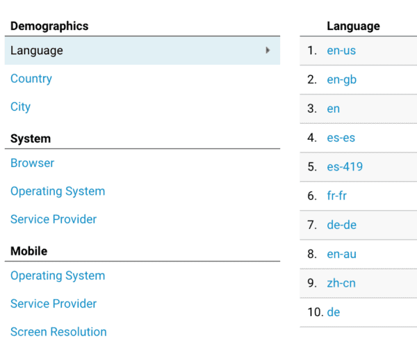
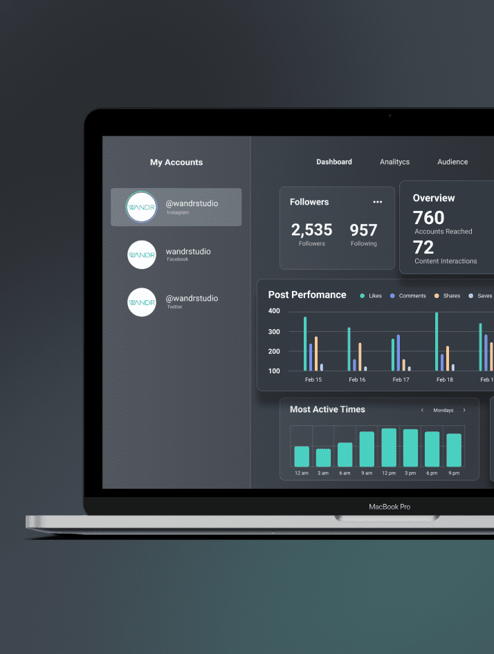
In Google Analytics, the designers group user data by categories (demographics, system, and mobile) and sub-categories (language, country, and city).
“Perfection is achieved when there is nothing left to take away.”
– Antoine de Saint-Exupéry
Highlight Frequent Functions
All user interfaces obey what’s called Pareto’s Distribution.
Vilfredo Federico Damaso was an Italian-French economist and engineer who noticed that in any given distribution, a small number of causes produce the large majority of outcomes.
How does the Pareto Distribution apply to design? There is a small number of features and functions that are used by most of your users most of the time. These key features are commonly referred to as red routes.
When applied to design, these red routes are the critical and frequent paths that users take to complete their tasks. – Justin Baker, Design Lead at Atlassian
By making sure the red routes in your product are easy to find and interact with, the perceived overall user experience of your dashboard will increase exponentially.
Negative Space is Your Friend
One of the most important dashboard ideas is utilizing negative space and letting your design breathe. Truly, I cannot overstate the importance of negative space. Negative space or white space is the white area that’s in-between elements and page margins.
Our visual perception works by processing contrast. You can test this by opening a picture in any photo editing app and drastically reducing the contrast value. At the most extreme values, you’ll notice that the picture becomes harder to see.
Negative space creates contrast around elements which helps our eyes see it better. It tells our eyes where to look.
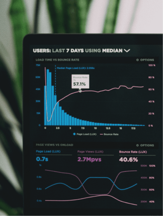
Unfortunately, a lot of business intelligence and analytics dashboards have very little negative space which, combined with an excessive cognitive load, produces a negative user experience.
Oftentimes, our clients ask us to ‘reduce real estate’ in order to cram more information that their users will be able to see above the fold, or in a specific section. The problem with that is they won’t really see everything anyway because their working memory is already saturated with information. Remember, most people can only keep on average, five to nine elements in their heads simultaneously.
When negative space is properly utilized, it makes things look better. Both by cleaning up the visuals and giving dashboards a sense of clarity, negative space helps highlight key data beautifully.
Final Thoughts on Dashboard Ideas
Your SaaS business can get a lot of value from the way data is presented. Hopefully, these 3 ideas will help you improve the user experience of your dashboards so that your team can start making smarter decisions.
Further Reading
- Medium.com: Red Routes — Critical Design Paths That Make or Break Your App
- UXdesign.cc: User experience and cognitive load: when less is more
- Wikipedia: Pareto distribution
What Are Your Favorite Dashboard Ideas?
Let us know by leaving a comment below.