articles
Most Common UX Design Mistakes Made by SaaS Companies

Businesses worldwide leverage SaaS products in their everyday operations, especially with the rise of the remote work culture. From sales to accounting, SaaS platforms make it easier for companies to streamline their systems and processes.
However, most SaaS businesses don’t prioritize user experience as much as they should while designing their product. This is the primary reason some SaaS products dominate the market, while most of them fade into the background.
With the competition in the SaaS industry, companies need to invest even more time and energy into their UI/UX research to ensure that their product checks off all the right boxes.
Simply concentrating all of your efforts on creating and promoting your product won’t guarantee its success. In fact, it can cause you to lose sight of what is important - your users.
In this blog, we’ll discuss the most common UX design mistakes that SaaS companies make and how to avoid them while developing your product.
What are the most common UX design mistakes you should avoid?
1. Designing for yourself
When you’re creating a new SaaS product, it’s extremely easy to get swept up in the creative process. Designers have a tendency to design products based on their past experiences, especially during the early stages.
Designing products based on past experiences and personal opinions is one of the most common UX design mistakes teams make.
UX designers need to prioritize their user’s preferences and concrete data over their own opinions if they want to build products with the potential to succeed in the market. Conducting thorough UX research at the early stages of product design and development is crucial for businesses to ensure their efforts are being directed toward the right people.
Furthermore, user needs and expectations change with time. Therefore, conducting UX research throughout the design and development stages is vital to ensure you’re optimizing your product based on these changes.
There are several ways to gather information on your target audience and identify different aspects that can help you design your product with the target audience as the center of the focus.
1) Qualitative and Quantitative Research
In UX, managers usually utilize qualitative research to gather observations about users, products, and services. Conducting interviews and field studies are some of the most common qualitative research methods. Product managers can identify problems with user experience, determine the causes of a problem, or uncover solutions using qualitative UX research.
Quantitative UX research allows project managers to understand user behavior on a larger scale. Managers use quantitative research methodologies to gather numerical insights, also known as UX metrics. Analytics, A/B testing, and surveys are popular quantitative UX research methodologies that businesses use to get these numbers.
While qualitative research helps uncover problems, quantitative analysis allows design and development teams to determine the scale of the problem. What section of your audience is affected by a specific issue?
Qualitative UX research is excellent for businesses that want to compare different features or solutions before deciding on the one that resonates the most with their audience.
2) Run usability tests
Your product wouldn’t be complete unless you conduct usability testing in real time. During a user testing session, the participant is asked to perform different tasks using specific features of the products. This allows designers to observe the participants’ behavior and incorporate the feedback they share while optimizing the product.
Usability testing helps product managers identify troublesome aspects within the design — Where do they get stuck? Are there areas that are particularly confusing?
It also helps uncover fantastic design opportunities by assisting designers in understanding the current issues in-depth and allowing them to find the best solutions.
3) Conduct in-app surveys
In-app surveys are powerful tools to collect feedback directly from your end-users for user-driven development. Based on the feature or part of the product the user is engaging with, you can trigger on-demand surveys to obtain highly targeted data in real time.
2. Market-centric approach
Market research is an essential component of the research process to ensure that there is actually a market for your product. However, people often club market research and user experience research together, typically at the expense of proper user intelligence.
Here’s the thing.
Business leaders and major stakeholders define the product vision and strategy, create a road map, and set the scope of the project. However, they may fail to understand that market research doesn’t answer all the questions, which is one of the major UX design mistakes.
People frequently confuse market research and UX research because they have many similarities, such as similar methodologies, the need to understand the user or consumer, and the fact that both are vital to the design process.
However, they are fundamentally different, even though they do have a few factors that overlap.
Market research usually stems from the consumer landscape and empowers leaders with information about business KPIs like branding, marketing, and sales.
On the other hand, UX research focuses on improving the organization’s bottom line by gaining an in-depth understanding of the target audience’s needs and requirements.

Even with the overlap, the results for these common elements would be different depending on the type of research. For example, the competitor analysis done by designers would be completely different from sales managers.
Therefore, it’s not a good practice to rely heavily on a market-centric approach during the design and development phase of your SaaS product.
3. Lack of user onboarding
Overlooking user onboarding altogether is one of the most common UX design mistakes businesses make. A majority of users judge a SaaS product on the very first impression.
When someone starts engaging with your product, you have minutes to convince them that you have something of genuine value to offer to them. Therefore, it’s crucial to have an interactive UI/UX design to ensure that users don’t immediately turn back to look for another alternative.
Building an interactive onboarding experience goes a long way to ensure users stick around and give your product a chance. Crafting a simple and detailed onboarding video explaining the different features helps create a pleasing experience.
Here are the top UX design mistakes when it comes to onboarding:
- Wrong focus. Business owners usually focus on product aspects they want to share with the users rather than what their users need and expect from them.
- Too much information. Sure, you may argue that your product or niche is complicated; however, that’s no excuse to expect your users to read a 7-page manual. Even if you disguise it with pretty illustrations and animations, the bottom line is to avoid bombarding the users with too much information right off the bat.
- Including screenshots within the app. This is one of the most common UX design mistakes where SaaS products include screenshots of the dashboard inside the software. When you have your user inside your interactive system that is up and running, why wouldn’t you take advantage of it and have them move through your user dashboard?
- Annoying pop-ups. Product managers may believe it is smart to request feedback when the user is actively engaging with the product. Sometimes, they make the interactive onboarding experience extensive by explaining the smallest aspects, like how the user can save a document. However, all this does is divert the users’ focus away from the app. Project managers should instead rely on common sense and past experience to determine what they need to include within the onboarding process.
There is only so much that a sleek and elegant user interface can do. You need to build a proper onboarding strategy to reduce friction and help your users master the skill of using your product.
4. Hopping on every design trend
UX design trends come and go every single day. Just when you may feel like you’ve got it down to a T, there are brand new UX design trends dominating the market, making you rethink your strategies.
However, it’s critical for product managers and business leaders to realize that it’s impossible to implement all the latest design trends.
Designers worth their salt follow UX design trends to gain inspiration and put their own spin on it. It’s essential to leverage trends relevant to your business to ensure you don’t seem outdated to your users, who are constantly being exposed to the same trends on all their favorite platforms.
Rushing to implement every new design trend is a major UX design mistake that costs businesses a personalized user experience. Therefore, it’s essential to focus on providing a better user experience to your target audience to succeed in the market.
5. Too many features
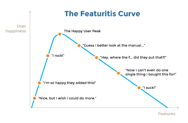
More often than not, SaaS businesses overdo it with features right off the bat. Sure, you may want your software application to cover a range of functionalities; however, incorporating too many features simply overwhelms the user and takes away from the core purpose of the SaaS platform.
The core purpose of your software application is the reason why it has become popular with people. During the beginning stages, it’s critical to focus on that core purpose and build your software around it.
There is nothing wrong with incorporating a lot of features as long as you do a good job of balancing quality with quantity.
Instead of bombarding users with a tonne of high-end features they may not be able to remember, you should gradually introduce new features into your product as they become accustomed to the interface.
That being said, even gradually introducing new (and often confusing) features may lead to “feature creep.” This will only serve to confuse your users and unnecessarily complicate your SaaS product.

6. Prioritizing new customers
Every firm, SaaS included, strives to gain more customers. However, one of the major UX design mistakes is doing everything to convert new customers but not doing enough to retain them.
While you need to develop features and do your best to attract new customers, many businesses don’t offer quality customer service once they sign up.
This is a sure-shot way to ruin your brand reputation and, worst of it all, customer loyalty. Therefore, while it’s crucial to establish new user relationships, it’s equally important to maintain those ties by providing a top-notch user experience.
Final Thoughts
User experience plays a vital role in the success or failure of any SaaS product. Businesses must focus on designing intuitive and seamless experiences for their users to attract and retain them.
While there is no universal way to approach SaaS UX design, you should keep these six UX design mistakes in mind while designing your product.
If you’d like help building your SaaS product or optimizing your existing one, you can book a free consultation with our experts today!


