
The best SaaS websites share one characteristic that has nothing to do with visual design: they were built around how buyers make decisions, not around how the company wants to present itself. The SaaS websites that consistently convert understand that a visitor's first question is never "does this look good" but rather "does this solve my problem "does this solve my problem, have they solved it for companies like mine, and can I trust them with this decision." This post covers what the best SaaS websites do differently, with specific examples of what makes them work and what your website can take from each.
Why Most SaaS Websites Look Great and Convert Poorly
The gap between visual quality and conversion performance is wider in SaaS than in almost any other category. Most SaaS companies invest significantly in visual design and end up with websites that look credible but underperform on the metrics that matter: demo requests, trial signups, lead quality, and sales cycle length.
The reason is consistent. SaaS website design has been professionalized to the point where the visual baseline is high across the category. Clean typography, strong hero imagery, and confident color systems are now table stakes. They no longer differentiate. What differentiates a SaaS website in a crowded market is how well it answers the specific questions a skeptical buyer is asking in the first thirty seconds of their first visit.
Those questions are the same regardless of whether the buyer is a VP of Marketing at a mid-market company or a founder evaluating tools for their first hire: does this work for companies like mine, have other people I would trust used it, and is the value clear enough that I can justify the time it will take to evaluate it properly?
The best SaaS websites answer all three questions above the fold. The ones that look good but underperform answer them somewhere between the third scroll and the case studies page.
What the Best SaaS Websites Have in Common
They lead with a specific outcome, not a category claim
The SaaS websites that convert best do not open with category positioning. They open with a specific, measurable outcome that a specific type of buyer cares about.
"Reduce onboarding time by 40%" is a specific outcome. "The modern platform for learning management" is a category claim. The former gives a buyer a reason to read the next sentence. The latter requires the buyer to do interpretive work before they know whether the product is relevant to them.
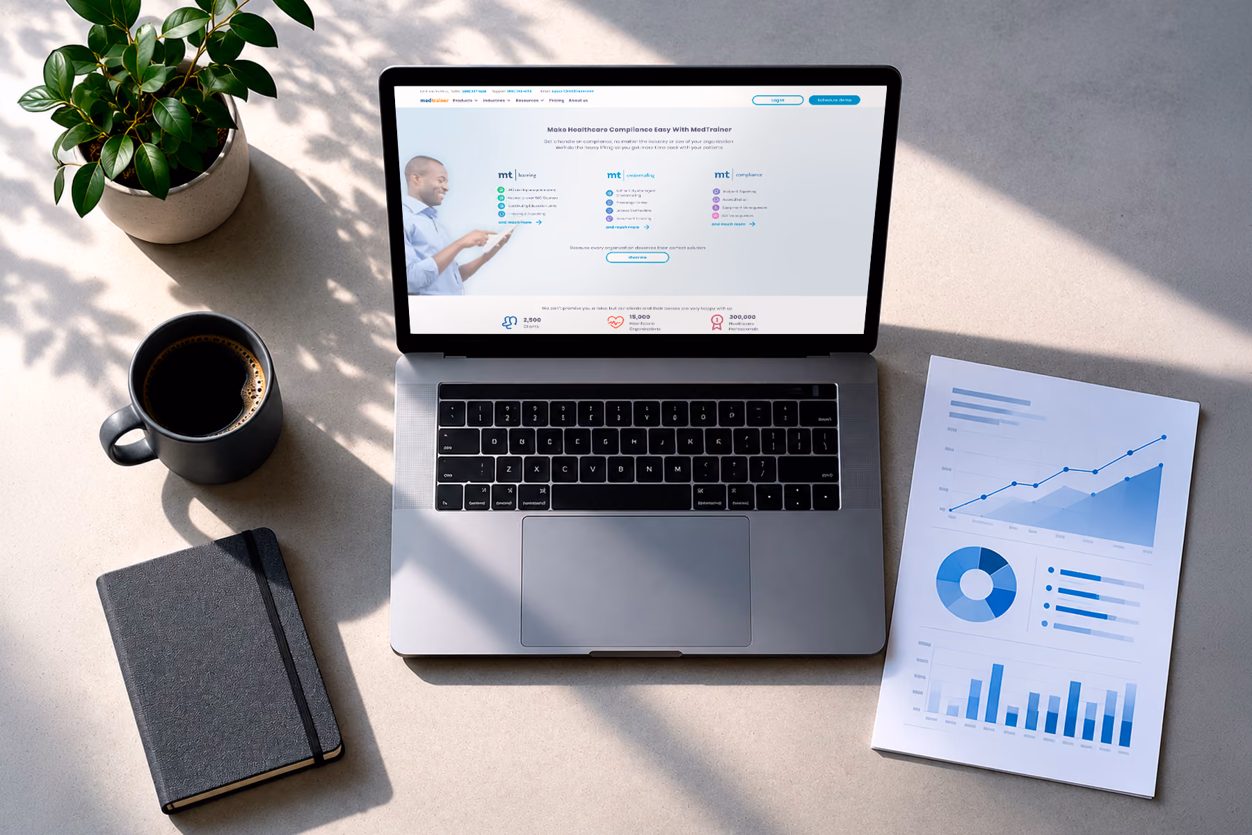
MedTrainer, one of Wandr's healthcare technology clients, had exactly this challenge. Their platform was genuinely capable across multiple use cases, but the website was leading with platform breadth rather than specific outcomes for specific buyers. The redesign restructured the hero around the outcome that mattered most to their primary buyer, compliance training completion rates, and demo requests improved by 23% within the first month.
Specificity is uncomfortable for SaaS companies because it feels like narrowing. Every founder wants to believe their product serves everyone. But specificity in the hero is not a narrowing of the product, it is a clarification of the primary buyer signal, and it is what separates websites that generate qualified pipeline from websites that generate traffic.
They surface social proof before asking for anything

The best SaaS websites treat social proof as structural architecture, not as a decorative element.
The difference is placement and specificity. A logo strip of recognizable clients above the fold answers the trust question immediately. A quote from a named buyer at a named company, placed next to the primary CTA, answers the credibility question at the exact moment a visitor is deciding whether to take the next step.
Most SaaS websites place social proof below the fold, in a dedicated testimonials section, after the product features have been explained. By the time a skeptical buyer reaches that section, they have already decided whether they are interested. Social proof placed after the decision has been made is not social proof, it is confirmation bias material for people who were already convinced.
Zoe Financial, Wandr's fintech client, operates in a category where trust is the primary conversion driver. Financial advisory marketplace buyers are evaluating whether to trust a platform with decisions that affect their wealth. Moving trust signals, advisor credentials, client outcomes, platform security indicators, to the top of the information hierarchy rather than the bottom produced a 37% increase in conversion after redesign.
They make the next step feel low-risk
The conversion flow on a SaaS website is where most of the conversion work gets undone. A visitor who has decided they are interested reads "Schedule a Demo" and mentally rehearsals the forty-five minute call with a salesperson before clicking away.

The best SaaS websites reframe the next step as a low-risk exploration rather than a high-commitment engagement. "See it in 15 minutes," "Get a personalized walkthrough," or "Try it with your own data" all accomplish the same conversion goal while reducing the perceived cost of taking the next step.
The specific language matters less than the underlying principle: make the primary CTA describe what the visitor gets, not what they have to give.
They segment content without building separate sites
SaaS products serve multiple buyer personas with different information needs. The best SaaS websites handle this through clear navigation and content architecture that allows self-selection rather than through a single generic page that tries to speak to everyone simultaneously.

Field Agent, Wandr's retail intelligence client, served both enterprise brand managers and small business operators, two audiences with radically different information needs and different thresholds for the evidence required before taking action. The website architecture created distinct pathways for each audience while maintaining a coherent brand experience. Visitors self-selected into the path relevant to them rather than encountering content that felt relevant to someone else.
The SaaS Website Elements That Matter Most to Conversion
The hero section is the most consequential real estate on any SaaS website. It determines whether a visitor reads the next section or closes the tab. The best SaaS hero sections lead with a specific outcome for a specific buyer, show the product in context rather than as an abstract illustration, and make the next step feel accessible rather than committal.
The social proof layer should appear multiple times throughout the page, not in a single designated section. Client logos near the top of the page answer the credibility question early. Specific quotes with metrics placed near CTAs answer the credibility question at the conversion moment. Case study previews with outcome data answer the credibility question for buyers who need more evidence before taking action.
The product explanation section is where most SaaS websites talk about themselves too much. The best versions frame every feature in terms of the outcome it produces for the buyer. Not "automated reporting" but "eliminate the three hours your team spends manually compiling monthly reports." The buyer does not care about the feature, they care about what the feature changes about their day.
The pricing section is increasingly important for SaaS conversion even when the goal is a demo rather than a self-serve signup. Buyers who cannot find any pricing signal on a SaaS website often assume the product is more expensive than they can justify evaluating without permission from finance. A pricing philosophy, a starting point, or a clear statement of what the pricing conversation will involve at the demo stage reduces this friction significantly.
The footer and secondary navigation are where motivated buyers go when the primary content has not answered their specific question. A well-organized footer with links to security documentation, compliance information, integration details, and customer stories serves the buyers who are deepest in the evaluation process and closest to a decision.
What Boring SaaS Websites Are Actually Doing Wrong
The consistent pattern in SaaS websites that look fine but convert poorly is that they were designed from the inside out. They reflect the company's understanding of its own product rather than the buyer's understanding of their own problem.
This shows up in specific ways. Feature-first organization that leads with what the product does before establishing that there is a problem worth solving. Generic positioning language that applies equally well to five competitors. Social proof that lists company names without explaining what outcomes those companies achieved. Conversion paths that feel like commitment before the visitor has been given enough to make a decision.
None of these are visual problems. They are architecture and content strategy problems that look like visual problems because they show up in the design. Fixing them requires starting with the buyer's mental model rather than the product's feature set.
Final Thoughts
The best SaaS websites in any given category are not the ones with the most impressive visual design. They are the ones where every decision, from the hero headline to the placement of social proof to the language of the CTA, was made with a specific buyer's decision-making process in mind.
That process is not secret. Buyers want to know whether the product solves their problem, whether other companies they would trust have used it successfully, and whether the next step is worth their time. SaaS websites that answer those questions efficiently, in the right order, and with enough specificity to feel credible convert at significantly higher rates than those that present the same information in a less deliberate sequence.
The visual design matters, but it matters because it signals product quality and company credibility. It does not convert on its own. The architecture and the content do the conversion work.
Build a SaaS Website That Actually Converts
Wandr has designed SaaS and B2B websites for MedTrainer, Zoe Financial, Field Agent, and many other companies where the gap between traffic and pipeline was a design and strategy problem. If your SaaS website looks good but is not generating the leads your product deserves, schedule a free consultation with our team and let us show you where the conversion is being lost.