MedTrainer
Our redesign turned MedTrainer's hard-to-grasp compliance platform into a site users understood in 5 seconds, and lifted inbound leads 23% in the first month.


Five interviews. Three product pillars. One system.
All-in-one compliance for thousands of healthcare organizations.

MedTrainer is an all-in-one healthcare compliance platform built around three pillars, Learning, Credentialing, and Compliance, that keep clinics, hospitals, and provider groups audit-ready. Founded in 2013, it serves 2,500+ clients, 15,000+ healthcare organizations, and 300,000+ professionals across North America.
The product was powerful, but its marketing site could not explain it. Strong organic traffic arrived and left without grasping what MedTrainer did, so demand that should have converted into demos slipped away instead.
A powerful platform its own site couldn't explain.
A desktop-first audience arrived through organic search in strong numbers, then dropped off almost entirely before reaching a demo.
A complex product, unclear value.
Three product lines, Learning, Credentialing, and Compliance, but the site never made the range legible. Visitors rarely saw the full offering or how it fit their organization.
Traffic that leaked away.
Behavior flow showed about 43,000 landing sessions and roughly 40,000 drop-offs, with little movement between pages. Strong organic interest was not converting into demos.
A confusing, dead-end experience.
Fullstory showed dead clicks on items users expected to be links, and low interconnectivity between pages left buyers stuck instead of exploring deeper.
Not built for how they buy.
Healthcare needs are highly specific, but the site spoke to everyone at once, so buyers could not see themselves, or the tools for their space, in it.
Same platform, rebuilt for the moment of understanding.
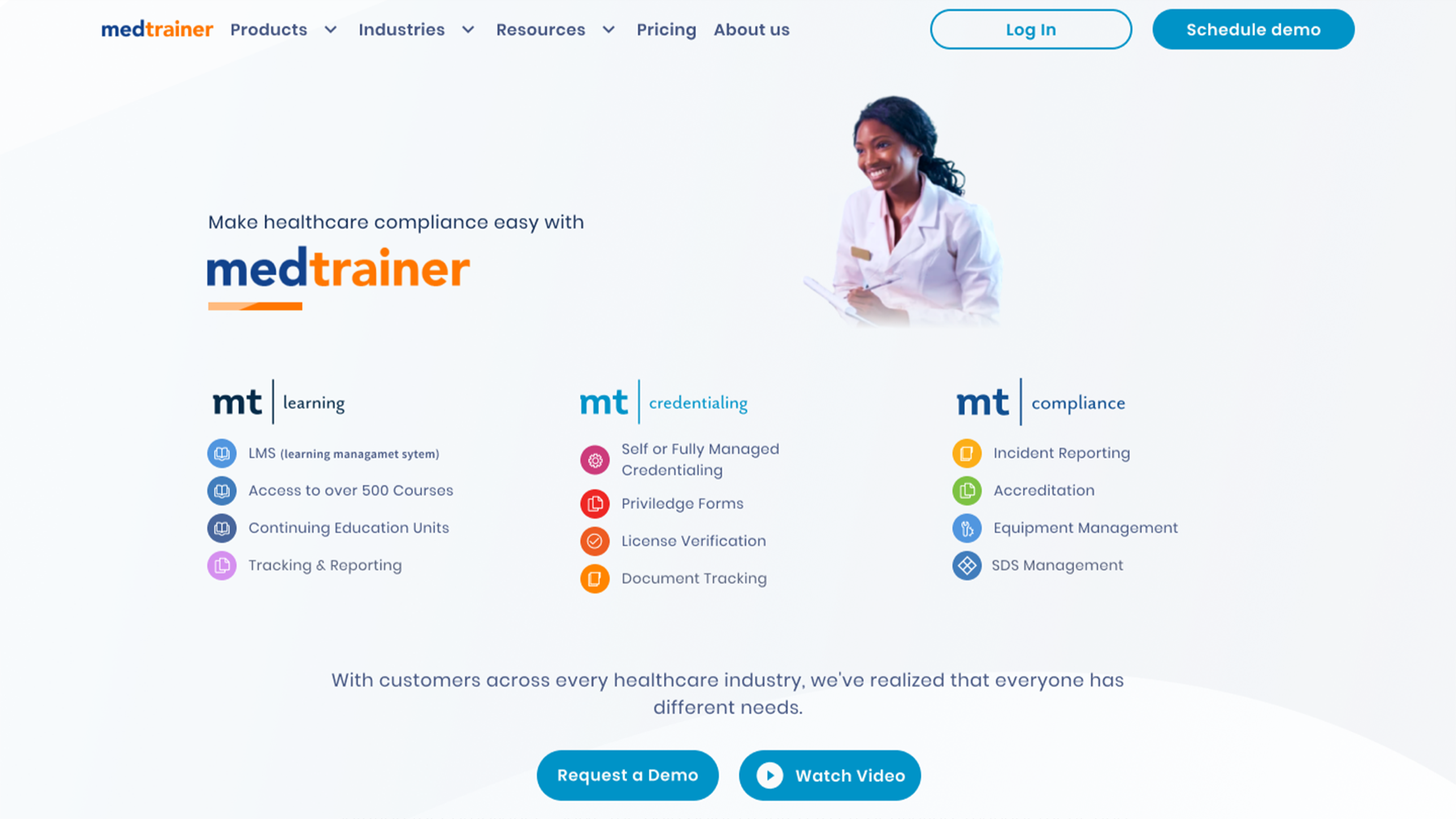
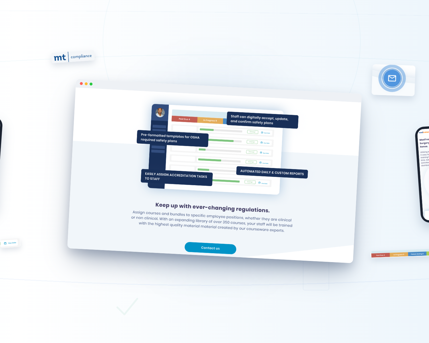
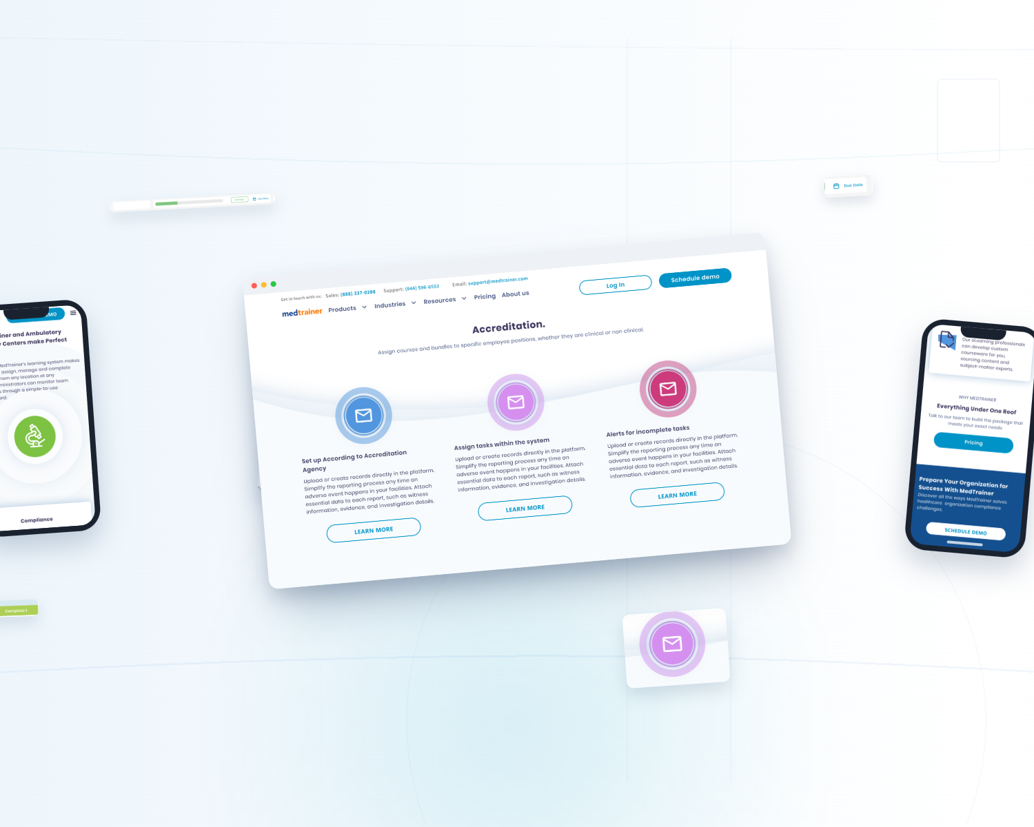
See how the homepage changed, from a dense, hard-to-parse landing page into a structured experience that explains a broad platform at a glance.



From redesign to a documented design system.
Before any pixel moved, we listened.
WANDR ran two exploratory and three validation interviews with healthcare users, then reviewed Google Analytics, competitors, and Fullstory sessions, and designed against that evidence.
COMPREHENSION
All three users grasped the offering in five seconds.
In a 5-second test of the new direction, every participant correctly described what MedTrainer does before reading a single line of copy.
DESKTOP
A desktop-first audience, entering through search.
Sessions ran 84.5% desktop, 14.3% mobile, and 1.2% tablet, arriving mostly through organic search, which set layout and page-depth priorities.
DROP-OFF
43,000 landing sessions, roughly 40,000 drop-offs.
The old site was excellent at being found and poor at holding attention, with dead clicks and little movement between pages.
Lead with meaning. Structure the depth. Tailor it to the buyer.
Clarify.
Open every page with what the product does for a healthcare team, then let detail follow, so value lands before navigation does. The three pillars carry the story, not a feature dump.
Structure.
Card sorting and a new IA gave the platform and its industries a navigable shape, replacing the drop-off and dead-end pattern with a guided path toward a demo.
Tailor.
An industry selector surfaces the recommended tools for a visitor's healthcare space, so a highly specific audience finally sees a site built for them, not for everyone at once.
The problem was never the product. It was making it legible.
MedTrainer had the platform, the customers, and the scale. What it lacked was a site that could explain a broad, multi-pillar product to a buyer who decides in seconds. Redesigning the pages fixed the symptom. A research-backed structure and a documented design system fixed the cause, so the clarity holds as the product keeps growing. A clearer site earns a demo once, but a system the team can build on earns them continuously.



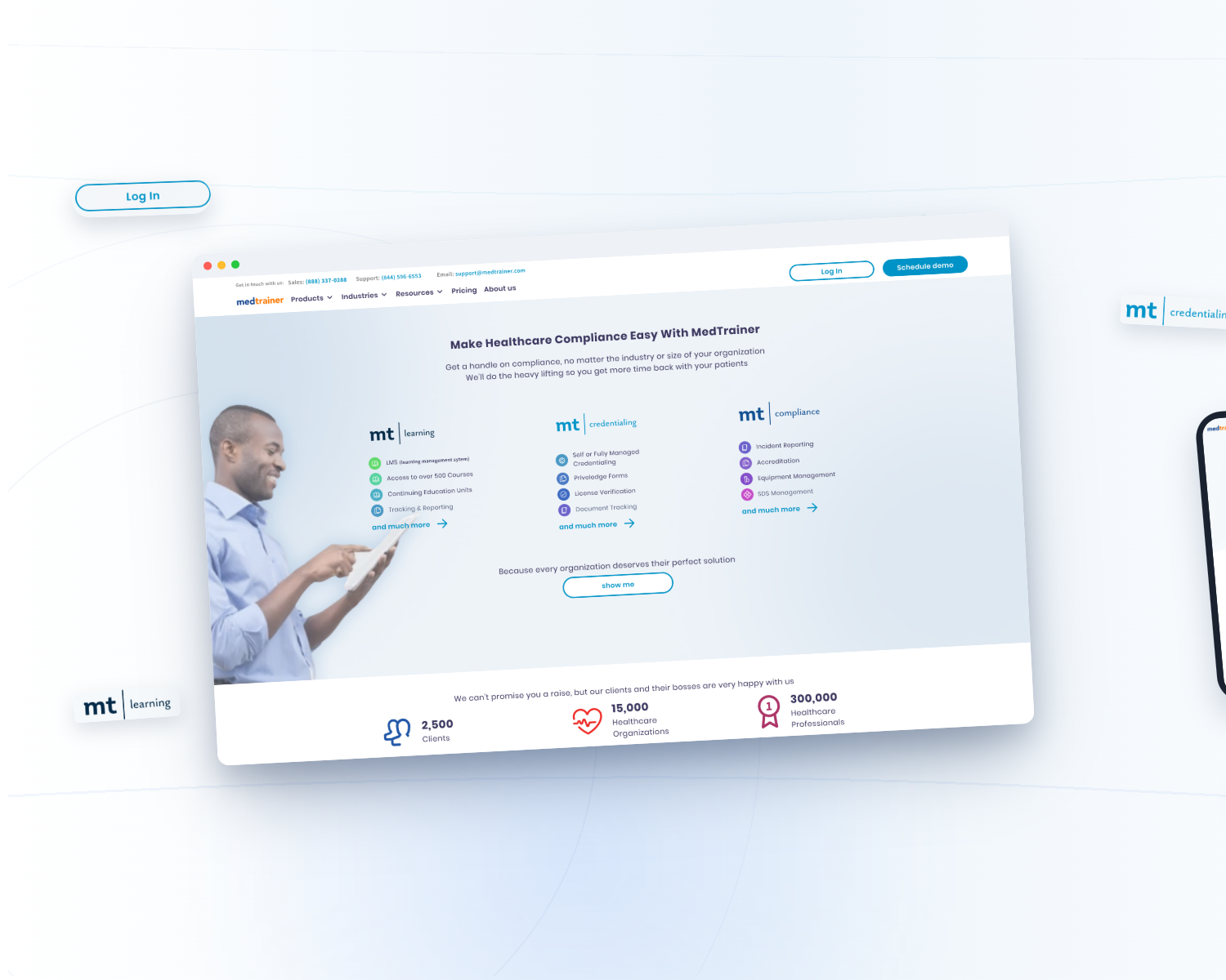
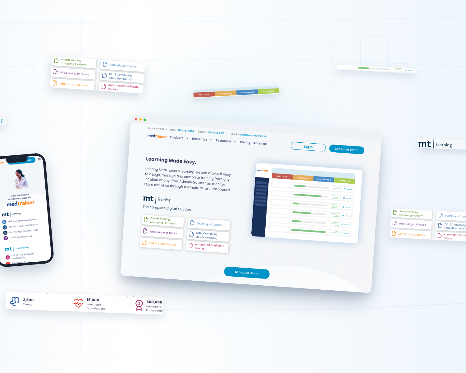
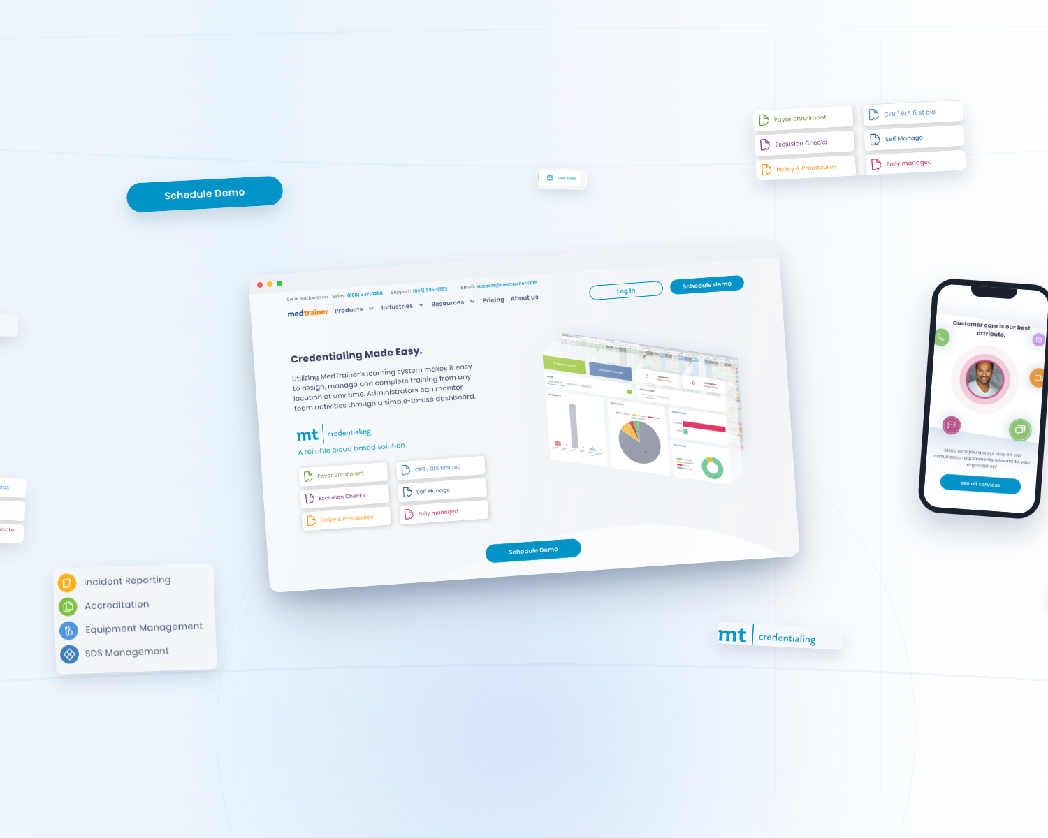
What the work moved.
By the end of the engagement, MedTrainer had a research-backed redesign, a documented design system, and a site that finally explained itself.
reported lift via the redesigned site
validated before the build
across three breakpoints
Learning, Credentialing, Compliance
Lead figure reflects Wandr-reported impact from the redesigned site; confirm the absolute before and after numbers before publishing. Comprehension and analytics findings are drawn from Wandr's 2021 Research Report. MedTrainer's $43M Series B (Vista Equity Partners, April 2022) is a company milestone, not a design outcome.
In their words.
WANDR took a genuinely complex platform and turned it into a website that finally communicates what we do. Visitors understand the product at a glance now, and that showed up fast in the demand we saw.