There's a moment every nonprofit leader knows. You send someone to your website: a potential donor, a corporate partner, a journalist: and you hold your breath. Not because you're unsure of your mission. You're completely sure of that. You hold your breath because the website? That's a different story.

At Wandr, we've spent over a decade designing digital experiences for nonprofits, NGOs, and mission-driven organizations. We've generated over $3.2 million in additional donations across 15+ nonprofit engagements. And the single most consistent thing we hear when a new client walks through the door is: "We know our website is the problem. We just don't know exactly how to fix it."
This guide is the answer to that.
We're going to walk you through everything: what makes nonprofit website design different from any other kind of web design, what the most common problems are, how to fix them, what a great nonprofit site actually looks like, and how to approach a redesign that actually moves the needle on your mission.
Let's get into it.
Why Nonprofit Website Design Is a Different Discipline Entirely
Here's something that doesn't get said enough: designing a website for a nonprofit is categorically different from designing one for a business.
When someone lands on an e-commerce site, the primary ask is money in exchange for something they get immediately. There's a clear transactional logic. When someone lands on a nonprofit website, you're asking for something much harder: trust. You're asking people to give money, volunteer their time, sign their name to a cause, or partner with your organization: and in every single case, they need to believe in you first.
That trust component changes everything about how a nonprofit website needs to be designed.
"All the actions and outcomes that nonprofits need: donations, advocacy, partnerships, volunteers: require a very high component of trust. And the websites are not reflecting that successfully.": Lina Silva, CEO, Wandr Studio
The credibility bar is higher. The emotional stakes are higher. The audience is more diverse. And the resources available to get it right are, almost universally, more limited.
That's the tension at the heart of nonprofit web design: and it's exactly what a specialized agency is built to navigate.
The 6 Biggest Problems We See on Nonprofit Website Design
Before we talk about solutions, let's be honest about what's broken. After auditing dozens of nonprofit websites, the same issues come up again and again.
1. They Don't Know Who Their Users Are
This is the root of almost every other problem. Most nonprofit websites are built to speak to "everyone": and end up connecting with no one.
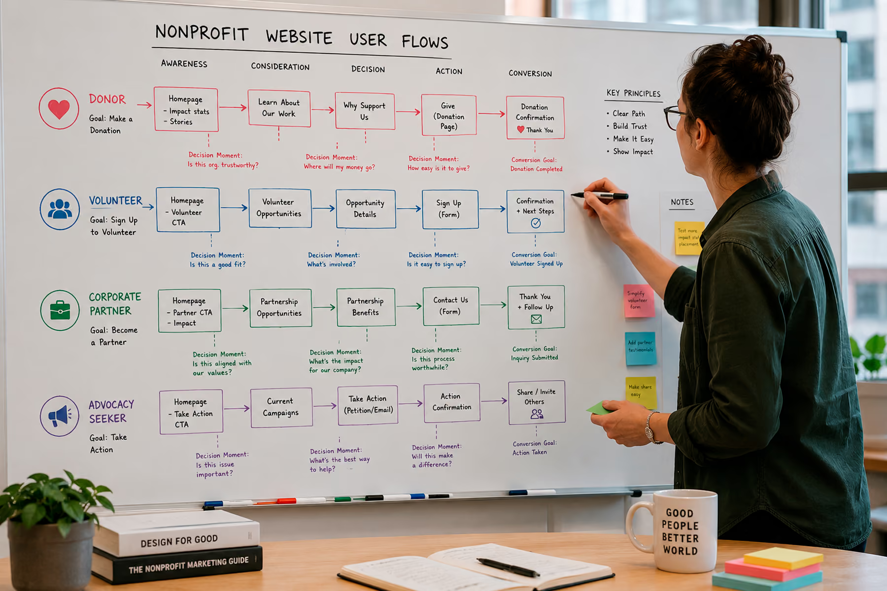
The reality is that a nonprofit's website typically needs to serve four very different types of users: donors, volunteers, corporate partners, and people seeking advocacy or information. Each of these users has completely different goals, completely different questions, and completely different conversion paths. If your website treats them the same, you're losing all of them.
We consistently limit user types to four maximum. More than that, and you start over-segmenting: which creates its own problems. For example, we've seen organizations split "donors" into high-ticket, low-ticket, recurring, and one-time: and then design four separate donation flows. What actually happens is that someone who might have donated a larger amount defaults to the smallest option because you asked them to categorize themselves before they even saw what was possible. You've guided their decision: and usually in the wrong direction.
The fix: build one strong donation flow that lets users self-identify within it.
Related: How to Design a Nonprofit Website That Increases Donations →
2. Bad Copy That's Killing Credibility
Nonprofit copy tends to do one of two things: either say too much or too little.
Too much copy usually comes from a place of anxiety: the organization doesn't feel like the design is earning trust, so it tries to compensate with volume. More words, more paragraphs, more information. But users don't read. They scan. And a wall of dense copy reads as a red flag, not a trust signal.
We've also seen the opposite: websites so stripped-down and vague that a potential donor has no idea what the organization actually does or why they should care.
Great nonprofit copy is specific, emotionally resonant, and structured to match each user's flow. It doesn't explain everything: it says the right thing at the right moment.
One thing we're firm on: regardless of what tools you use to write it (AI included), there has to be a human making sure the emotion and mission actually come through. Nonprofits live and die by human connection. Copy that sounds like it came from a content generator will undermine the whole thing.
3. Donation Flows With Too Many Steps
We've seen donation processes that required seven steps. Seven. Most users don't complete them. They abandon somewhere around step three: right before actually entering their payment information.
Every extra step in a donation flow is a door you're giving the user to walk out of. The goal is to minimize friction to near zero. That means fewer form fields, fewer decisions, fewer pages, and clearer copy at every touchpoint that reinforces why this donation matters right now.
Related: Nonprofit Website Redesign: When, Why, and How to Do It Right →
4. No Content Manager — And the Website Shows It
A lot of nonprofit websites we audit have broken links, duplicate pages, contradictory messaging across sections, and outdated content that was accurate two years ago. These aren't design failures. They're management failures: and they're not the organization's fault.
Most nonprofits, especially smaller ones, don't have a dedicated web manager. The website gets built, launched, and then... handed off to whoever has the bandwidth, which is usually no one. Things break. Pages get added without a strategy. The About page says one thing and the Programs page says something else.
The answer here isn't just to build a better website. It's to build a website that's easier to maintain, and to make sure there's a plan for ongoing management. We'll talk about how we handle that in the services section below →.
5. Third-Party Donation Integrations That Break
This one is painful to audit because you can have a beautifully designed, conversion-optimized website: and if the donation button leads to a broken third-party integration, none of the rest matters.
We've seen this more than we'd like to admit: users who make it all the way through the donation flow, intent and payment information ready, who hit a wall because the integration is broken or outdated. That's not just a missed donation. That's a relationship damaged.
Our position on donation platforms: use a purpose-built donation tool. Fundraise Up, Givebutter, and Donorbox are all strong options. We generally recommend clients move away from PayPal donations and Stripe links: not because those platforms are bad, but because they weren't built for this use case. They lack the credibility signals, the reporting features, and the donor experience that purpose-built platforms provide.
6. No Analytics — Flying Blind
If you don't know how many people are coming to your website, which pages they're landing on, where they're dropping off, and what's actually converting: you're guessing. And guessing is expensive when your budget is limited.
Setting up a proper analytics environment isn't optional. It's the foundation of everything that comes after launch. At Wandr, we treat analytics setup as non-negotiable from day one. Here's the order we recommend:
- Google Search Console: Understand what terms people are using to find you, and which pages are performing. Start here before anything else.
- Google Analytics: Understand all traffic sources, user behavior, and goal completions.
- Heatmapping: Save this for after the redesign. Looking at heatmaps on an outdated design is like analyzing how people navigated a building that you're about to tear down. Do it after the new site is live.
Related: How to Do a Nonprofit Website SEO Audit (Free Checklist) →
What Great Nonprofit Website Design Actually Looks Like
Let's move from problems to principles. These are the design standards we build every nonprofit website to.
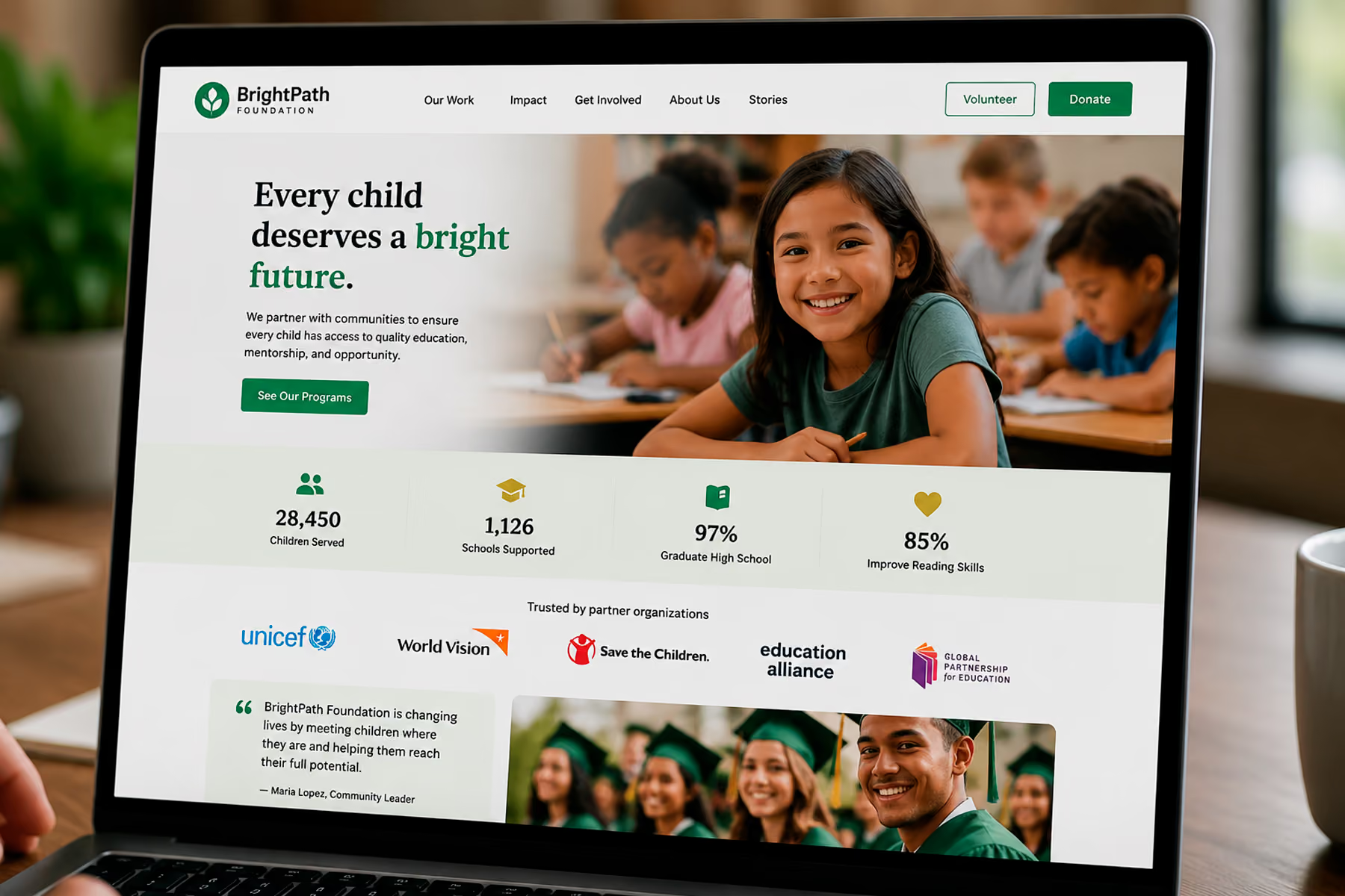
Principle 1: Trust Architecture First
Every design decision should serve one primary goal before anything else: making the user trust you enough to act. That means:
- Professional, modern visual design (outdated design communicates outdated mission)
- Social proof everywhere: testimonials, partner logos, media mentions, impact stats
- Transparent use-of-funds information
- Real faces, real stories, real outcomes
- Fast loading times (a slow site reads as unprofessional, and it is)
Principle 2: User Type Clarity
Within the first 10 seconds of landing on your website, each of your four primary user types should know that this website is for them and should be able to find their path forward without scrolling through content irrelevant to their goals.
Navigation architecture, hero messaging, and call-to-action placement should all serve user clarity before they serve organizational comprehensiveness.
Principle 3: Minimal-Friction Conversion Paths
For every conversion goal: donation, volunteer application, newsletter sign-up, partnership inquiry: design the path as if every click costs you money. Because it does.
We map flows before we design pages. We know exactly how many steps exist between a user landing and a user converting, and we challenge every single one of them. Does this step need to exist? What would happen if we removed it?
Principle 4: Mobile-First, Always
The majority of nonprofit website traffic is mobile. If the mobile experience is an afterthought: as it often is: you're losing the majority of your potential supporters before they even get started.
Mobile-first doesn't mean "make sure it doesn't break on mobile." It means designing for mobile first, then adapting for desktop. That's a very different approach, and it shows.
Principle 5: SEO Built Into the Structure
A nonprofit website that nobody can find is a beautiful thing that does no good. SEO isn't an add-on that happens after the design is done: it's baked into every structural decision: URL architecture, heading hierarchy, content organization, page speed, image optimization, internal linking.
And when you're doing a redesign, content migration is one of the most critical (and most often botched) parts of the process. We've seen organizations lose years of SEO authority because a migration wasn't handled correctly. At Wandr, we have documented results: for Mercy For Animals, we preserved over 90% of their SEO authority through a major platform migration and recovered the remaining portion within four weeks.
Related: Nonprofit Website SEO: How to Get Found Without a Big Ad Budget →
The Wandr Process: How We Approach Nonprofit Website Design
Every project starts the same way regardless of size, budget, or complexity.
Step 1: The Audit (3 Days)
Before we touch a single design element, we conduct a three-day audit of everything they have. We look at the current website, analytics (if they exist), existing content, integrations, and competitive landscape. The audit tells us what's broken, what's working, and where the biggest opportunities are.
This shapes the entire roadmap. There's no cookie-cutter approach here: every nonprofit is different, their mission is different, and what they need to accomplish is different. We customize every step.
Step 2: Stakeholder Interviews + User Persona Development
We meet with the organization's leadership to reverse-engineer their user personas from their outcomes. They usually know what they want to achieve: more donors, more volunteers, more corporate partnerships. We work backward from those goals to build clear user profiles.
Then we challenge those profiles with real research. We've been surprised more than once by how many assumptions nonprofit leadership holds about their audience that aren't true. One client was convinced that a certain geographic region would never support their cause. We challenged that assumption with user interviews and found a significant untapped audience that was not only willing to support: they were actively looking for an organization like this and just couldn't find them.
We challenge everything. It's the only way to actually get it right the first time.
Step 3: User Research + Flow Mapping
With personas validated, we map every user flow from entry point to conversion. Each of the four primary user types gets their own path, optimized from first impression to final action.
This is where a lot of agencies skip ahead to design. We don't. The flow comes first because the flow determines the design: not the other way around.
Step 4: Design + Development
Design follows the flows. Every visual decision is in service of trust, clarity, and conversion. We're not just building something beautiful: we're building something that works.
Development is handled by our in-house team, with specialists for every platform and integration. We have experts in WordPress, Webflow, and virtually every major donation platform. We understand the constraints of each and build around them.
Step 5: Analytics Setup + Launch
Before launch, the full analytics environment is configured. Every conversion goal is tracked. The site goes live already set up to capture the data you'll need for year-one decisions.
Step 6: Post-Launch Support
Our commitment doesn't end at launch. We offer ongoing content management support from hourly packages (starting at five hours per month) to full-time placements: whatever the organization actually needs. And we stand behind our work with a clear warranty: if you don't see meaningful increases in your key metrics in year one post-launch, we come back and work for free until you do.
What Does Nonprofit Website Design Cost?
We know budget conversations feel uncomfortable. We think transparency is better than making people guess.
For a full nonprofit website redesign: including research, UX, design, development, and launch support: mid-range pricing typically falls between $25,000 and $30,000. Timeline is approximately three to four months.
For organizations that specifically need donation flow optimization without a full redesign, that service starts at $10,000. It covers user mapping, flow rebuild for each user type, and integration cleanup. The outcome is measurable: more completions, fewer drop-offs, more conversions.
Related: How Much Does a Nonprofit Website Cost in 2026? →
Real Results: What This Looks Like in Practice
WWF Canada
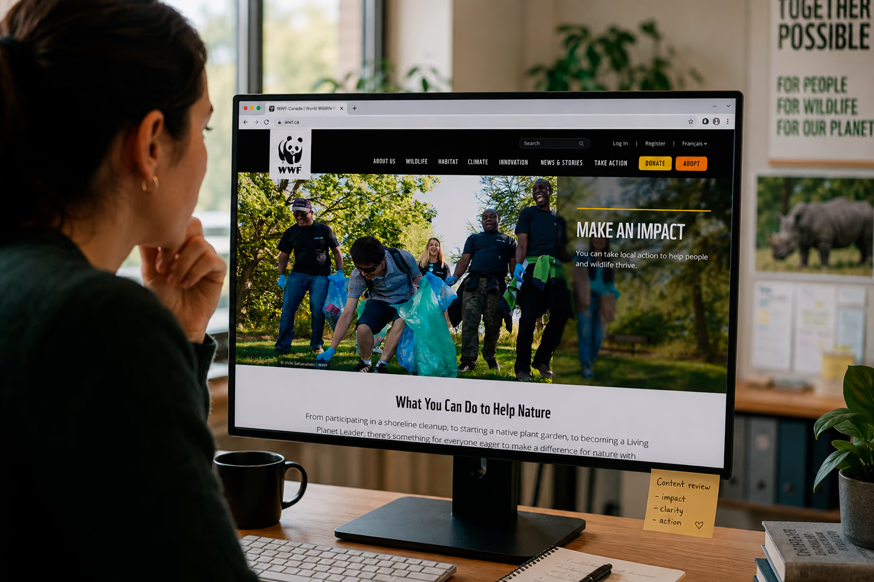
Wandr redesigned WWF Canada's digital platform with a focus on donor conversion, bilingual content architecture (English and French), integrated shop, advocacy platform, and peer-to-peer fundraising. The results:
- Online transactions increased by 30%
- Unique users increased by 25%
- Time on page increased by 18%
"We've seen a lot more traffic coming to WWF.ca since the redesign... and our conversion rate on our donor forms is up.": Vanessa Turpin, Sr. Manager Digital, WWF Canada
Read the full WWF Canada case study →
Mercy For Animals
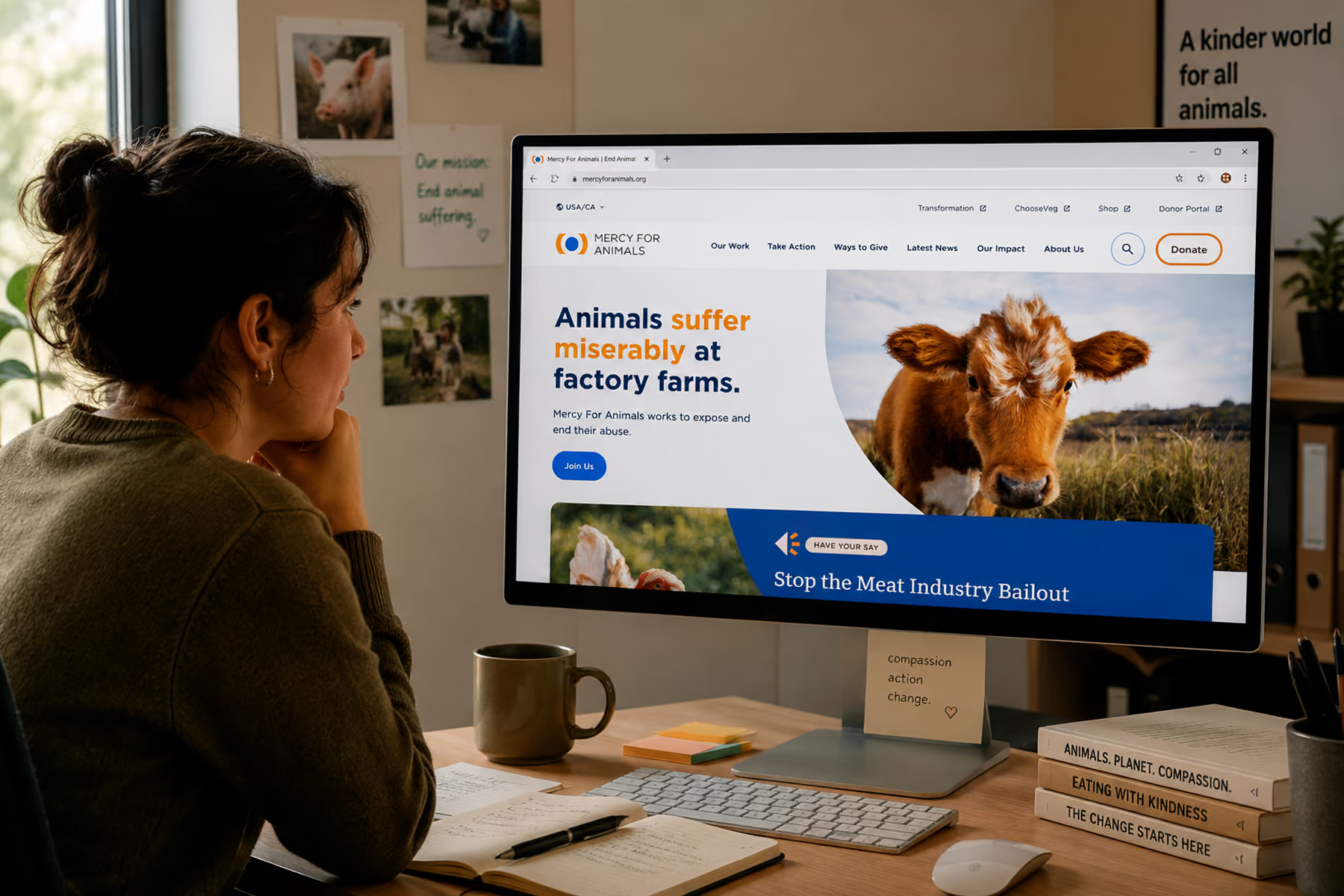
Wandr consolidated Mercy For Animals' complex digital ecosystem, unified over 12 campaign pages into three manageable templates, and executed a major platform migration without losing their SEO authority.
- Donations increased by 32% in year one post-engagement
- SEO fully recovered within four weeks of migration
- Accessibility achieved across the full site
"They turned our challenges into a beautifully designed solution. The results speak for themselves.": Aditi Sharma, Product Manager, Mercy For Animals
Read the full Mercy For Animals case study →
DonateHello
Wandr redesigned DonateHello's donation platform with a focus on donor transparency, cause discovery, and a streamlined giving flow that rebuilt trust at every step.
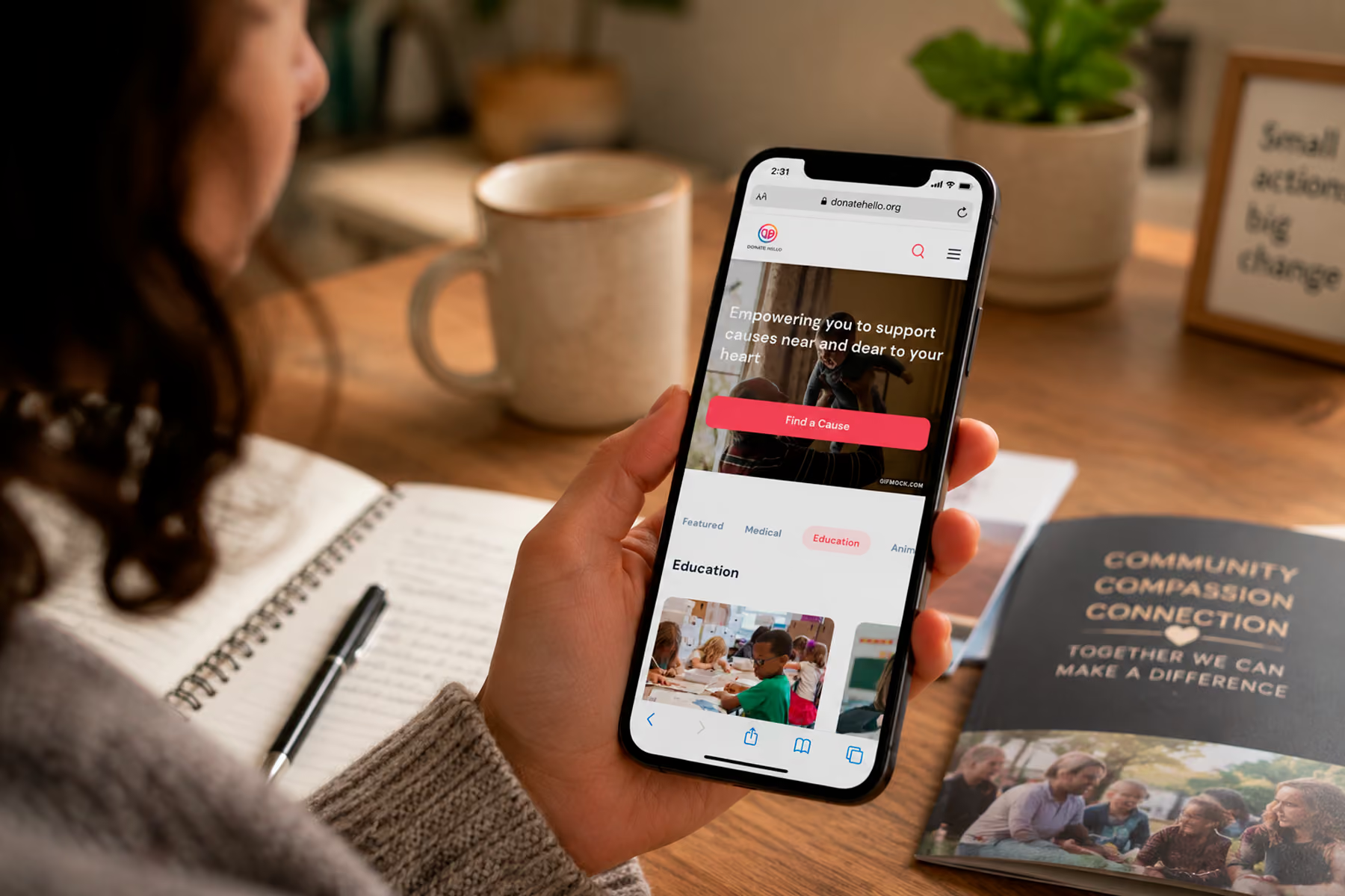
Read the full DonateHello case study →
How to Choose a Nonprofit Website Design Agency
Not every agency that says they work with nonprofits has actually built a practice around it. Here's what to look for:
Proof of results, not just proof of work. Portfolio screenshots tell you what they can build. Case studies with real metrics tell you whether it made a difference.
A process that starts with research. Any agency that skips user research and goes straight to mockups is guessing. That might work for a basic marketing site. It won't work for a complex, multi-audience nonprofit website.
Specialization. There is terrain that's been traveled in nonprofit web design: patterns that work, platforms that integrate cleanly, flows that convert. An agency that specializes in this space has already learned those lessons. You shouldn't have to pay for theirs.
A warranty. We're one of the few agencies that will put a commitment in writing: you will see your key metrics increase in year one, or we come back and work for free. That's not a marketing line. It's how we operate.
Related: Nonprofit Website Design Services →
Ready to Get Started?
If your website is holding your mission back, we'd like to change that.
We offer a diagnostic call where we look at what you have, talk through what you need, and give you an honest assessment of where the gaps are: before any commitment is made.
Book your free nonprofit website diagnostic →
Wandr Studio is a woman-owned, woman-led design, development, and strategy studio. We've spent a decade building digital experiences that move the needle for nonprofits, NGOs, and mission-driven organizations. Learn more about our nonprofit services →