Persona 01
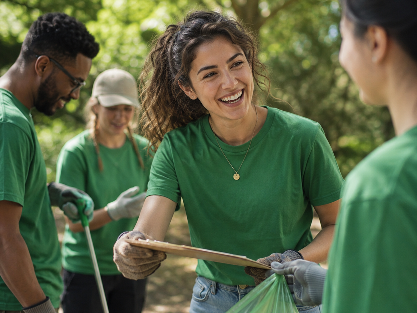
The committed advocate.
Already engaged. Wants to donate, sign petitions, and volunteer, and needs to see where the money goes.
RETURNING
DONATES
ACCOUNTABILITY
Our redesign of the mobile donation funnel lifted WWF-Canada's digital donations 37%, then unified four fragmented platforms into one WordPress multisite.
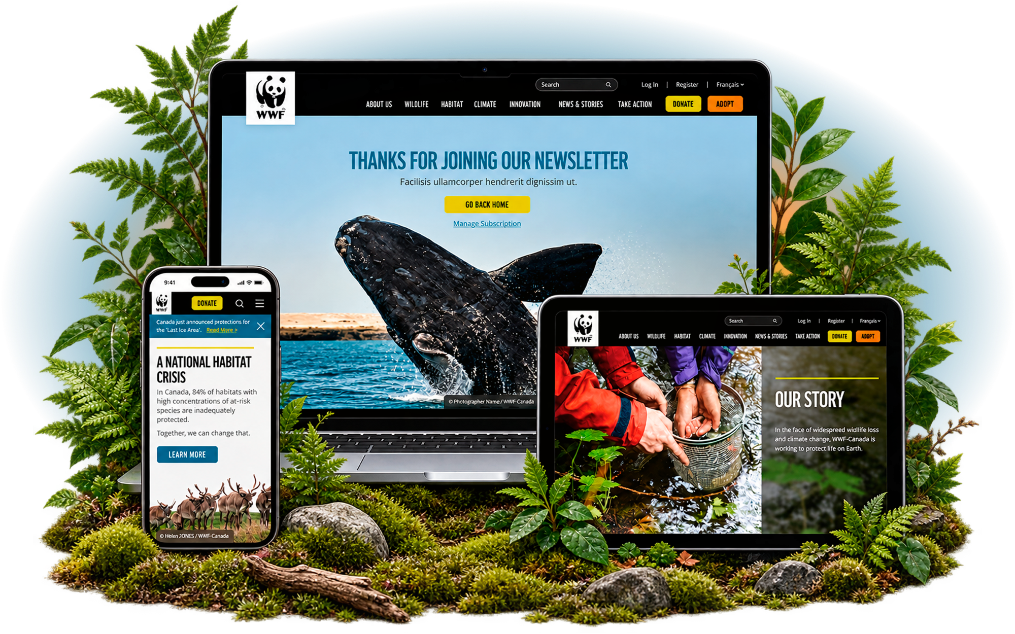
WWF-Canada is the Canadian arm of one of the world's most recognized environmental organizations, founded in 1967 and working to protect wildlife, habitats, and the ecosystems Canadians depend on across the Arctic, oceans, freshwater, and species conservation.
Its website is not a brochure. It is the front door for donors, the checkout for online and mobile giving, and the operational hub for campaigns that respond to conservation issues in real time. By 2018, that front door had stopped keeping pace with the mission behind it.
The site was losing people at the exact moment they decided to act.
A high-traffic site with almost no depth of engagement, running on a patchwork of platforms, was leaking donation intent at the highest-value point in the journey.
The main site ran on ColdFusion. A store microsite, three separate Living Planet supporter portals, and a set of campaign properties had each been built at different times, on different systems. A supporter met a different organization on every property.
Mobile carried a third of traffic and behaved like a different site, bouncing far higher and converting far lower than desktop, exactly where giving was headed.
Routine content changes required a developer, so campaigns moved at engineering speed rather than conservation speed.
WWF operates one of the most tightly governed brand systems in the nonprofit world, shared across every international chapter. Usability and conversion had to improve without redrawing the visual language.
The site was not served over HTTPS, page load ranked below average, and WCAG 2.0 Level AA would become legally required under AODA on January 1, 2021. Any failure landed directly on donor trust and fundraising.
Drag the handle to see how the mobile donation funnel changed, from a distraction-heavy checkout that lost supporters mid-decision into a streamlined flow built to convert.
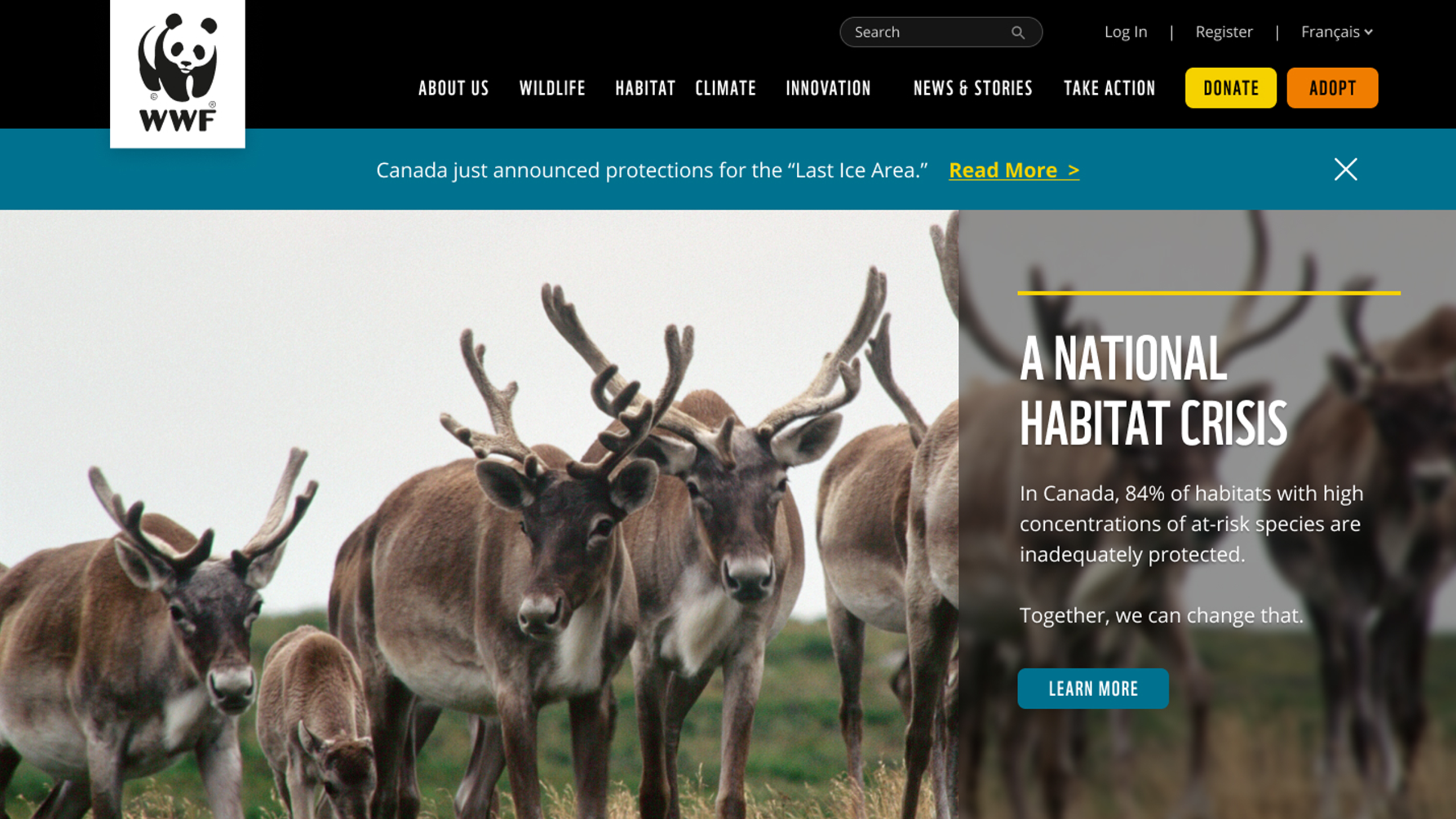

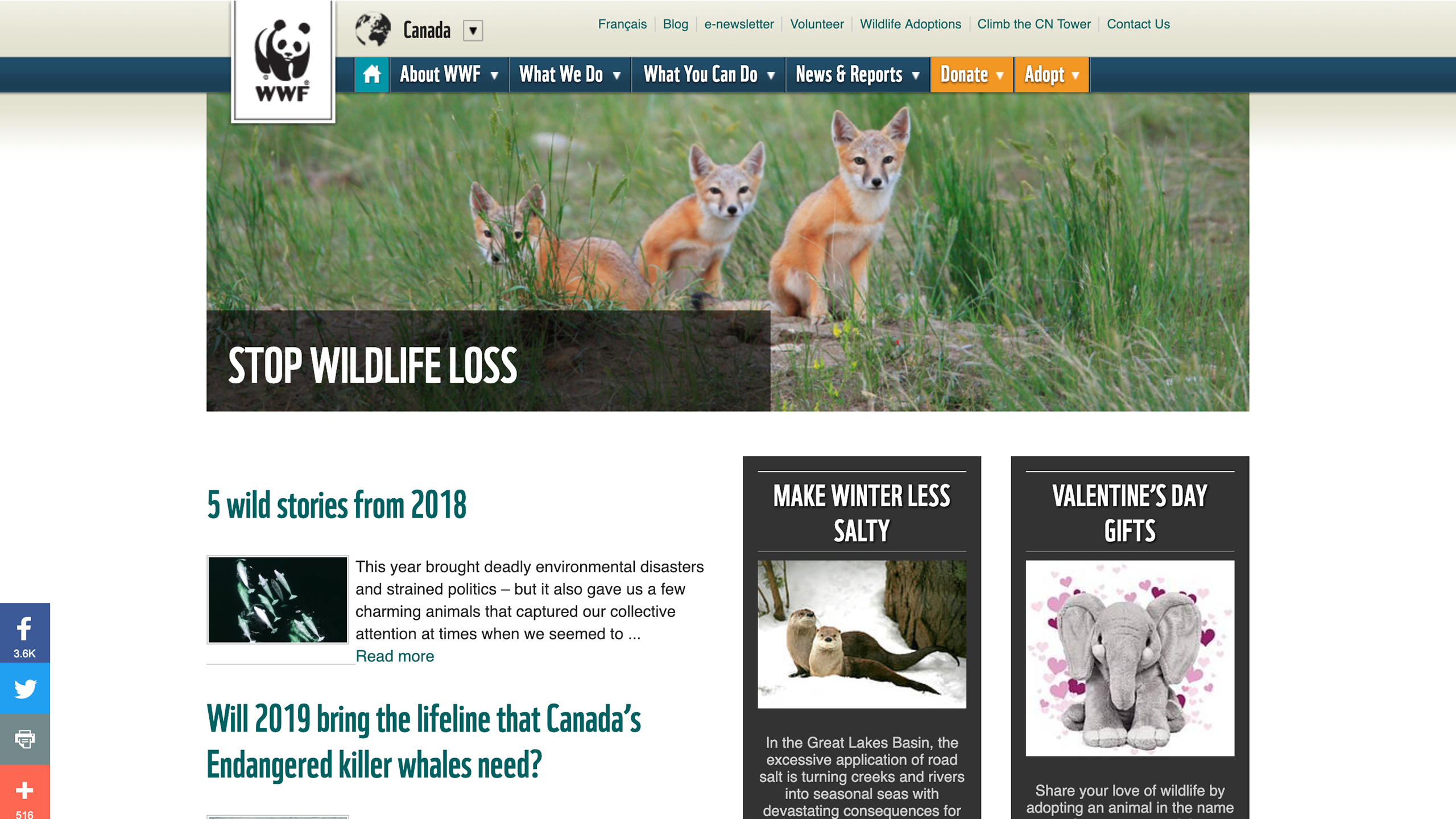

We measured the funnel
before we rebuilt it.
A documented Website Review and Strategy, commissioned by WWF-Canada from Bits Creative Agency, established the pre-redesign baseline from Google Analytics and FullStory across three months in 2018. WANDR carried its own UX audit into the engagement and designed against that evidence.
Organic search drove 63% of sessions but converted at just 0.28%, against 1.21% for direct traffic and 2.80% for email. The site excelled at attracting people and failed at moving them to give.
Bounce sat at 69% against a 40% ideal, with the average visitor seeing 1.88 pages and leaving after 1 minute 35 seconds. Engagement was shallow across the board.
Mobile carried 34.7% of traffic but generated CA$7,035 against desktop's CA$45,906, bouncing at 75% with 49-second sessions. The fastest-growing surface was the weakest.
Already engaged. Wants to donate, sign petitions, and volunteer, and needs to see where the money goes.

New to the cause, often younger. A curious browser who wants a fast, low-friction way in and does not know where to start.

Philanthropist or corporate sponsor weighing a sizeable gift. Wants strategic plans, successes, financials, and a person to talk to.

Student, scientist, or policy lead hunting data. Lands deep on species and science pages, reads long, and rarely converts on the visit.

Drawn by the prestige of the brand. Needs careers, leadership, and credibility signals.
Decision maker evaluating sponsorship. Wants annual reports, financials, and return on investment before any conversation.
Move off ColdFusion onto a single WordPress multisite, bringing the store, campaign properties, and the three Living Planet portals under one brand-compliant system, so the experience no longer changed depending on which door a supporter entered through.
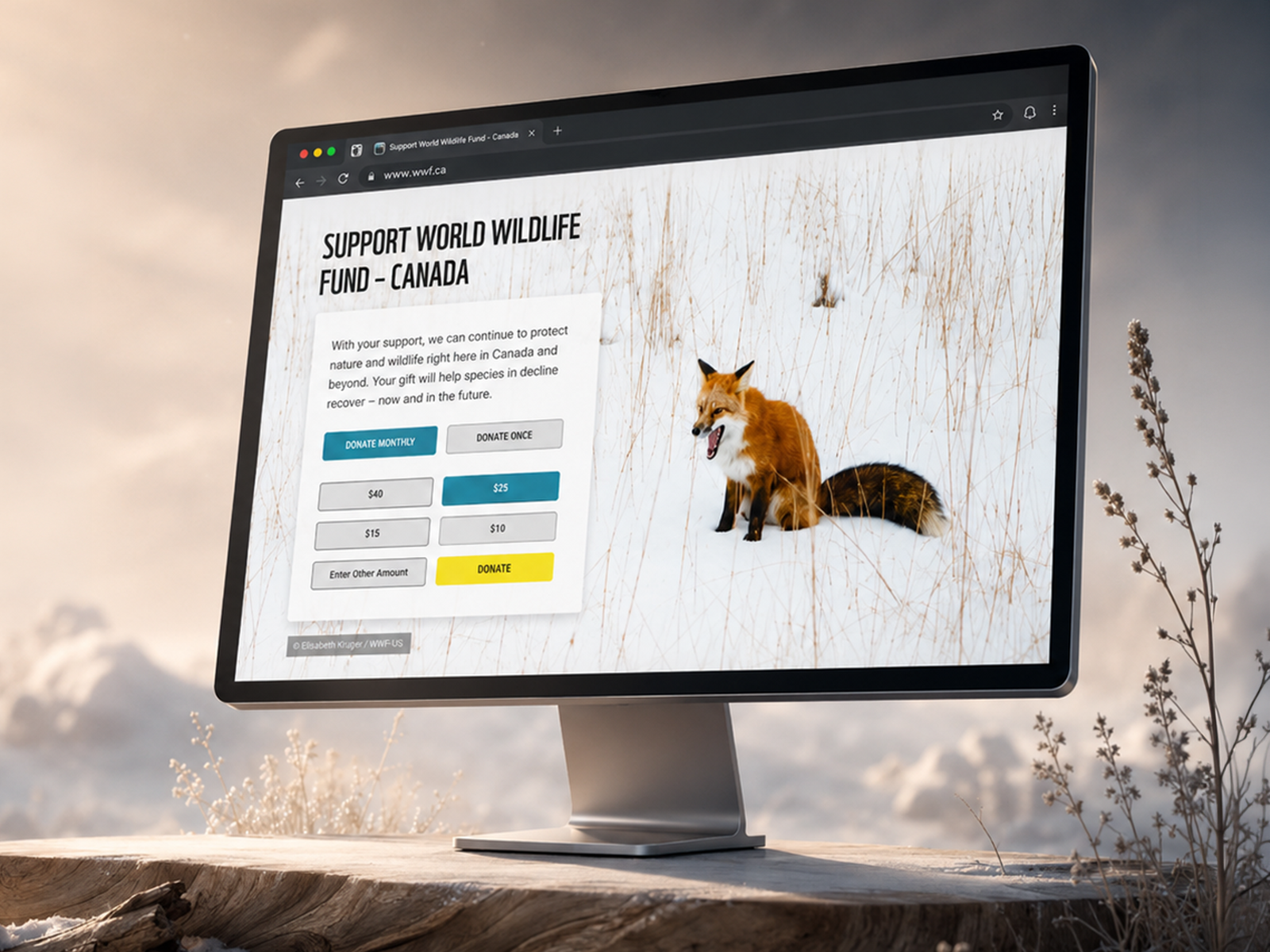
Rebuild the funnel around how supporters actually decide. Strip distraction from the donation page, cut steps between intent and completion, surface recurring giving as a first-class option, and preselect suggested amounts anchored to the CA$61 average. Every decision was made against mobile first, because that was where the money was being lost.
Deliver a modular content system so internal teams could launch campaigns and restructure pages without opening a developer ticket, and without breaking global brand standards. The redesigned flows were codified in a reusable design system with accessibility built in from the first decision, so consistency held across the multisite and engineers reused components instead of rebuilding them.
WWF.ca was excellent at being found and poor at converting the people it found. And because the global brand was locked, the gains could not come from a new look. They had to come from architecture, hierarchy, and funnel design.
That is the harder version of the problem, and the more repeatable one: a better donation flow recovers revenue once, but a platform the team can run recovers it continuously.
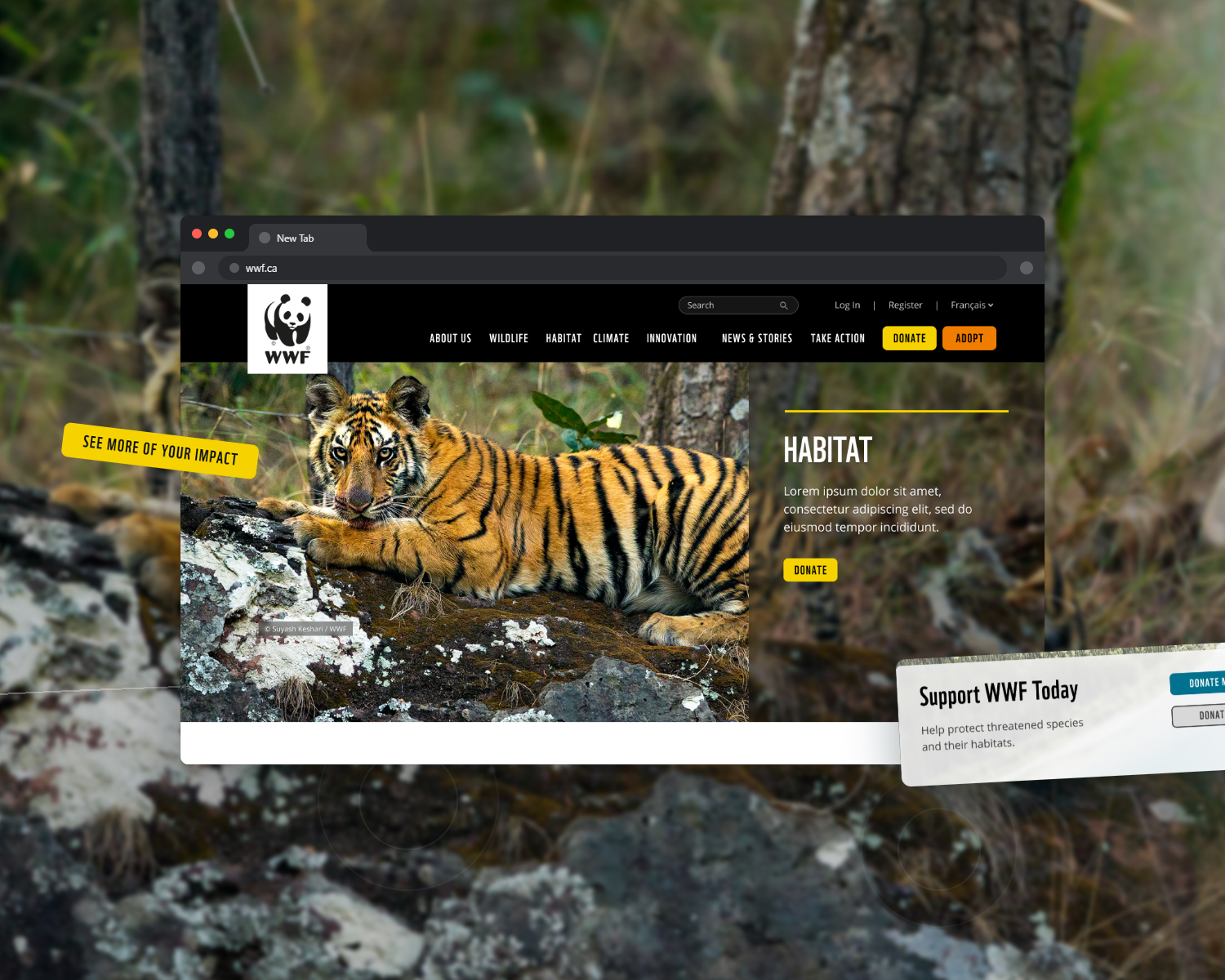
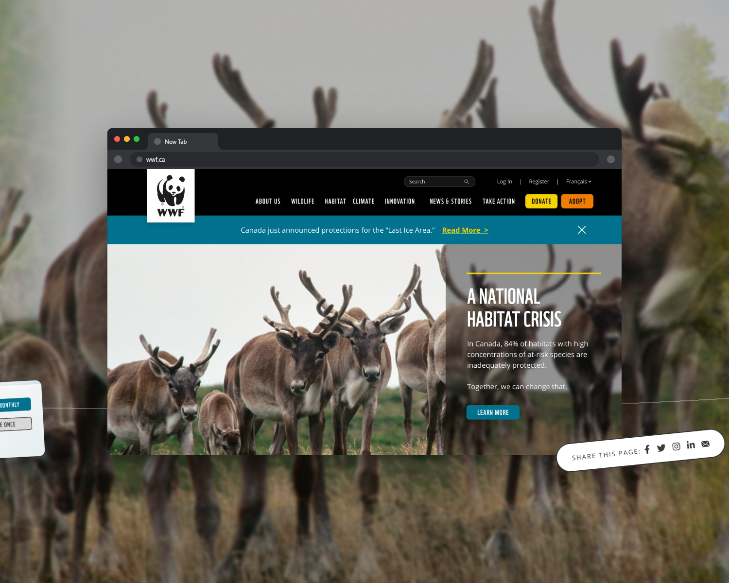
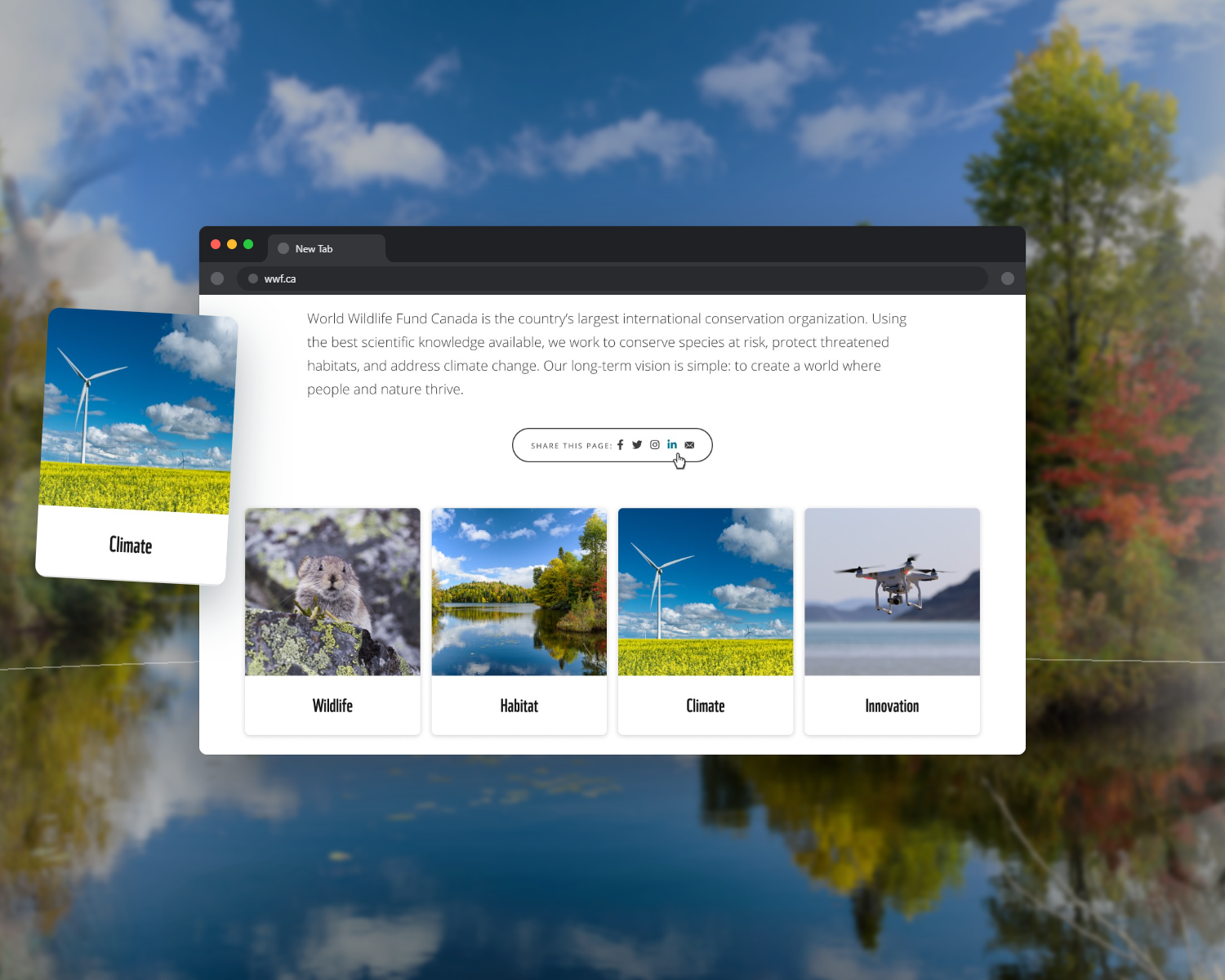
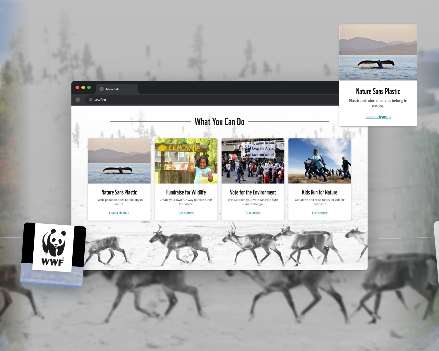
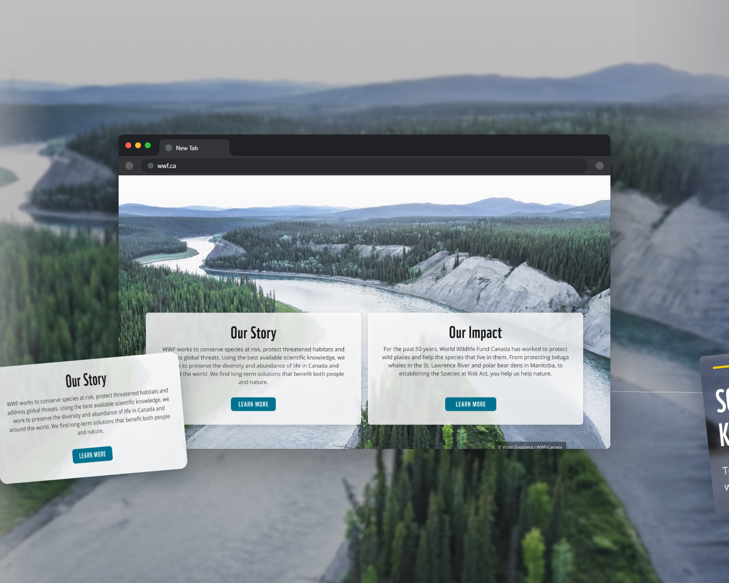
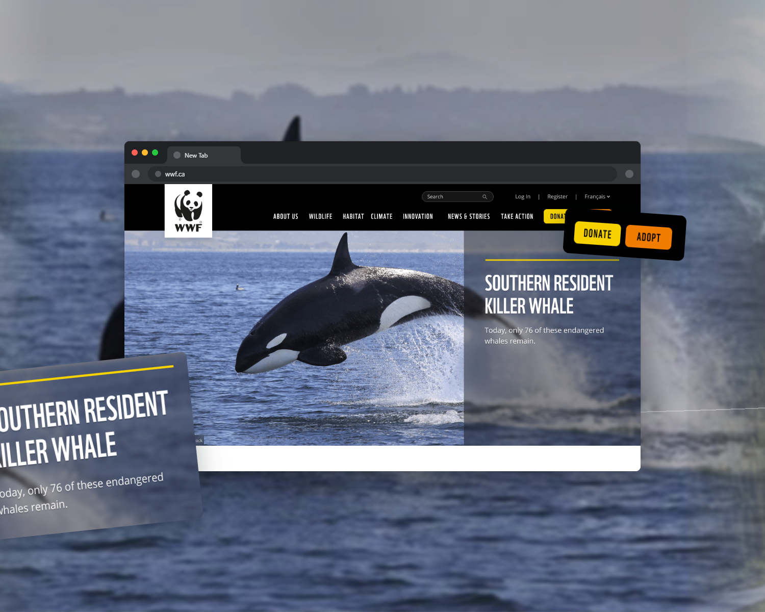
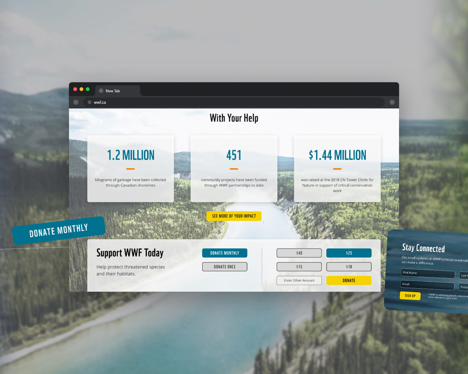
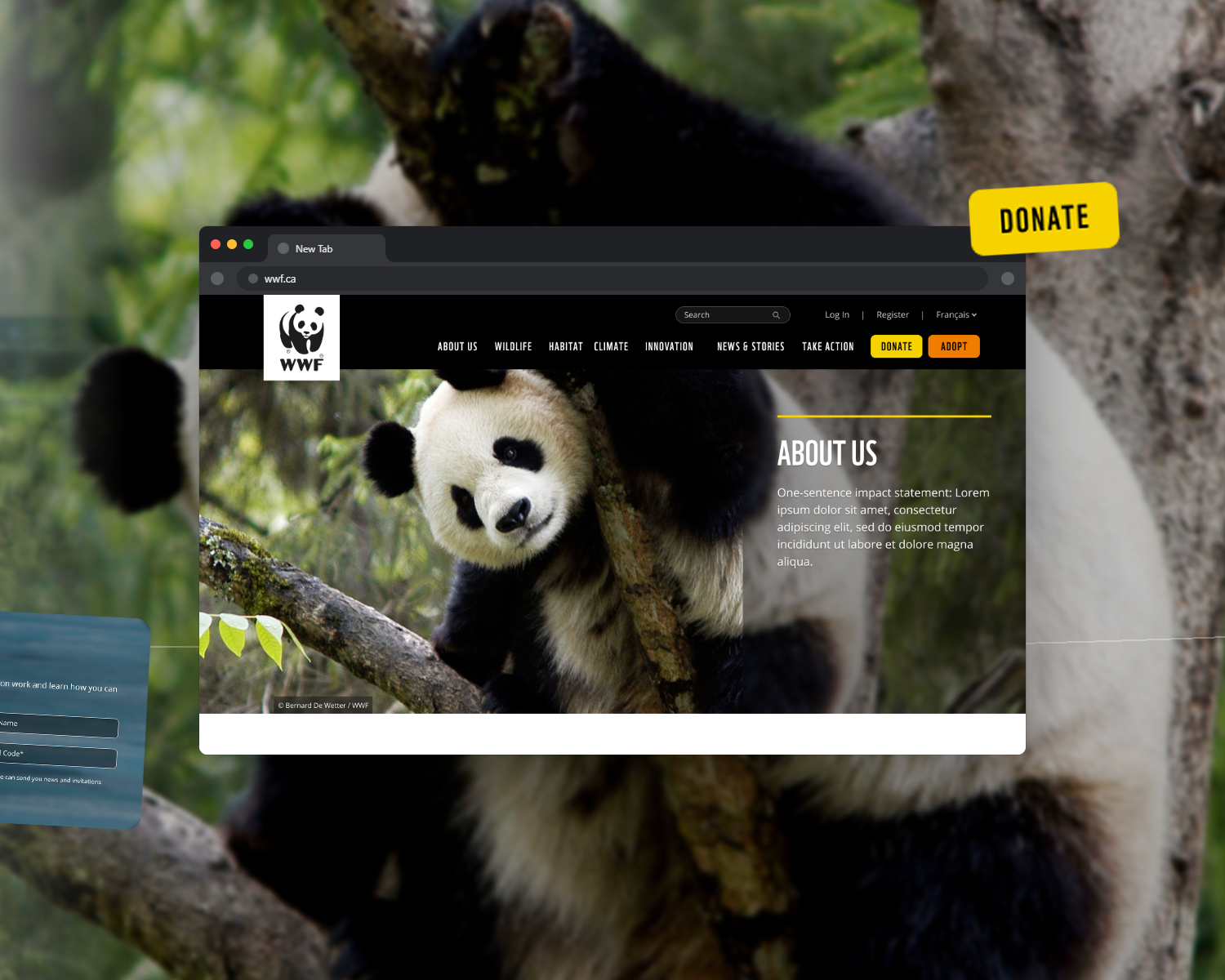
By the end of the engagement, WWF-Canada had a rebuilt donation funnel, a single brand-compliant platform, and internal teams who could run it.
Donation figure reflects WWF-reported impact from the redesigned funnel. Traffic figures are from Semrush (wwf.ca); organic keyword footprint over the same window grew from roughly 37,600 to 53,700 ranking terms.
We've seen a lot more traffic coming to WWF.ca since the redesign… and our conversion rate on our donor forms is up thanks to Wandr's new designs.