

Dashboard UI design is one of the most consequential surfaces in any product. It is where users decide, session by session, whether the product is worth their continued investment of time and attention. Most dashboard UI failures are not visual failures. They are structural failures: the interface was designed around what data is available rather than around what the user needs to decide. This post covers what great dashboard UI looks like, why the common patterns fail, and what designing for real user decisions actually requires.

Why Dashboard UI Is Harder Than It Looks
A dashboard UI is harder to design well than almost any other surface in a product. The reason is that it has to solve multiple problems simultaneously that are in genuine tension with each other.
It has to be comprehensive enough that power users can find the depth they need, but simple enough that new users are not overwhelmed on their first session. It has to surface the most important information immediately, but not hide secondary information so completely that users who need it cannot find it. It has to work beautifully on a large monitor at full attention, and still be usable on a laptop in a meeting or a phone between calls.
Most dashboard UI designs fail not because the team lacked skill but because these tensions were never explicitly resolved. The result is a dashboard that reflects the capabilities of the data layer rather than the needs of the person using it, and that serves power users adequately while losing everyone else before they ever become power users.
The Foundational Decisions That Determine Dashboard UI Quality
Who Is Actually Using This, and When
The most important dashboard UI decision happens before any visual design begins: defining exactly who will use the dashboard, in what context, and what they need to accomplish in a single session.
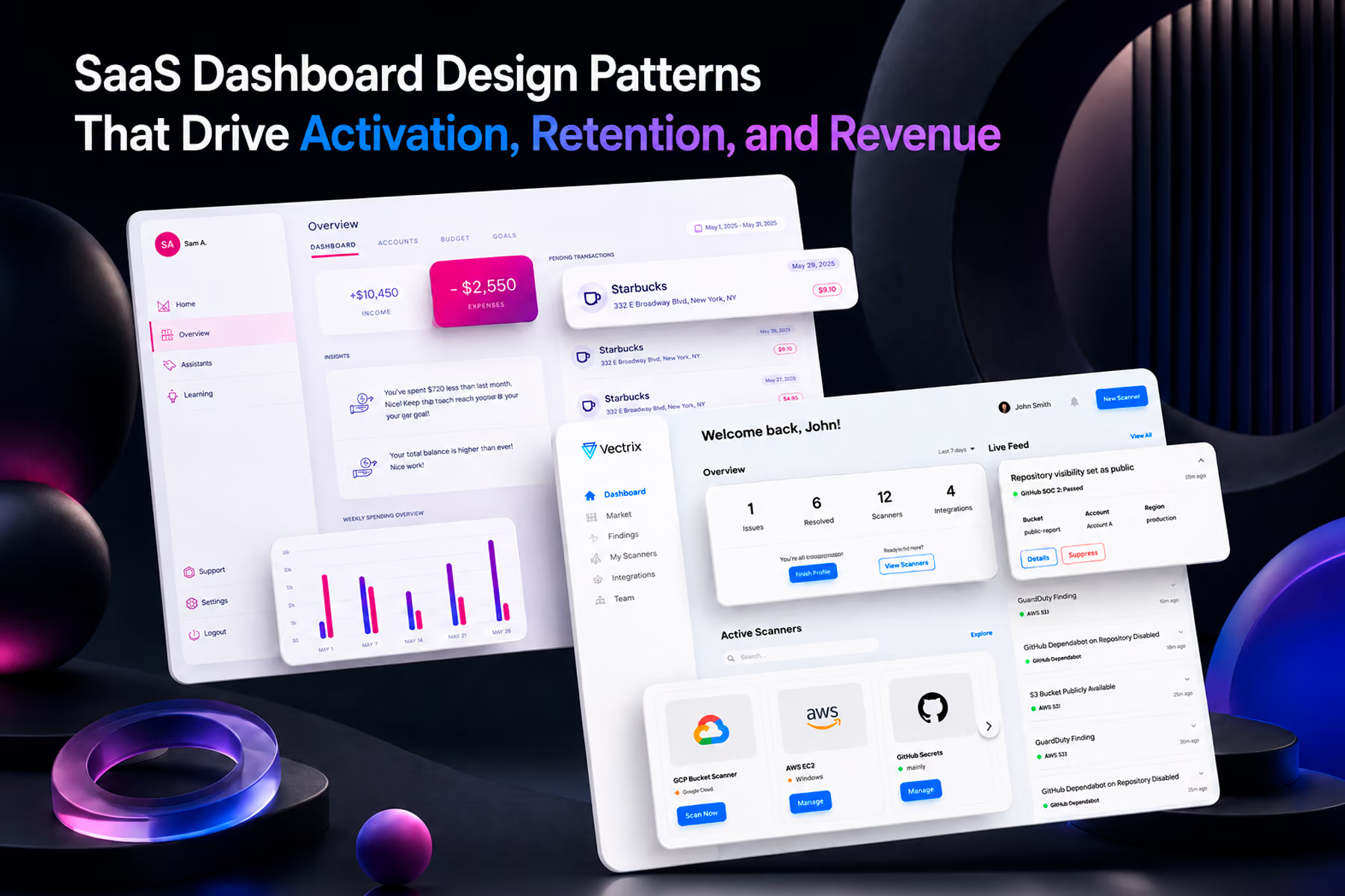
A security analyst checking Vectrix's cloud security dashboard at the start of their shift has a fundamentally different context from an executive reviewing the same underlying data in a quarterly business review. The analyst needs to identify whether there are active policy violations requiring immediate response. The executive needs to understand whether the organization's overall security posture is improving or deteriorating.
Same product, same data, completely different dashboard UI requirements. When those two contexts collapse into a single design that tries to serve both simultaneously without deliberate information architecture, both users end up underserved.
Wandr's approach to every dashboard UI engagement starts with a decision mapping exercise: what specific decisions does each user role make from this dashboard, what information do they need to make each decision confidently, and what is the sequence in which that information needs to appear? The visual design follows from that map. It does not precede it.

The Visual Hierarchy Has to Carry the Decision Hierarchy
Once the decision map exists, the visual hierarchy of the dashboard UI has to reflect it precisely. The most important decision-driving information has to be the highest visual weight element on the page. Secondary information has to feel genuinely secondary. Supporting detail has to be accessible without competing for attention with the primary signal.
This sounds obvious. It is violated constantly. The most common failure is treating all dashboard UI elements as equally important, which in practice means no element is important enough to guide user behavior. When everything competes for attention equally, users scan the entire dashboard looking for the signal rather than finding it immediately, which creates the cognitive fatigue that drives abandonment.
The specific visual hierarchy decisions that matter most are: what is the largest element on the page and why, what appears above the fold versus below it, what requires interaction to access versus being immediately visible, and what uses color as a signal versus as decoration. Each of these is a decision about information priority, not an aesthetic decision.
Comparison Context Is What Converts Numbers Into Insights
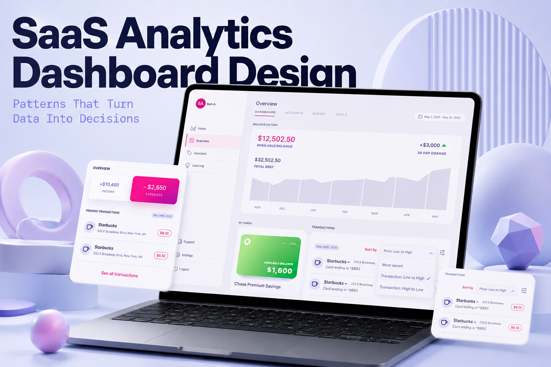
A dashboard UI that shows metrics without comparison context is a reporting tool, not a decision support tool. A metric that cannot be evaluated against something else (a target, a previous period, a benchmark, or a threshold) cannot drive a decision.
This is one of the most consistent gaps in dashboard UI design across industries. A conversion rate of 3.2% is meaningless without knowing whether the target is 3.0% or 4.0%, whether it was 2.8% last month or 4.1%, and whether it is above or below the category average. The dashboard UI that surfaces the number without the context forces the user to retrieve the context from memory or from another source, which is friction that compounds across every session and eventually causes the dashboard to be used only for investigation rather than for routine monitoring.
Building comparison context into the visual design of every primary metric is a structural decision, not a data decision. The data team knows the context. The dashboard UI has to make it visible.
The Dashboard UI Patterns That Work
Progressive Disclosure
The dashboard UI pattern that most consistently reduces cognitive load without sacrificing depth is progressive disclosure: surfacing the primary signal at the top level of the hierarchy, and making detailed data available through deliberate interaction rather than presenting everything simultaneously.
At the top level, the user sees the status of the things that matter most. One click down, they see the breakdown that explains that status. One click further, they see the underlying data that supports the breakdown. Each level is available for users who need it, and invisible to users who do not, which means the interface serves both the executive doing a thirty-second status check and the analyst doing a thirty-minute investigation using the same underlying architecture.
Synchrony's GiftNow platform required this pattern for a specific reason: the dashboard served both high-level account managers monitoring portfolio performance across dozens of client accounts and individual account managers focused on their own accounts. The information hierarchy had to work for both contexts without either group navigating through content irrelevant to their role.
Role-Based Views Within a Shared System
When a dashboard UI serves multiple user types with genuinely different information needs, the most effective pattern is role-based views within a shared design system rather than separate dashboards for each role.
Separate dashboards create maintenance overhead and fragment the data relationship between views. A shared design system with role-based filtering surfaces the right information depth for each user while maintaining visual consistency and allowing users to understand the same metrics from different angles when their role requires it.
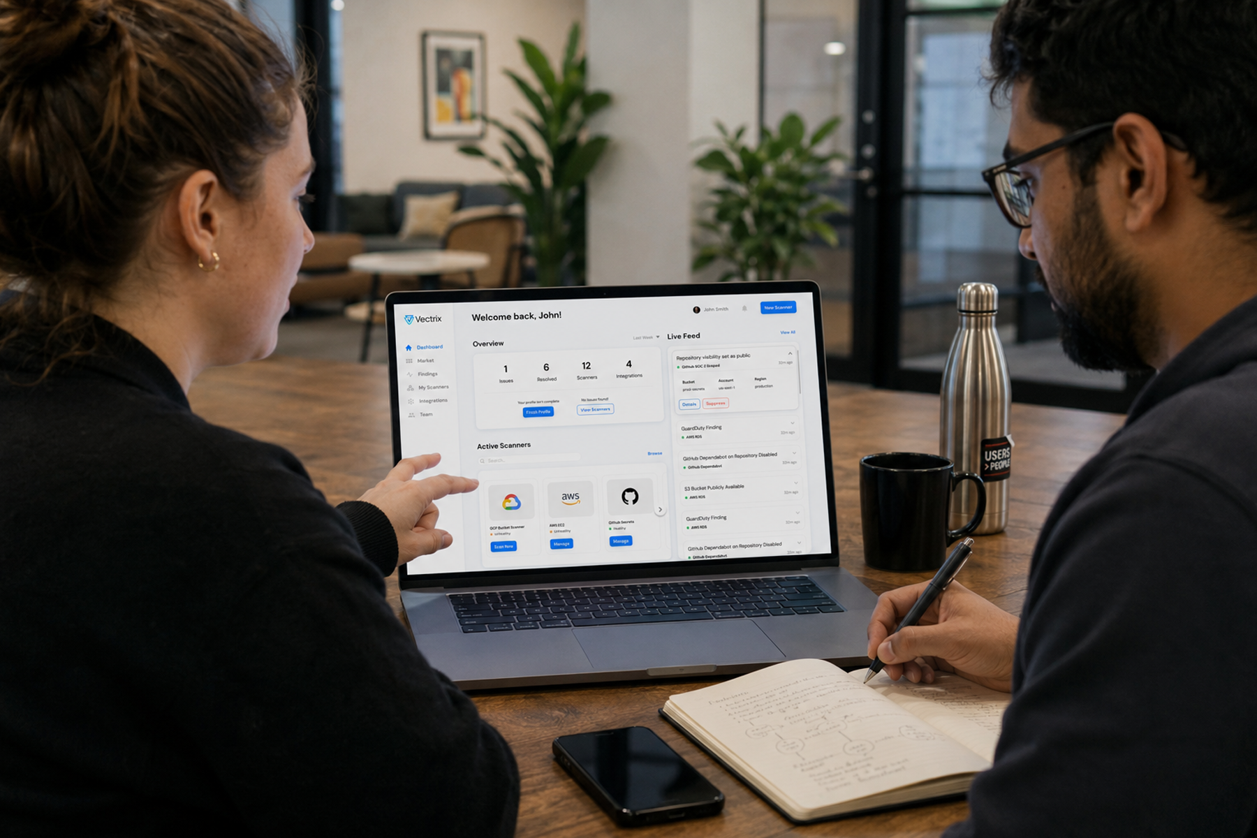
The dashboard UI Wandr built for Vectrix served both the security engineers doing technical investigation and the security managers doing portfolio-level risk assessment. The underlying components and visual language were consistent across both views. The information displayed, the default visibility of different data layers, and the primary actions available differed by role. Both users experienced a dashboard that felt built for them specifically rather than adapted from something built for someone else.
Empty States That Build Confidence Rather Than Create Anxiety
The empty state of a dashboard UI is the first thing a new user sees. It is also the state most consistently neglected in dashboard UI design.
An empty state that shows a blank screen with placeholder text creates uncertainty about whether the product is working correctly. For a new user evaluating whether the product is worth the implementation effort, that uncertainty is damaging at exactly the wrong moment.
An empty state that shows what the dashboard will look like when populated, explains why the data is not there yet, and gives the user a clear next action to generate the first data creates confidence rather than anxiety. It communicates that the product was designed with new users in mind, which is a trust signal in itself.
Error States That Maintain Trust
In any product where the dashboard UI displays data users depend on for decisions, an error state is a trust event as much as a technical failure. A dashboard that fails silently, shows stale data without indication, or displays a generic error message without context creates the same anxiety as a financial product showing an incorrect balance.
The dashboard UI patterns that maintain trust during failures are specific rather than generic: explaining what failed, whether it affects the data currently visible, and what the user can do while the issue is resolved. These patterns require design investment during development and are almost always deprioritized because they are invisible in demos. They are highly visible to users at the moments when trust is most fragile.

SaaS Dashboard UI: What the Category Gets Wrong
SaaS dashboard UI design has specific failure modes that appear across the category regardless of the underlying product.
Feature completeness prioritized over clarity is the most common. SaaS products compete on feature sets, and dashboard UI designers face pressure to surface all available features rather than surfacing the features most relevant to the user's current context. The result is dashboards that impress in product demos and confuse in daily use.
Onboarding treated as a separate problem rather than a dashboard UI problem is the second. Most SaaS products have a dedicated onboarding flow that hands users off to the dashboard at completion. If the dashboard UI does not continue the onboarding work by surfacing a clear primary action for a user who has no data yet, the activation rate suffers regardless of how good the dedicated onboarding experience was.
Mobile treated as a responsive afterthought is the third. SaaS buyers and administrators access dashboards on mobile frequently. A dashboard UI that degrades to an unusable experience on a phone is a dashboard that will not be consulted during the contexts where quick decisions are most needed, which reduces the product's perceived value to exactly the users with the most influence over renewal decisions.
What Great Dashboard UI Looks Like in Practice
The best dashboard UI designs across categories share a consistent set of characteristics.
They surface one primary signal without requiring the user to interpret what they should be looking at first. They provide comparison context for every primary metric so that the metric communicates direction as well as value. They load fast enough that checking the dashboard feels like a natural part of the user's workflow rather than a deliberate commitment of time. They handle empty states and error states with the same design intention as their populated, functioning states. And they work well enough on mobile that the primary use case is completable without friction.
None of these characteristics require sophisticated visual design. They require clear thinking about what the user needs to decide, deliberate prioritization of the information that supports those decisions, and the discipline to resist adding elements that feel useful in design reviews but create cognitive load in daily use.
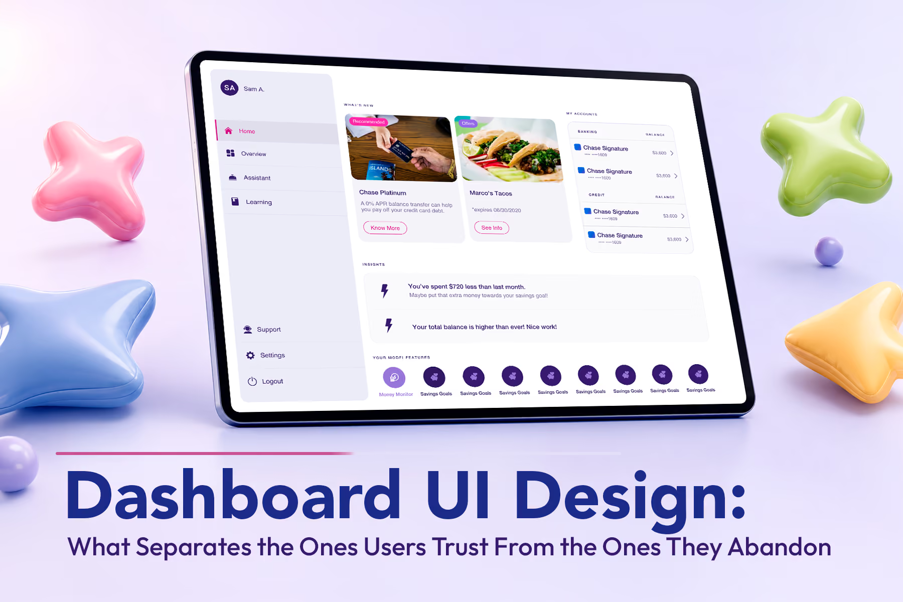
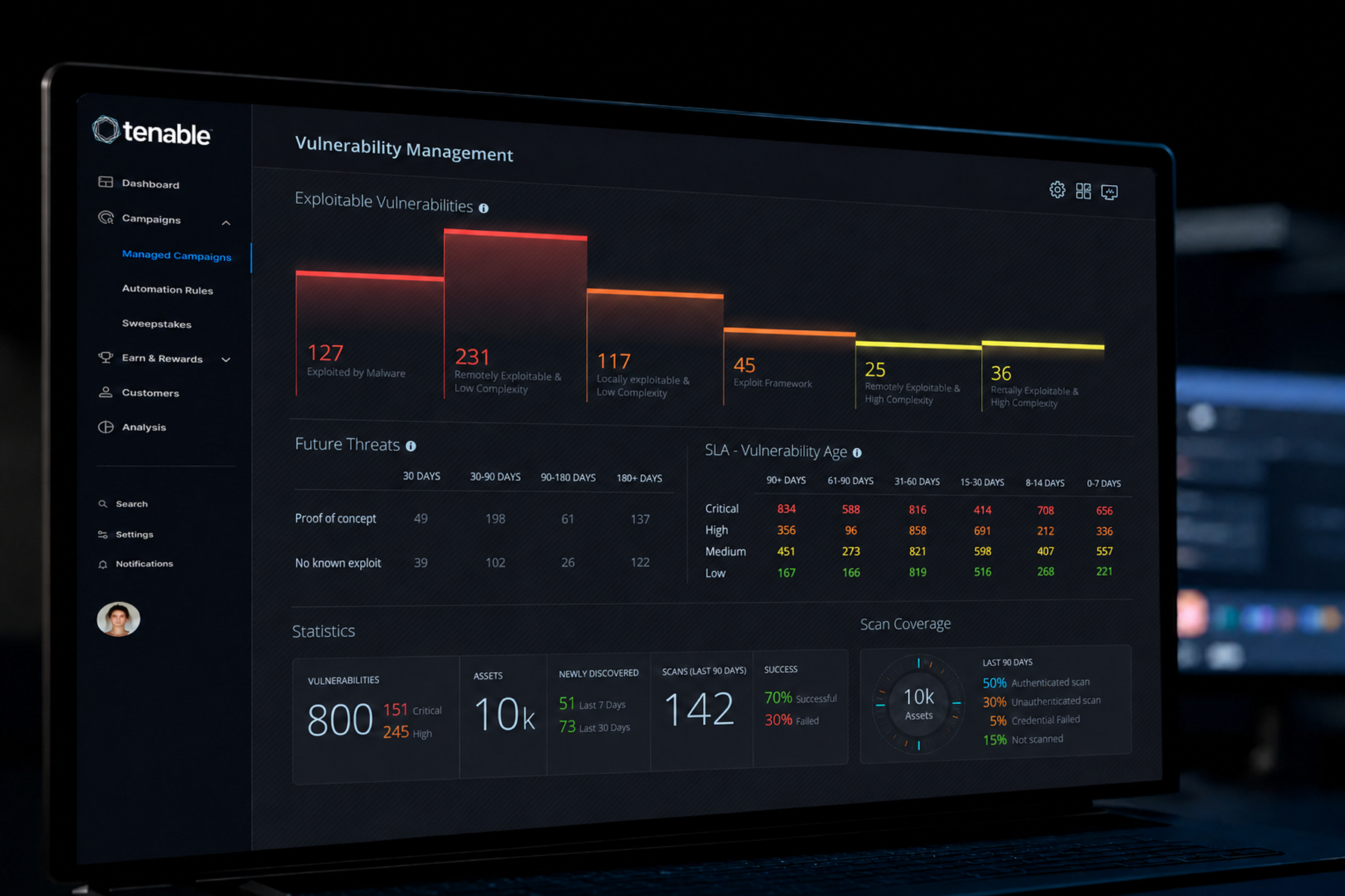
The dashboards Wandr has designed for Tenable, Vectrix, Synchrony, and Modfi each required different answers to these structural questions. What they shared was the process of answering them before opening a design tool.
Final Thoughts
Dashboard UI design is infrastructure. It is not visible in a marketing demo. It does not appear in press releases. But it is the surface that users interact with every day, and it determines whether those users develop the habits of engagement that produce retention, expansion, and advocacy.
The products that invest in dashboard UI as a strategic discipline rather than a visual finishing exercise consistently outperform those that do not on the metrics that matter most to SaaS businesses: activation rate, daily active use, and contract renewal. Getting it right requires starting with the person rather than the data, and maintaining that discipline through every subsequent design decision.
Work With a Dashboard UI Design Team That Starts With the Decision
Wandr designs dashboard UI for enterprise, SaaS, fintech, and cybersecurity products where the interface is the product. If your dashboard is not driving the behavior it was built to support, schedule a free consultation with our team and let us show you where to start.