Optimizing SaaS Dashboard Experience
Unlock the secrets of top-notch SaaS dashboard UX. Learn design ideas and best practices for optimal user experience.

What you need to know about SaaS Dashboard UX, including dashboard design ideas and best practices. Brought to you by WANDR, an award-winning UX design and product strategy firm that specializes in SaaS products.
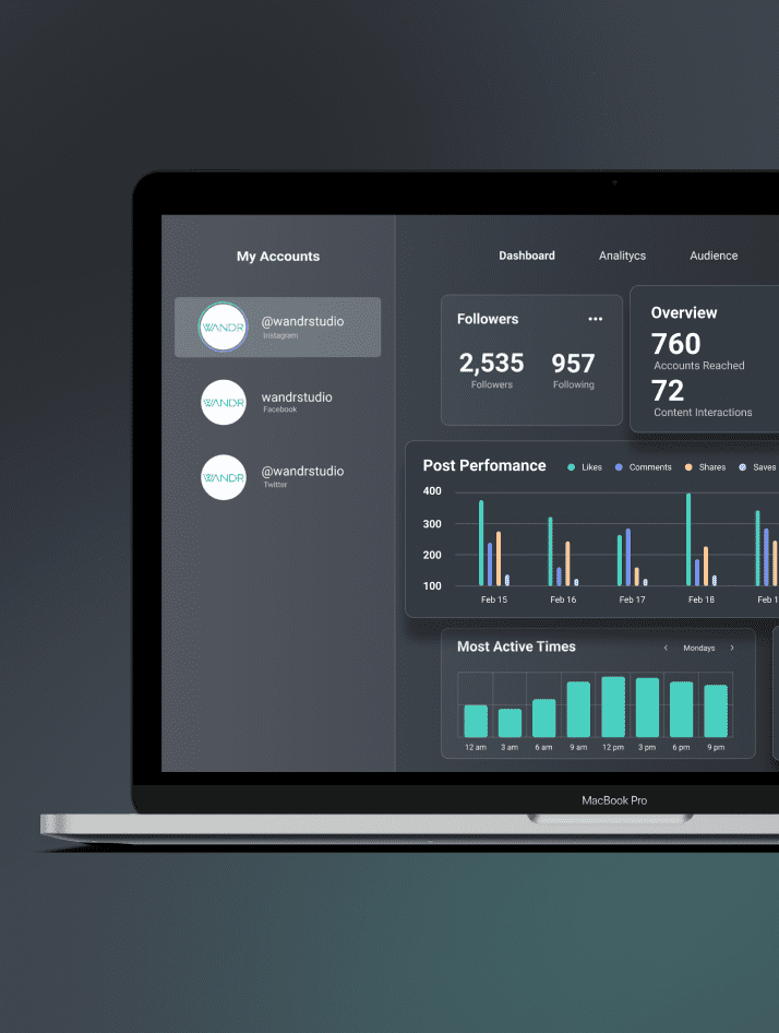
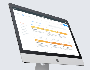
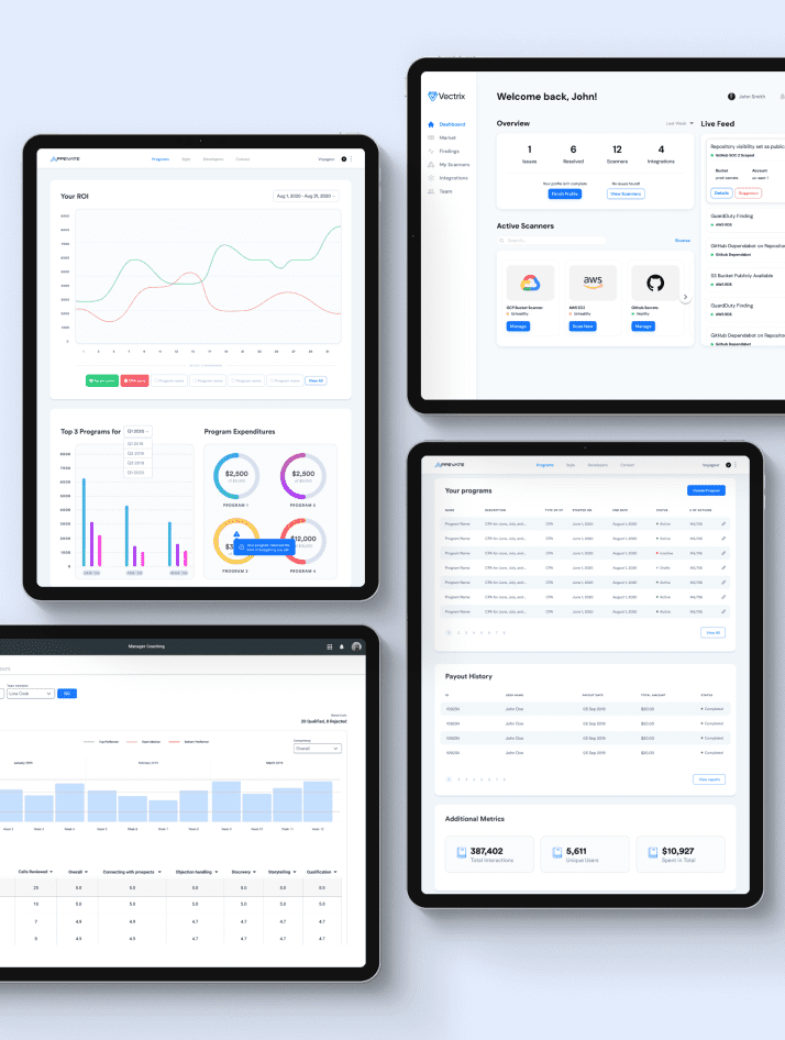
Software as a service (SaaS) dashboards should present users with important data related to your application or software. These users may be customers or an internal team. A great dashboard provides an overview, giving users fast access to the most useful information.
An inferior dashboard UX (user experience) limits customer satisfaction, resulting in lower retention rates, fewer referrals, and even loses customers. It also results in an opportunity cost for your marketing, operating, and product strategies.
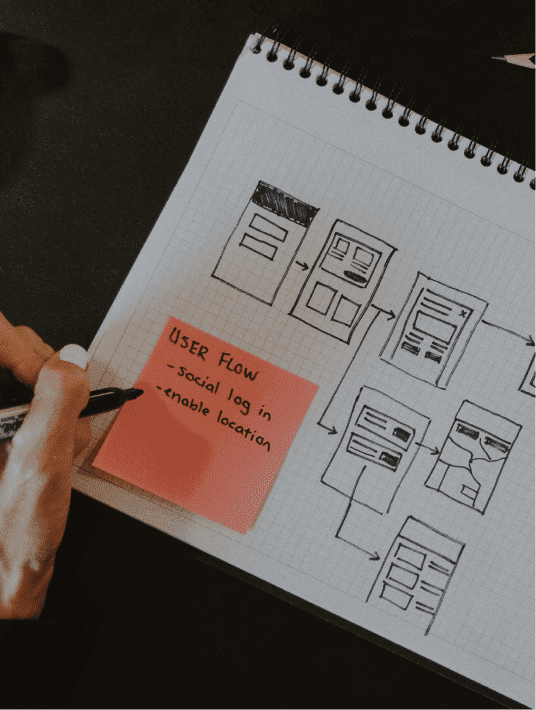
Before getting too far into the planning of the dashboard UX, remember to analyze and research the needs of your users. Find out what information they consider most important and base your dashboard ideas around their requirements.
Here is a closer look at essential dashboard design principles and the latest dashboard UX trends.
4 Key Dashboard Design Best Practices
Before trying to implement dashboard ideas for extra features, focus on the core dashboard design principles.
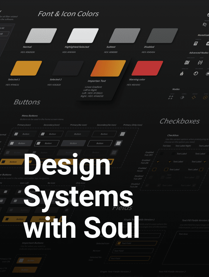
First, what is a dashboard UX? The “UX” refers to the user experience, including ease of access and overall satisfaction with the interface.
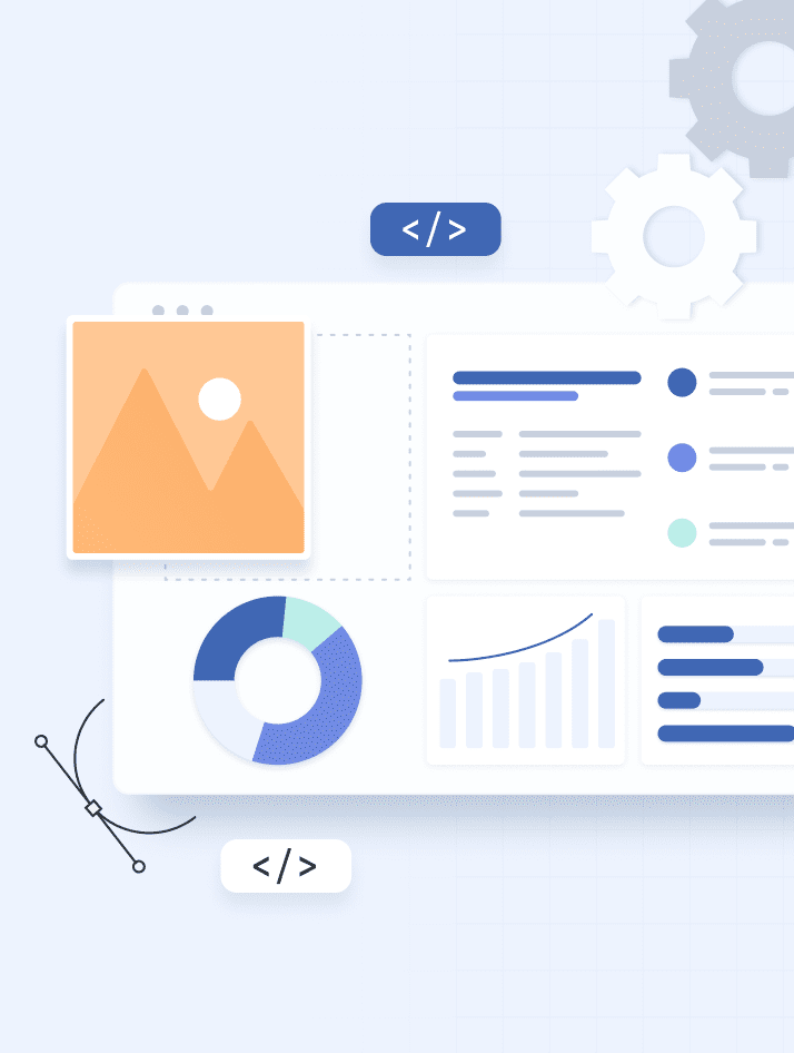
A dashboard is typically a visual display containing relevant data. It consolidates the most important details that your users want to track. To meet these needs, follow the essential dashboard design best practices:
- Analyzing the needs of users
- Using a responsive design
- Using a logical layout
- Providing fast access to data
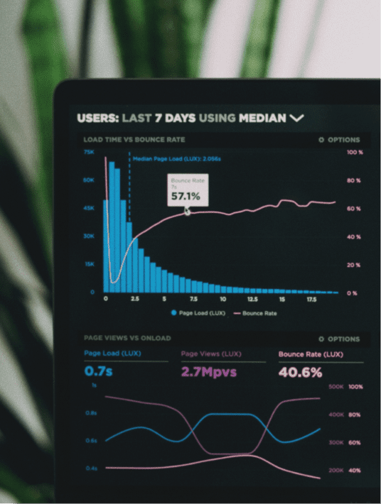
Data visualization is an important part of developing your initial dashboard ideas and framework. In short, the goal of the dashboard is to help users understand complex concepts or data. However, there are multiple types of dashboard UX design:
- Analytical dashboards
- Operational dashboards
- Strategic dashboards
Analytical dashboards present data related to performance trends, such as website or landing page analytics. Operational dashboards track real-time activities related to the daily operations of the business. With strategic dashboards, you create a dashboard UX that tracks specific goals.
Read more about Database Design: Core Concepts & Applications or contact us about our services.
No matter the type of dashboard UX, it helps to follow a few basic dashboard design principles. Here is a closer look at the best practices for delivering a better dashboard UX.
1. Determine the Needs of Your Users
First of all, the most important of the dashboard design principles is to determine the needs of your users. Without an understanding of your users, you may overlook relevant data to include in the dashboard.
Many SaaS businesses utilize customer personas to help gain a better sense of the average customer’s needs. However, the best source of information about the average customer is the customers themselves.
SaaS businesses may employ several techniques to receive input from real users:
- Market research
- Customer feedback
- Usability testing
These solutions are part of the UX research process. Researchers should analyze the market and the industry to determine what features the typical dashboard UX provides. They should also review the most common complaints from users and analyze the competition.
Along with the initial research, it helps to obtain real-time feedback from users. With usability testing, real users help uncover flaws and potential issues.
2. Use Responsive Design for Greater Compatibility
Secondly, a great dashboard UX should work well on any device. To meet the needs of your users, you may need to deliver software that works on different types of screens.
Tablets and smartphones have become increasingly common in the workplace. From warehouses to offices, workers use mobile devices for everyday tasks.
If your users intend to access the dashboard on various devices, use responsive design. A responsive dashboard adjusts to the size of the screen.
Some UX designers also refer to dashboards that offer more user control as responsive.
For example, a responsive dashboard may allow users to adjust the size or layout of the elements. This personalization makes it easier to ensure a quality user experience on any device.
3. Utilize a Logical Layout for Presenting Data
A logical layout is another essential part of a quality dashboard UX. This refers to a layout that presents information in the most compelling manner.
Many UX designers rely on the inverted pyramid to present a logical layout. This best practice started in journalism.
With the inverted pyramid, you divide data into three categories:
- Essential data
- Important data
- Supplementary data
Essential data includes the information that customers want access to most frequently. This may also include data that tends to receive the most updates or data that remains critical to business decisions or operations.
Supplementary data helps provide context for the other metrics. This information is less essential to daily operations.
Important data belongs in the middle. It is not essential, but shareholders or decision-makers may need access to the information occasionally.
4. Provide Fast Access to Relevant Data
Lastly, a great dashboard UX also provides quick access to data. The best dashboard ideas are ineffective without this key principle.
Many UX designers follow the “five-second rule.” After the dashboard loads, users should find the information they want within five seconds.
As mentioned, the logical layout places the most important data at the top. If users need access to supplementary information, they can scroll further down the page.
Depending on the complexity of the dashboard UX, the main dashboard may not contain all information. Additional screens or menus are often used to separate data into different categories.
When utilizing multiple dashboards, maintain consistency. Use the same design and elements for every screen. These additional screens should also be reachable from the main page.
The standard dashboard design best practices recommend keeping every menu within one or two mouse clicks of the main dashboard.
Exploring the latest SaaS Dashboard UX Trends
Along with the dashboard design best practices discussed, consider implementing the latest dashboard ideas and trends.
The most significant trend is the use of artificial intelligence (AI) in the dashboard UX. AI is a big field with many sub-categories, including automation.
Through machine learning, SaaS businesses can use AI to deliver a better customer experience. For example, live chatbots allow businesses to quickly address technical issues and therefore streamline customer service.
AI allows SaaS businesses to deliver a personalized dashboard UX. Based on user interactions, the dashboard adjusts the layout of data. The information that users access most frequently moves toward the top, while less important data is moved toward the bottom.
Optimizing the dashboard and SaaS products with AI is a major trend in this industry, but it may take several years for some of these solutions to become widespread.
SaaS businesses are also increasing their use of thought leadership content marketing. Currently, only about one-quarter of SaaS businesses create and publish content to inform and educate their customers and leads.
In the coming years, more SaaS marketing campaigns are likely to utilize thought leadership content to establish themselves as industry leaders. When presenting this content on a website, following the basic dashboard design principles remains important.
Provide users with a simple layout for exploring or searching for content such as blog articles, case studies, and white papers.
Follow Dashboard Design Best Practices & the Latest Trends
Creating a quality dashboard UX starts with a closer look at the needs of your users. However, some of the best dashboard ideas include innovative features like AI. To stay up to date with these trends, turn to peers’, competitors’ products, or hire product experts to do it first.
Ultimately, UX designers should both focus on the standard dashboard design best practices, while constantly looking ahead to deliver fresh solutions.

What is your favorite SaaS Dashboard UX Best Practice?
Drop a comment below or post on social media LinkedIn, Instagram, Facebook, or Twitter.