5 Common UX Mistakes Startups Make
Avoid the most common UX mistakes startups make, including focusing on aesthetics over functionality and waiting for perfect UX, for smoother growth.

It is common knowledge that starting anything will come with a variety of ups and downs, and this can’t be stated enough when it comes to starting a business. When beginning a startup, the risks are often loud and clear, but understanding what you can focus on to make your target audience happy can lead your startup to success.
Something that often goes overlooked when creating a startup is a well-designed UX, emphasizing that your customers have a positive experience in using your product.
Poor UX can damage a business, while quality UX can transform it.
Let’s dive into the most common mistakes startups usually make and how to avoid them.
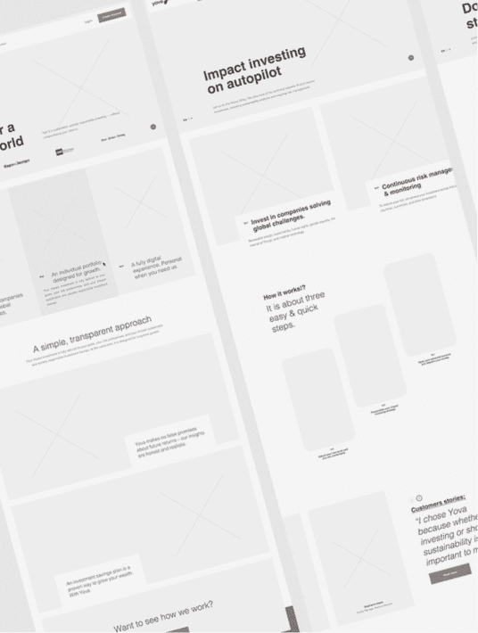
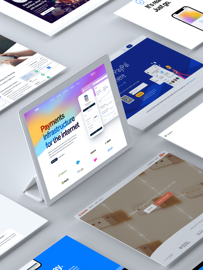
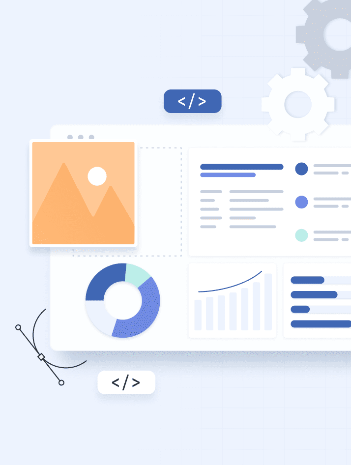
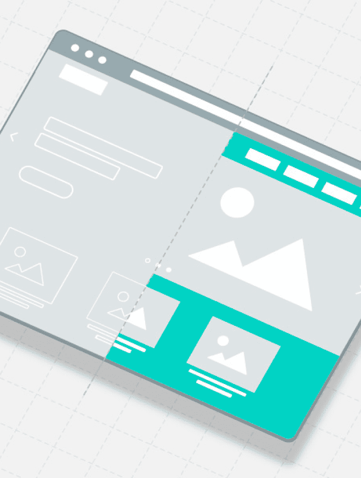
Inconsistency in the Design
When designing a product it’s easy to get carried away by the vast number of options and design trends in the current market. Although it’s good to have some sort of variety of trends and design variations within your product, when you include too many, your design ends up looking inconsistent. This can lead your product to look unprofessional or at times chaotic, and at times this can complicate the user experience.
By using the right design, you can significantly improve the user experience. Invest in a consistent interface design where the elements and user interactions act and look the same. Users will be able to browse through your product with ease, and it’s known that familiarity and simplicity allow users that ease in usability.

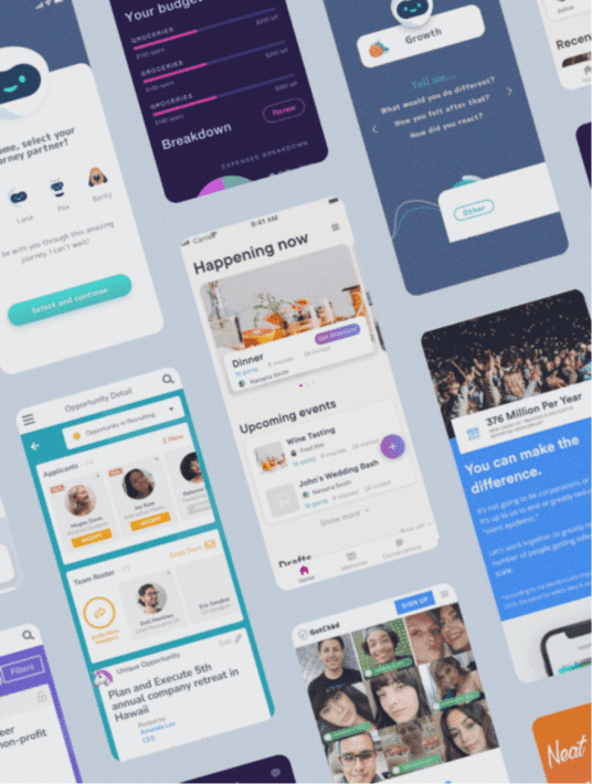
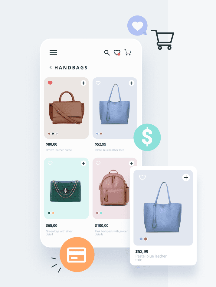
Focusing on Aesthetics over Functionality
It’s crucial to realize that an optimized website = balance.
What do we mean by this? When you have a website that is designed in such a way that focuses on functionality, users can easily navigate through a product without hassle or frustration.
Aesthetics are important; however, this should never override the functionality of the site. While a beautiful and aesthetically pleasing product is nice to the eye if you forgo the site’s functionality, your users will be unhappy no doubt. They can appreciate aesthetics, but once they begin to actually use the site and it falls short of functional expectations, there is no reason for users to stay.
Startups need to emphasize the first impression they make on users, and when a site is optimized for the best use, your users will keep coming back.

Unclear Value Proposition
Startups need to capture the audience’s attention right away. Users have many options when it comes to goods or services, and if you can’t capture their attention at first glance, you can lose many of your audience. This is where the importance of designing with a clear value proposition, will make all the difference.
The use of a clear value proposition gives the opportunity to convert a new user into a customer interested in your product or service. Essentially, you’re telling the customer right up front how they can benefit from your product; as a result, they should be able to understand the intention behind your brand.
As they say sometimes “short and sweet”, is the best methodology when creating a value proposition, but ensuring that it is clear and concise is a critical factor in that. When the value proposition is unclear, users will go elsewhere to find their answer quickly.
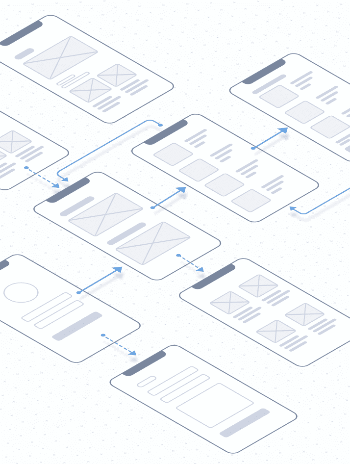
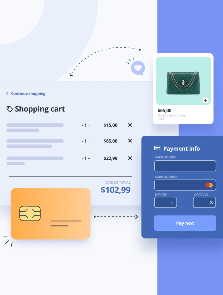
Unresponsive Design
Good UX is responsive design. When a design is unresponsive, you lose out on prospective customers. What is considered an unresponsive design? This could be an application that lags, an interaction that simply doesn’t work, and a variety of issues that prevents users from browsing your application with ease. Often this is common when users access the mobile versions.
Ensure your website is adaptable to the device being used to access it. A responsive design will help your customers easily switch between devices to accomplish their goals, and stay on your application for long periods of time.

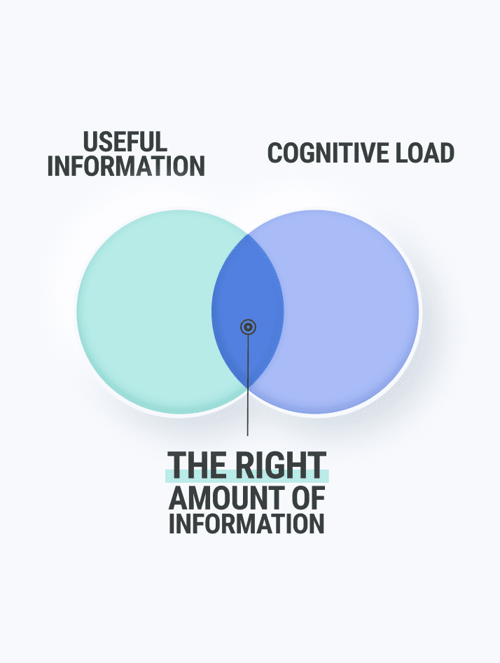
Waiting for Perfect UX
Don’t wait too long to launch your website or app. When companies wait for the “perfect UX” or let all issues hold them back from being put into the market, they miss out on opportunities to gain insight or move forward with a product. Being a perfectionist at times can serve well, if companies wait too long for certain releases they can miss out on potential customers or not meet trending timelines that could lead to higher success rates.
It’s important to continually work to improve the user experience as you get valuable feedback from your users. It’s fine to be cautious before launch, but when a product can receive real critique from actual users the product will only continue to grow into the best version it can be.

Takeaway
In knowing these 5 common UX mistakes startups often make, you can avoid them and ensure your startup makes the most informed decisions throughout the continuous rollercoaster that is owning a startup. Through the highs and lows of any project, startups have the unique quality of being able to build something from the ground up. Paying close attention to details and how things are done throughout the startup process allows you to follow the best path forward and reach that success.
Do you have a product vision, but don’t know where to begin?
Develop your new idea in a 4-week timeline with the Startup Bootcamp!
Book a free consultation call with our team, here.
What Questions Do You Have About UX mistakes startups make?
Let us know in the comments below.
Talk to us on LinkedIn, Instagram, Facebook, or Twitter.