UX Design In Banking And Fintech
Learn how poor UX design in banking led to costly mistakes, and discover strategies to tailor UX to different generations and leverage financial psychology.
User experience has become a significant factor for customers when choosing banking and Fintech enterprises. Therefore, it has become vital for banks and other fintech firms to create a digital product that fulfills the needs and expectations of their end users while ensuring it offers all the banking capabilities required. Banking UX design inevitably involves complicated components; however, businesses need to ensure that customer experiences are not broken because of them.
In this blog, we'll discuss the importance of banking UX design, the strategies and challenges involved in UX design, and the different financial psychology principles design and product teams should utilize while developing fintech products.
Importance of UX Design in Banking and Fintech
Let's understand why UX design research is critical for banking and fintech businesses with an example. Poor UX and usability cost Citibank nearly $500 million in August 2020.
Citibank intended to disburse around $8 million in interest payments to several lenders on behalf of Revlon Inc. Instead, Citibank unintentionally sent $900 million to Revlon's lenders — almost 100 times the original amount.
While some lenders did return the money, many did not. Citibank filed a lawsuit to try and get back the funds; however, it still hasn't received roughly $500 million from financial advising businesses.
Here's what the actual UI for the transaction looked like:
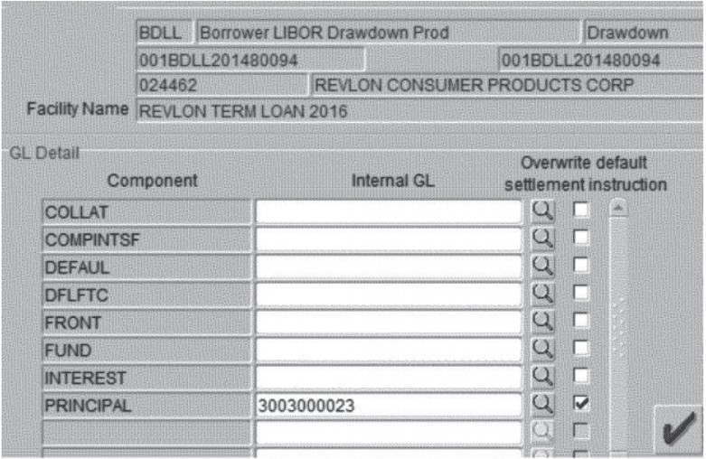
The subcontractor had to check the principal, fund, and front components and copy-paste the Citibank wash account number into the other two fields. However, the subcontractor assumed that simply checking the 'principal' field and entering the Citibank wash account number would ensure that the principal amount would stay at Citibank.
In this scenario, a simple 'Are you sure you want to proceed' pop-up to validate the step and clarify the exact outcome could have prevented this blunder. Several banking and finance enterprise tools are built with zero UX research, leading to such expensive mistakes.
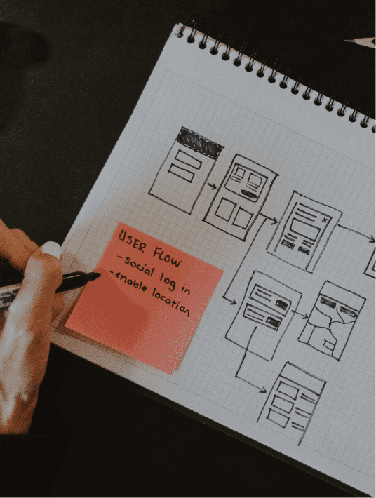
Fintech and Banking UX Design Strategy and Challenges
Fit Banking UX to millennials and older generations
Designing your banking platform focusing primarily on Gen Z is a huge mistake. People of all ages have started utilizing digital banking solutions in this post-COVID world. Banking applications that are centered around the younger generation can alienate the older generation.
Gen Zs were born and raised with social media and technology and can quickly adapt to digital banking. They expect personalized and frictionless experiences and have no issues changing banks if their needs aren't being fulfilled. Therefore, the financial sector may make the mistake of developing cooler features to cater to this audience.
However, even though the younger generation is a growing customer base for banks, it's not good to overlook the vast population of older customers who may have stayed with the bank for years.
While the older generation may have lacked the technical ability or preferred to speak directly to a real person, things have changed during the course of the pandemic. COVID-19 has all but forced everyone to learn how to use online services, which has steadily increased the number of people leveraging online banking.
Therefore, banks need to build online systems that meet the needs of the millennials and the older customer base without alienating the younger generation.
Practice Financial Psychology
While usability testing and user research are important factors when it comes to fintech and banking UX design, they aren't enough. Product and design teams should leverage financial psychology principles while creating different product features. Financial psychology allows designers to ask the right questions during user research and derive the right conclusions while analyzing research data.
From the best way to design navigation menus to the architecture of the banking platform, financial psychology can answer a lot of questions. While you can spend your time and effort A/B testing small elements like the size of your text and the color of your buttons, they would only have a small impact on your conversion rate.
Financial psychology allows designers and product managers to gain an in-depth understanding of how their end users think and what they're expecting from you.
Let's take a deeper look at how financial psychology can be used to create excellent banking UX design strategies.
The Importance of Financial Psychology for Good UX
Designers need to recognize that psychology plays a massive role in the banking UX design process. It's critical to analyze how your users will respond to the different elements on your site. Let's take a look at a few psychology principles that can help you design better products and create a more seamless experience for your end users.
1. Rely on mental models
Design teams and end users may not look at a project the same way. While design and development teams may want to be innovative and original, it may not be what the target audience is looking for.
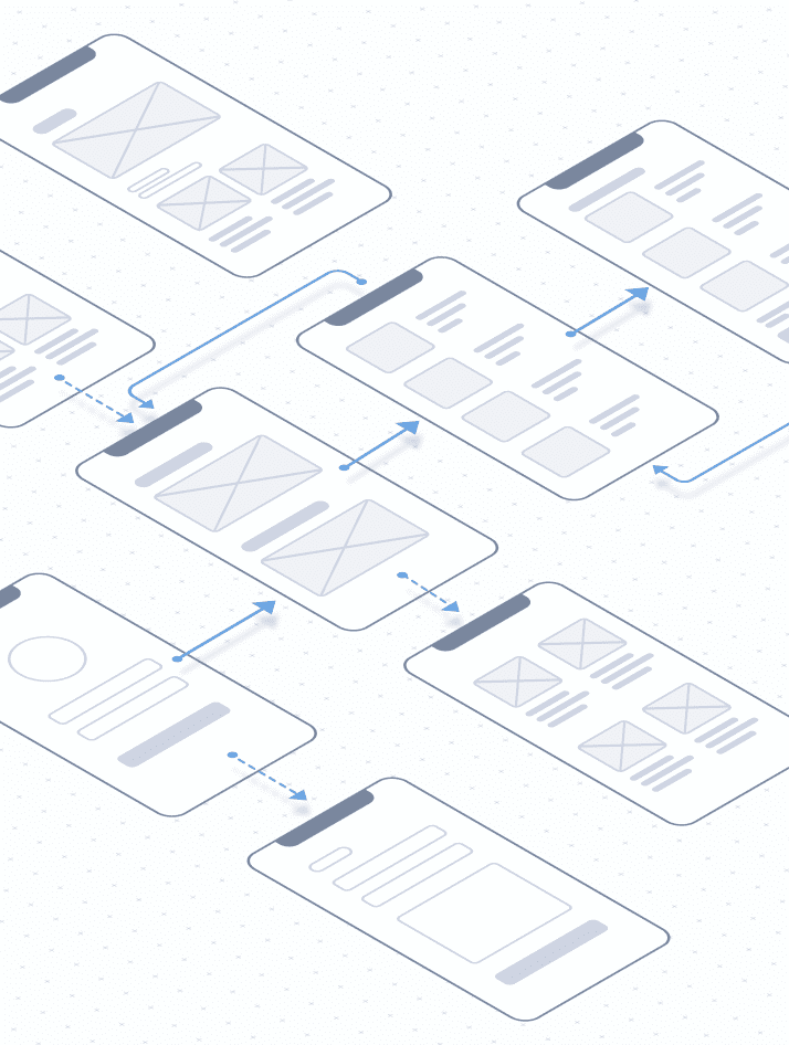
Every time people pick up a new product or explore a new feature, they approach it based on systems they're already familiar with. The belief that users have about how a product or system should operate is called a mental model. A mental model symbolizes the user's thought process for how a website, mobile application, or any digital product should work.
People form mental models of how certain products are intended to work when they use the many applications available on the market. As we'll see later in Jacob's law, people will transfer the expectations they have from one product to another when they seem to be similar to each other.
When people use a new banking platform, they refer to the other banking applications they've used in the past to streamline their interaction with the new platform. They have expectations about where they can check their balance, how to download their bank statement, and the easiest way to transfer money from their mobile application.
People's past experiences and prior knowledge influence how they perceive new banking products. Therefore, when it comes to banking UX design, teams need to uncover their target audience's mental models.
It's critical for design and development teams need to somewhat match the interactions and the architecture of other top banking applications to ensure the users are comfortable using their digital product. Leveraging mental models will help them make UX design decisions that will make the experience more engaging and intuitive for your end users.
2. Follow Jakob's Law to ensure consistency
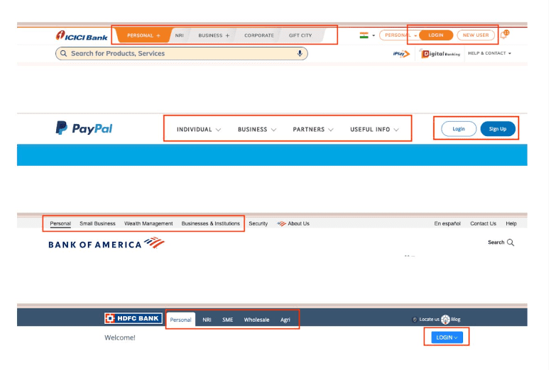
According to Jacob's Law, people spend the majority of their time on other websites. Therefore, users prefer your website to function similarly to other websites they are already familiar with. Users often project their expectations from one well-known product onto another within the same niche or industry.
For example, there is a reason why most of the top banking websites have Personal/Business type categories and the Login/SignUp option right at the top within the header section.
By making use of pre-existing mental models, we can design better user interfaces that let users focus primarily on what they need to do rather than spending time learning how your website functions.
Top websites refrain from introducing entirely new features and functionalities because people naturally resist change. Introducing new experiences creates friction that could make your customers less likely to use your product since it forces them to learn things they aren't familiar with.
If you're rebranding or redesigning your website, there is a chance that your visitors may be disoriented by the changes on your site. Therefore, if you're making such major changes to your website, allow users the choice to switch back to the older version for a short while to reduce friction.
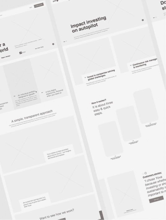
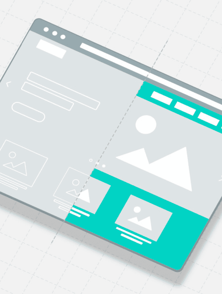
3. Organize UI Elements according to Gestalt Psychology
Users want simple, elegant, and intuitive banking UX designs. It doesn't take users longer than a few seconds to determine whether they find a website visually pleasing or not. Research has shown that when designers include a plethora of elements within the product design, it increases the complicated nature of the product, which has a direct impact on how visually appealing users find the product.
Aspects like visual appeal, simplicity, and an overall sense of harmony have a significant impact on how trustworthy people perceive banking applications. If any of these elements seem out of place, people will struggle to manage their finances on a platform they don't find trustworthy.
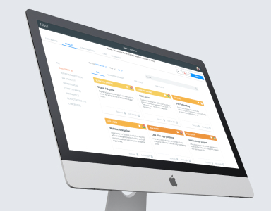
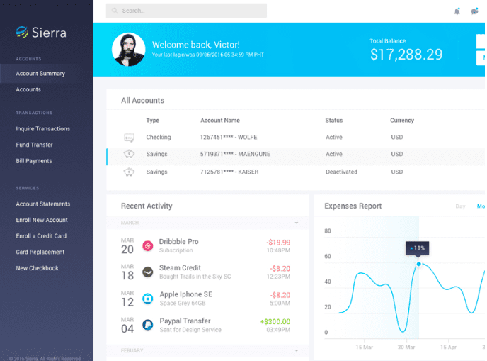
According to Gestalt psychology, people look at the whole picture and how different elements come together rather than isolated components. Here is an example of a well-organized financial application interface that instils a sense of harmony within the end-user when they use the software.
It focuses on the human behavior of grouping things together and has a set of principles that designers can leverage while creating banking UX design strategies.
There are five principles or laws of Gestalt theory.
1. The law of proximity.
According to the law of proximity, elements that are placed close together seem more related than components that are placed farther away.

2. The law of similarity
The principle of similarity states that people will group similar elements and interpret them to have the same functionality. Studies suggest that people tend to find simple correlations within complex scenarios to prevent information overload. Banking UX design strategies that reduce the mental effort required by end users are more engaging and effective.
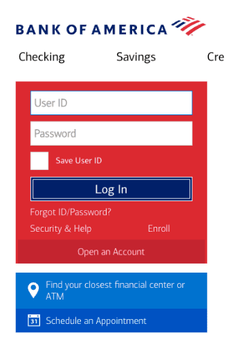
For example, in the login form below, people tend to group the email and password fields because they are designed similarly. However, even though the text fields and the login button have the same size, people can identify that the login button has a different functionality because of its color.
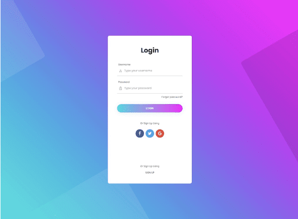
Furthermore, the social media icons can be grouped together based on the same principle.
3. The law of common-region
This law is similar to the law of similarity. According to the law of common region, elements that are located within a single closed region are grouped together by the users.
Even if several data sets are placed close together in the above example, the common closed region makes it easy for users to recognize data that can be grouped together.
4. The law of focal point
This principle is quite straightforward — any element that visually stands out will grab the user's attention first. The most common example of leveraging the law of focal point in UX banking design strategy is the login or sign-up button.
5. The law of continuity
Design teams leverage the law of continuity to ensure their users smoothly interact with their digital product. According to the principle of continuity, components that are arranged in a single line or a curve showcase a strong sign of connection
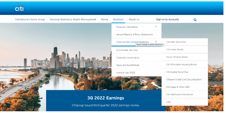
For example, the navigation CITI bank offers on their website makes it easy to understand the primary and secondary navigation and understand how they are related.
6. Hick's Law — The paradox of choice
Hick's law, or the Hick–Hyman law, is one of the most straightforward laws to understand. It states that the time users take to make a decision significantly increases with the number and complexity of choices offered to them.
Overwhelming people with a plethora of choices increases the amount of time it takes for them to make decisions. Therefore, while building your banking UX design strategy, ensure that you simplify choices for your end users by breaking down complicated tasks into smaller ones. A good example is listing similar items under a single category within the menu section.
Simplifying complex tasks and minimizing the choices they have significantly affects their response times. You can go one step further and highlight options that are recommended to make it easier for them to make decisions.
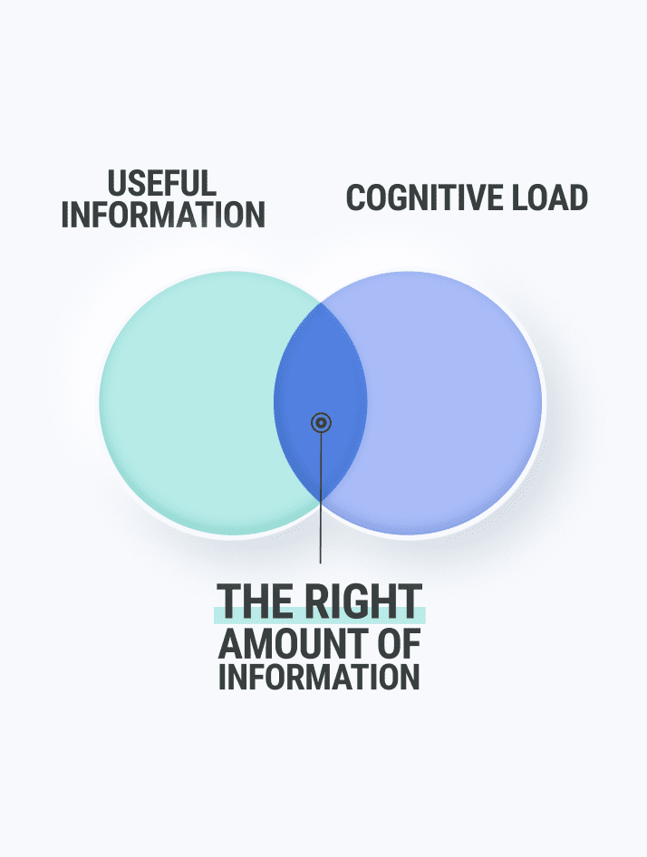
Use progressive onboarding to minimize cognitive load for new users. For example, transferring a huge amount via bank transfer can include three smaller steps or checkpoints: Enter account details > Payment > Confirmation.
Shorten long lists and eliminate unnecessary fields, tags, links, images, buttons, and more wherever possible. However, if you have to include long lists with a plethora of fields, break it down. Only show a handful of fields at a time and let them progress through the pages as they fill out the form.
First, this doesn't overwhelm the user. Second, there is a lower potential for your users to quit in the middle, and the progression makes them want to see it through to the end.
A good example of this situation is when users want to open a new account.
Final Thoughts
UX design is crucial for banking and fintech businesses. While UX design mistakes can simply be stepping stones to a better design for other companies, UX design errors in the fintech sector can be expensive.
In this blog, we've discussed why UX design is important in banking and fintech, the strategy and challenges of UX in these industries, and the importance of leveraging financial psychology while designing banking products.
If you're looking to build a financial product, WANDR can help you leverage the power of good financial UX design. Book a free consultation and get in touch with our experts at WANDR today!