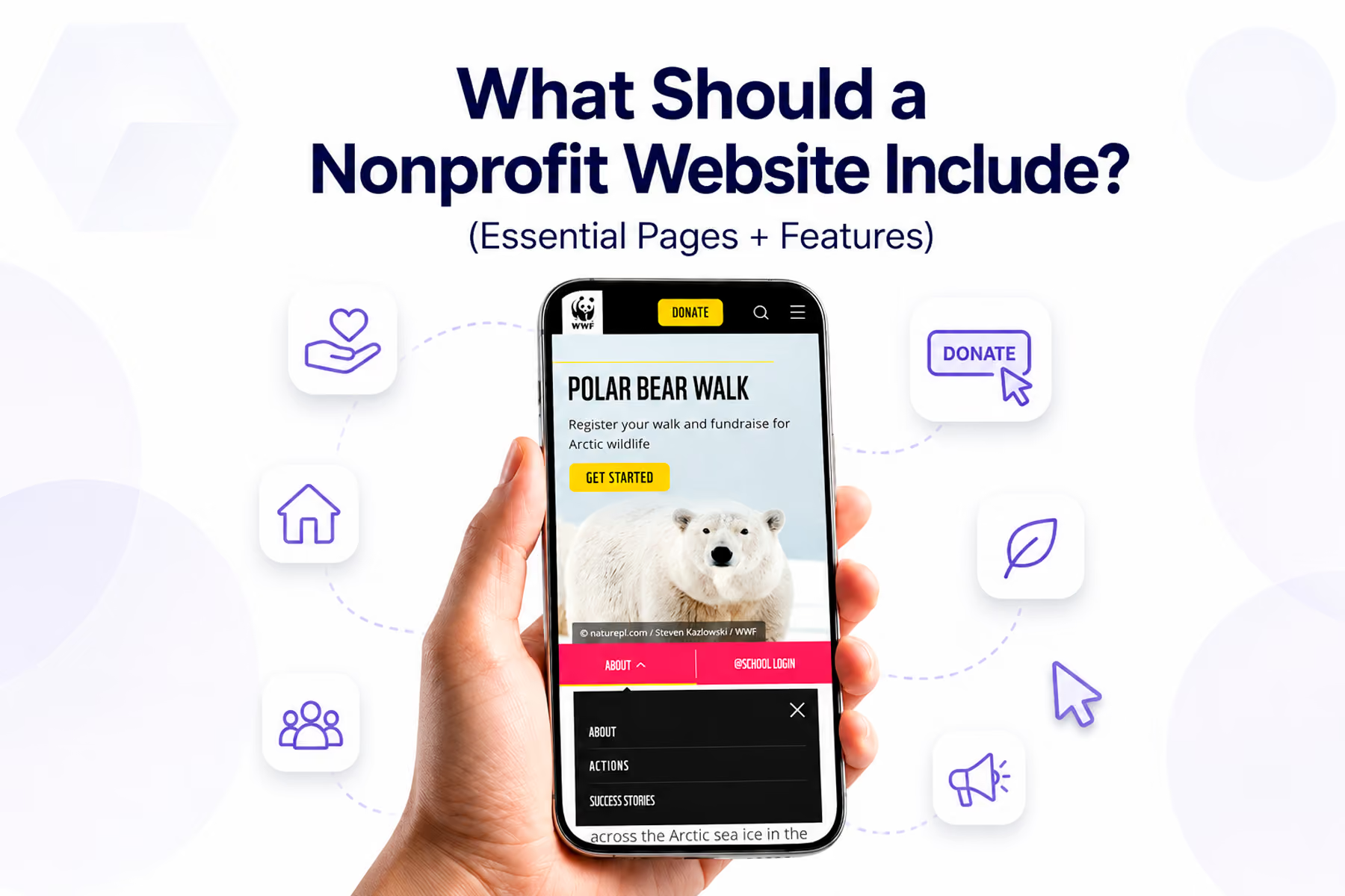
Ask ten people what a nonprofit website needs and you'll get ten different lists. Ask us, and we'll give you the one shaped by auditing dozens of nonprofit sites and seeing: specifically, measurably: which elements move the needle and which are just clutter.
This isn't a list of "nice to have." Everything here earns its place.

The Non-Negotiables
1. A Clear, Mission-Forward Homepage
The homepage has one job: get the right person to the right place as quickly as possible.
This means:
- A headline that states what you do and who benefits: specifically, in one sentence
- Navigation organized around user goals, not organizational hierarchy
- A primary CTA visible without scrolling
- At least one credibility signal above the fold (impact stat, trusted partner logo, media mention)
- A secondary path for each of your other primary user types
What it doesn't mean: telling the full organizational story above the fold. That's what the About page is for.
2. An About Page With Real Information
The About page is where first-time visitors come to decide whether to trust you. It should include:
- Your mission statement (specific, not generic)
- Your history and founding story (briefly)
- Your team: named, photographed leadership builds more trust than "Our dedicated team"
- Your legal and fiscal status (501(c)(3) confirmation, EIN if you share it)
- Partner organizations and affiliations
What often makes About pages ineffective: generic mission statements that could belong to any organization ("We believe in a better world"), stock photography of people shaking hands, and team sections with no names or faces.
3. A Programs / What We Do Section
This is where you explain the actual work: not the vision, but the reality.
Each program deserves its own page or section with:
- What the program does, specifically
- Who it serves
- How it works (what happens when someone engages?)
- Verifiable results (numbers, not just sentiment)
- A clear next step for interested parties
4. A Donation Page Built for Conversion
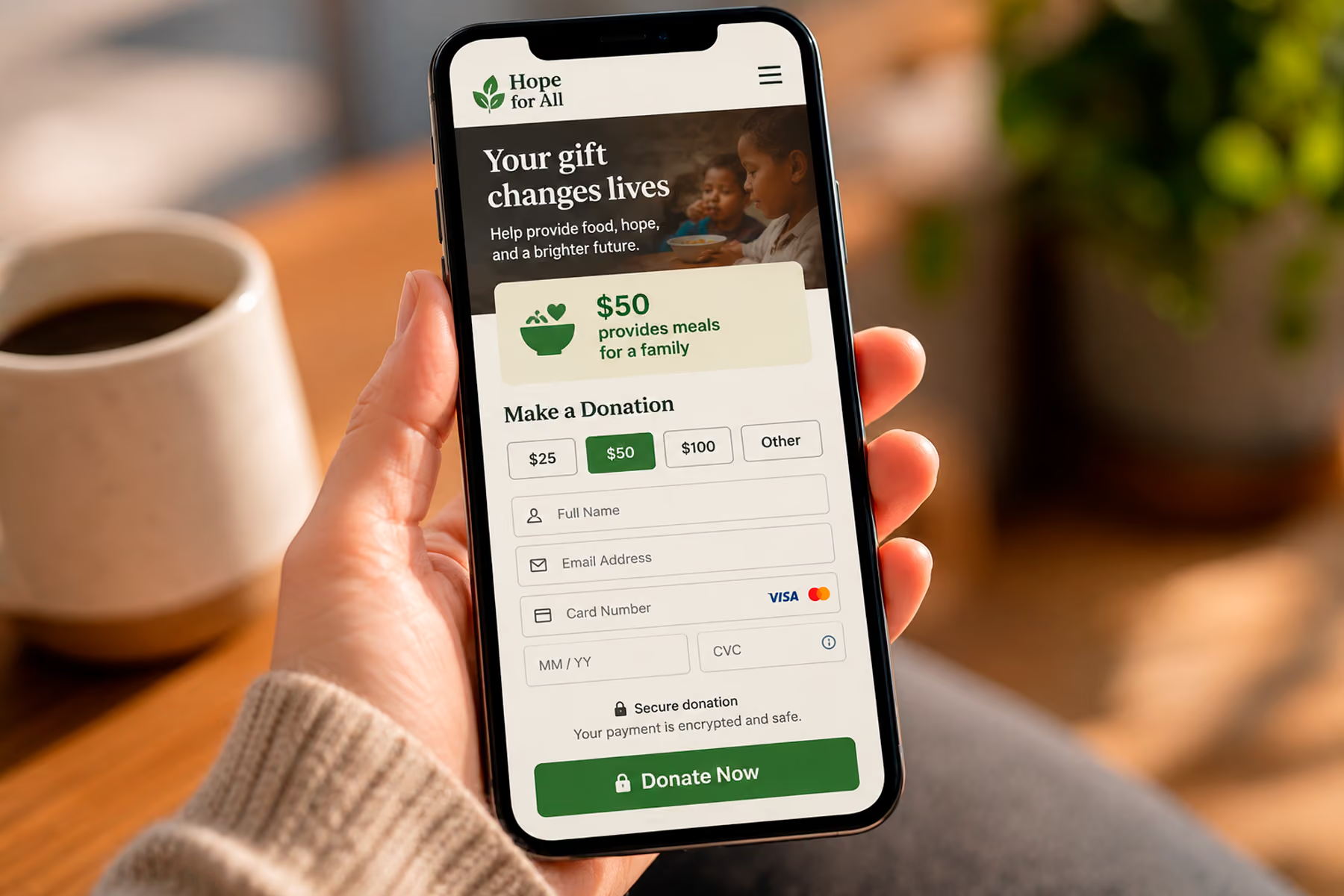
The donation page is the highest-stakes page on most nonprofit websites. Its design should be driven by one question: what's the shortest path from "I want to donate" to "thank you for your donation"?
Essential elements:
- Simple form (name, email, amount, payment: that's it)
- Impact statements tied to specific donation amounts ("$50 provides...")
- Security indicators near payment fields
- Recurring donation option surfaced naturally (not forced upfront)
- Mobile-optimized: test this specifically
- A warm, specific confirmation page that reinforces the impact of the gift
What kills donation page conversion: too many form fields, too many decisions before payment, generic copy, broken integrations, and a bare PayPal button doing the job of a real donation form.
Related: How to Design a Nonprofit Website That Increases Donations →
5. A Get Involved Page
Donors are one user type. You likely also need volunteers, corporate partners, advocacy supporters, newsletter subscribers, and event attendees. The Get Involved page (or section) is where everyone who wants to engage: but isn't ready to donate: finds their path.
Each engagement type should have:
- A clear description of what's involved
- Specific requirements or expectations
- A friction-minimal application or sign-up process
- A real person or team to contact with questions
6. An Impact / Results Page
This is the most underdeveloped page on most nonprofit websites, and one of the most important.
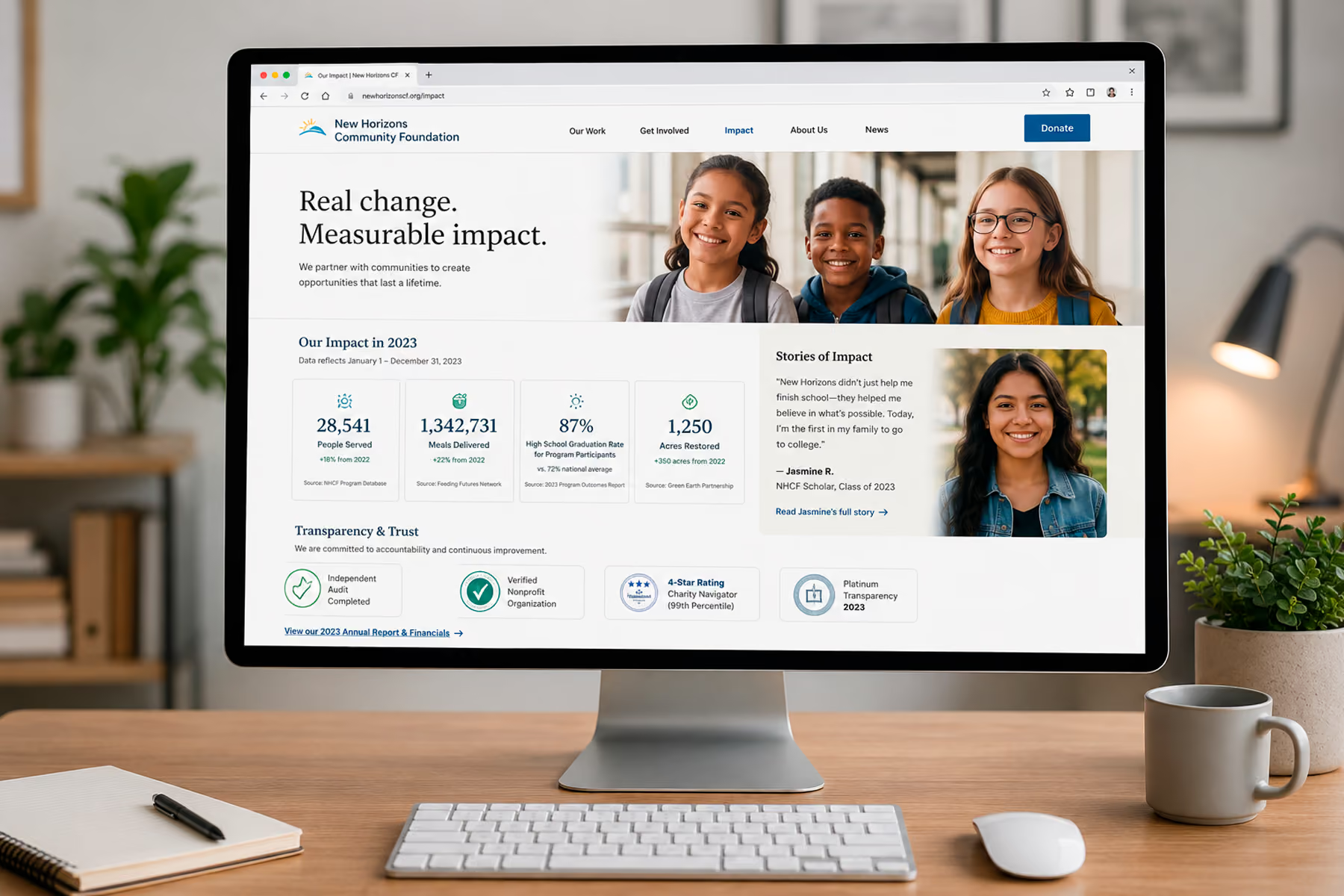
Potential donors, corporate partners, and grant funders all have the same question: does this organization's work actually produce results? The impact page answers that question with evidence.
Effective impact sections include:
- Specific, current, verifiable numbers ("4,200 animals rescued last year" not "thousands of animals")
- Before-and-after stories with real beneficiaries (with permission)
- Third-party validation (independent evaluations, media coverage, watchdog ratings)
- How donations translate to specific outcomes
7. A Blog or News Section
This one often surprises people. Is a blog really essential?
For SEO purposes, yes: it's one of the highest-value things a nonprofit website can have. Fresh, relevant content signals to search engines that the site is active and authoritative. It's how you rank for the informational queries that bring new supporters to your organization for the first time.
The blog doesn't need to be a daily publication. Two to four well-written posts per month, covering topics your audience genuinely searches for, will compound meaningfully over time.
Related: Nonprofit Website SEO: How to Get Found Without a Big Ad Budget →
8. A Contact Page That Works
This seems obvious, but we've audited nonprofit websites with broken contact forms and email addresses that bounce. Your contact page should have:
- A working contact form (test it regularly)
- A real email address
- A phone number if your organization answers calls
- A physical address if relevant to your programs
- Response time expectations ("We typically respond within two business days")
Features Worth Including
Donation Widgets in Context
Don't limit donation prompts to the donation page. A donation CTA in the sidebar of impact stories, embedded in program pages, and accessible from the navigation: wherever a supporter's motivation is highest: outperforms a single isolated donation page.
Email Newsletter Sign-up
An email list is a direct line to your supporters that social media algorithms can't interrupt. A simple sign-up: name and email, nothing more: should be accessible from every page, typically in the footer and embedded naturally in relevant content.
Social Proof Throughout
Testimonials, endorsements, media logos, partner logos, charity ratings (Charity Navigator, GuideStar/Candid): these should appear throughout the site, not just on a dedicated "testimonials" page.
Accessible Design
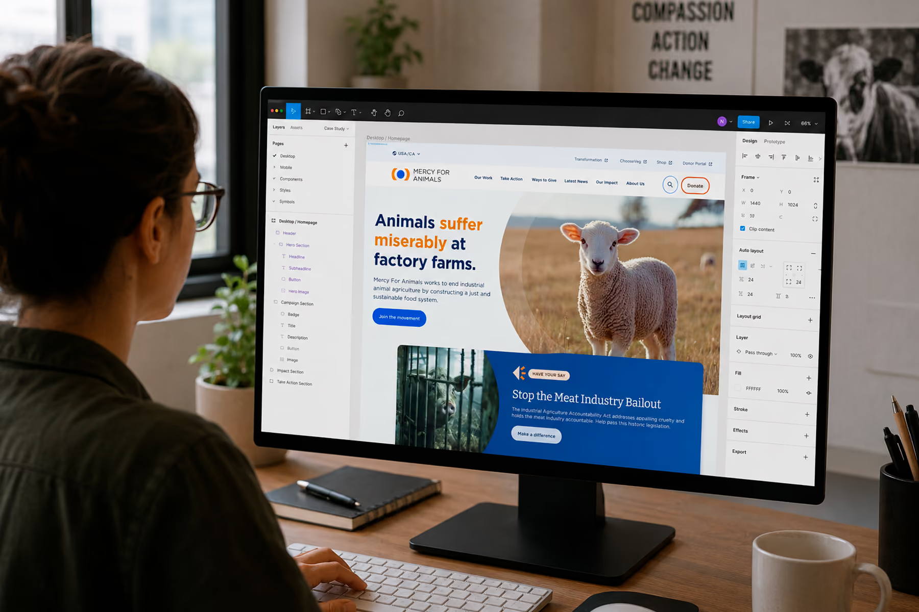
WCAG 2.2 AA compliance at minimum (the current version of the standard — 2.1 was superseded in late 2023). This means proper color contrast, alt text on all images, keyboard navigability, screen reader compatibility, and accessible forms. For Mercy For Animals, we achieved full accessibility compliance: and it made the site better for everyone, not just users who needed it.
Related: Nonprofit Website Accessibility: ADA Compliance for Mission-Driven Orgs →
Privacy Policy and Terms
Required for any site collecting personal information (which every nonprofit website does through donation forms and newsletter sign-ups). Standard templates are available, but they should be reviewed for accuracy to your specific data practices.
What Not to Include
A donation page that requires account creation Any unnecessary friction before donation is money left on the table. Require as few steps and as little information as possible.
Auto-playing video or audio It's disruptive and drives users away. If video is important (and it often is for nonprofits), make it opt-in.
Too many social media feeds Live social feeds look dynamic but often load slowly, display unpredictable content, and send users away from your site onto platforms with their own algorithm-driven distractions.
Dense FAQ sections on the homepage FAQs have their place: but hiding answers to important questions in an accordion on the homepage suggests the content architecture isn't doing its job.
Multiple competing CTAs When three things are equally prominent, nothing is prominent. Every page should have one primary CTA.
The Checklist
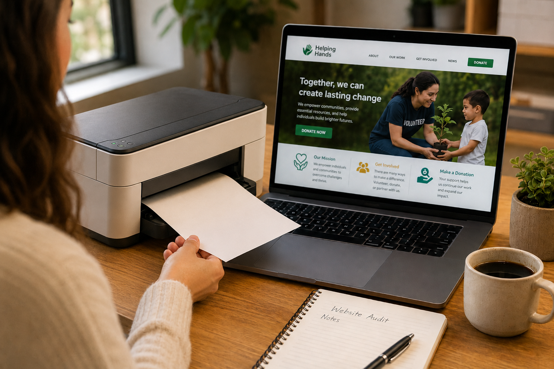
Print this out and check off your current site:
Pages
- Homepage with clear mission, primary CTA, and credibility signal above fold
- About with named team and organizational details
- Programs / What We Do with specific program descriptions
- Donate with simple form, impact statements, and mobile optimization
- Get Involved with paths for volunteers, partners, and advocates
- Impact / Results with specific, current, verifiable outcomes
- Blog / News with regular, SEO-relevant content
- Contact with working form and real contact information
- Privacy Policy
Features
- Donation CTAs accessible from all major pages
- Email newsletter sign-up in footer and contextually
- Social proof (testimonials, partner logos, media mentions) throughout
- Accessibility compliance (WCAG 2.2 AA)
- Mobile-optimized across all pages
- Google Analytics and Search Console configured
- Donation platform tested end-to-end on mobile
How many of these can you check off?
Ready to get everything on this list working? Book a free diagnostic →
Wandr builds nonprofit websites that include everything above: and nothing that doesn't earn its place. See our work →