Reading Time:
4 minutes
Category:
B2B
A focused guide to four practical website improvement tips for 2022 that help businesses create more personalized, inclusive, and visually engaging digital experiences that keep users coming back.

A focused guide to four practical website improvement tips for 2022 that help businesses create more personalized, inclusive, and visually engaging digital experiences that keep users coming back.

Spring is here! But have you checked on your website? Maybe it’s time to improve your website and we have some tips that could be just what your website needs in 2022.
Whether your customer is viewing your site for the very first time or for the 10th time, it’s beneficial to customize their experience. Utilizing collected data, a business can recommend products, videos, and various other content to their users or create a customized homepage for each individual customer gives them a somewhat home base to go back to as they browse through your website.
In personalizing their experience using data we can even reach potential customers. In Ecommerce, this is especially beneficial when you can provide a customer with what they seek without them having to actually go and search for it. Essentially you are predicting their preferences for them to create an impactful experience.

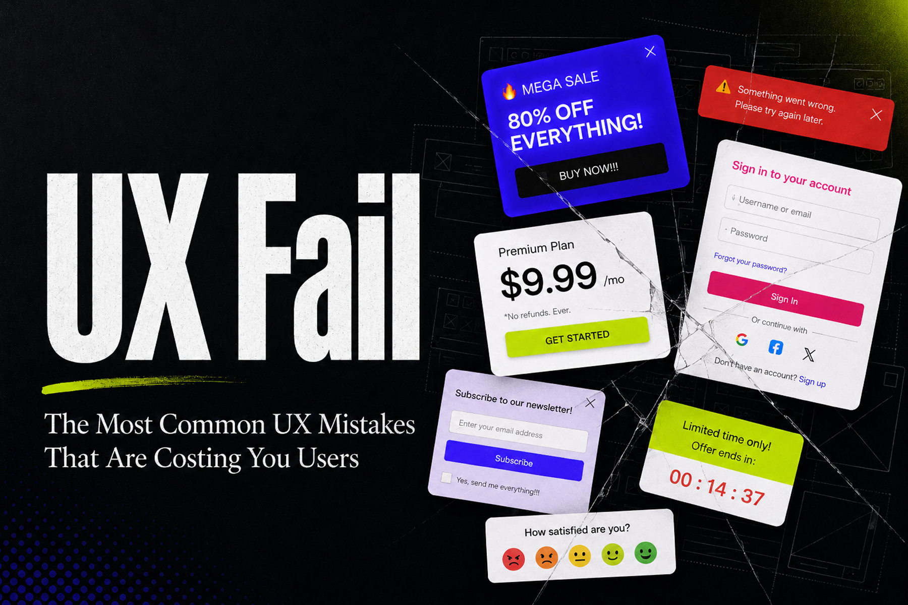
In many cases decorating your designs with intricate wording and descriptive informational captions is a commonly seen style of UX writing in previous years. Yes, we want our users to hear the full back story of a product and understand each detail that goes into the functionality of a product, but in today’s world “to the point” is the goal.
UX writing needs to be concise, and tell the consumer what they need to know in a few direct sentences. Adding word decoration or “fluff” requires your consumers to commit time that generally most people just don’t have enough of.
Creating terminology for your users to easily decipher through your site or application adds to a “friendlier” usability experience as well. Often the way a hyperlink or navigation link is phrased can detour a user, for example, if a link to view another page on your site displays “Sign up and read our blog!” this can lead to the user leaving the site not wanting to make that commitment right away. Whereas when you phrase it to the point as something like “Read our Blog!” a user is more likely to click on that link and keep exploring.
Using as few words as possible in your article without losing information intended, and create a clear objective at the start for your users they have a higher likelihood of staying and browsing through the site. When you can communicate your brand’s goals, back story, and other points in an efficient manner, you can make a significant influence on your audience that will last.

Designing for Inclusivity is key in 2022, and it’s essential in understanding the scope of all your possible audiences. When you keep in mind a variety of perspectives you are ensuring a broader interest rate than before.
When designers only create solutions from their perspective they limit their designs to a specific audience that shares the same perspective. Brands want their audience to broaden and always continue to expand, if you only have solutions for say 50% of your audience it may lose the interest of the other 50% completely. If we can address the problems of our entire audience why not do that?
In designing for inclusivity it’s important to acknowledge where exclusion is happening. Once you can identify that, it’s easier to identify and ensure your team pays attention to these points.
It’s important to gain knowledge from your diverse audience, understanding the points they have made and how their outlook can be recognized. Taking emphasis on the opinions and perspectives of your various audiences you end up gaining a larger audience.
People love to see the information being given to them, instead of only reading through the information you provide, a visual asset ensures the important content is known. When a user can visualize the data it becomes engaging for them. Methods such as creating animated infographics or bold imagery leads the eye of our user; it's essentially a highlight. Often times people prefer to look at the highlights, as it’s a quicker read than a paragraph of informative text. However, these highlights can provide a preview to draw a user in.
Creating visualized data allows designers to convey complex concepts that may be misconstrued in solely text. Data visualization allows users to comprehend the material better. When users can easily comprehend the material it allows for quicker decision-making.
When looking to improve your website it’s important to stay in the know of trends and tricks that you may be missing out on. The benefits a well-designed website can do for a business makes all the difference in continuing to grow your business.
Check out our article on 5 UX Methods & Trends to Follow in 2022.

The four most impactful website improvements for 2022 are customizing user experiences with collected data, adopting concise and direct UX writing, designing for inclusivity across all audience segments, and presenting information through visual assets like infographics and bold imagery. Together these strategies improve engagement, accessibility, and conversion rates.
Businesses can personalize website experiences by leveraging collected behavioral data to recommend relevant products, videos, and content, or by creating customized homepages tailored to individual users. In e-commerce especially, predicting user preferences and surfacing the right content proactively creates a more meaningful and conversion-friendly experience.
UX writing refers to the text used throughout a digital product or website, including buttons, navigation links, headings, and instructional copy. In 2022, concise and direct UX writing is essential because users have limited time and attention. Clear, to-the-point language reduces friction, improves usability, and increases the likelihood that users will continue exploring a site rather than leaving.
In e-commerce, personalization allows businesses to surface products and content that align with each user's preferences before they even have to search for them. This proactive approach reduces friction in the buying journey, increases time spent on the site, and significantly improves the likelihood of conversion by making the experience feel tailored and relevant.
The way navigation links and CTAs are phrased has a direct impact on whether users click through or leave a site. Overly committal or vague link text can deter users, while clear and direct phrasing like "Read our Blog" encourages exploration without pressure. Small adjustments to navigation copy can have a measurable effect on bounce rates and overall site engagement.