


Most articles about game UI design are galleries. Somebody collects twenty attractive screenshots, writes a caption under each about how "clean" it is, and calls that a guide. It is pleasant to look at and completely useless if you are the person accountable for whether your game retains anyone.
This is written for that person. It covers what game UI design actually involves, the decisions that carry real weight, the constraints that break teams coming from product design, and the diagnostic questions worth asking about your own interface before you commission a redesign you may not need.
What Game UI Design Involves (Beyond Making Screens Look Good)
Game UI design is the design of the communication layer between your game's systems and the person playing them. Every health bar, menu, inventory grid, quest marker, store page, and settings panel is part of it. If you want the full taxonomy and the diegetic-versus-non-diegetic framework, we cover that in our guide to what UI means in games.
What the job actually consists of, day to day, is a sequence of decisions that have very little to do with aesthetics.
Deciding what information the player needs at each moment, and what they do not. Deciding what order things get introduced in. Deciding what happens when a value is zero, or negative, or six digits long, or in a language where the word is three times wider. Deciding how a screen behaves under a thumb, under a cursor, and under a d-pad. Deciding which of the fifteen things the team wants on screen actually earns its place.
The visual layer is real work and it matters. But it is the last of those decisions, not the first, and teams that start there produce interfaces that photograph well and play badly.
Game UI Design Versus Game GUI Design
Worth clearing up because the terms circulate interchangeably. GUI stands for graphical user interface, and in general computing it distinguishes visual interfaces from command-line ones. That distinction is meaningless in games, since there is no such thing as a non-graphical game interface in any commercial context.
In practice, game GUI design and game UI design refer to the same discipline. Some studios and outsourcing shops prefer GUI because it emphasises the visual craft. Some engines use the term in their component naming. There is no difference in the work. If a vendor tells you GUI design is a separate service from UI design, they are constructing a line item.
The Six Principles That Actually Govern Game UI Design
Not laws. Just the things that come up over and over, across genres, platforms, and budgets.
1. Frequency and Urgency Determine Form
Before you decide what an element looks like, decide how often the player consults it and how fast they need to parse it.
High frequency, high urgency means it goes in the persistent overlay, at high contrast, in a fixed position the player's eye can find without searching. Health during combat. Ammo. Cooldowns.
Low frequency, low urgency means you have options, and this is where you can afford immersion. An in-world journal instead of a menu. A physical map instead of a minimap. These are lovely and they cost the player time, which is fine when the player has time.
Most bad game UI is the result of skipping this question and letting art direction answer it instead. That is how you end up with a stylised, angled, semi-transparent ammo counter that nobody can read at 3am.
2. The Interface Is Read Under Pressure, Not Studied
Your player is not calmly parsing your screen. They are being shot at. They are tracking a timer, an enemy, and a teammate simultaneously. They may be on a TV across the room, or on a phone in sunlight, or half-watching something else.
The consequence is that legibility standards from product design are not sufficient. A contrast ratio that passes a desktop audit can fail completely when it is overlaid on a bright explosion. Type sized comfortably for a monitor at arm's length is unreadable on a television at ten feet.
Microsoft's Xbox Accessibility Guidelines publish concrete text size minimums by platform and resolution, and they are the most useful public reference on this even if you never ship to Xbox. Most teams are eyeballing numbers that Microsoft has already tested.
3. Feedback Is Not Optional
Every action needs a response, and the response needs to arrive fast enough that the player connects it to the action they took. Nielsen Norman Group's research on response time limits puts the threshold for something feeling instantaneous at around a tenth of a second, and the threshold for keeping someone's flow of thought uninterrupted at about a second.
Games live entirely inside that first threshold. A hit that registers 300 milliseconds late does not feel late, it feels broken. A button that does not visibly depress makes the player press it again. This is why the feel of a good game interface is carried as much by motion and sound as by layout.
4. Complexity Is a Reward, Not an Introduction
The single most common interface failure in games is showing a new player everything at once.
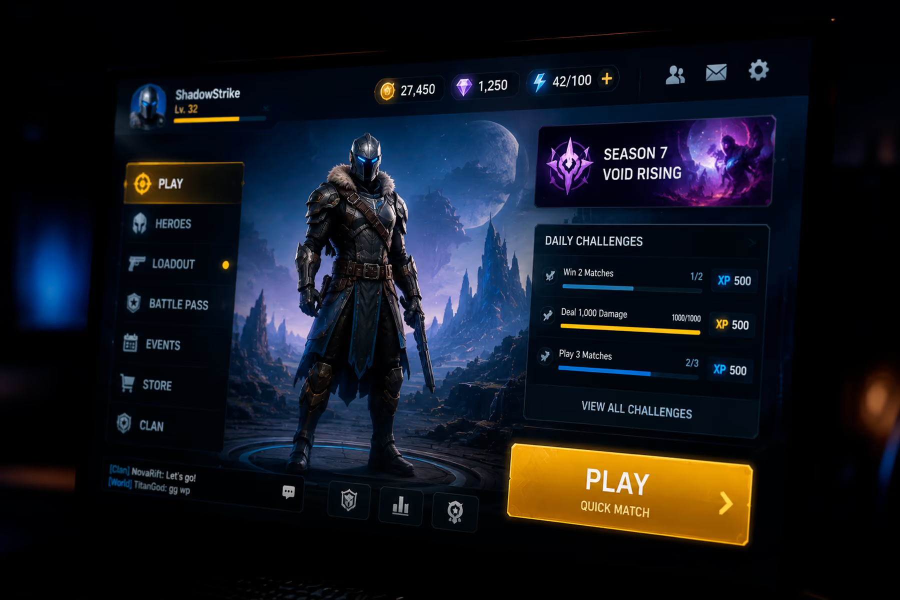
It happens for structural reasons, not stupid ones. Every system in your game has an internal champion. The economy designer wants the currencies visible. The progression designer wants the XP bar visible. The social lead wants the friends list visible. Every one of them is advocating correctly for their system. Nobody in that meeting represents the player who has been in the game for ninety seconds and does not know what a single one of those numbers means.
Eric Lee Smith, a game designer who has shipped award-winning titles, described the underlying dynamic to us on our Visionaries podcast as a plain fact of development: the longer a product is in development, the more complicated it becomes. He offered it as a truth rather than a criticism, and that framing is the useful part. Drift toward complexity is the default state. Simplicity only happens if somebody with authority is actively deleting things.
The counter-practice is progressive disclosure, documented well by Nielsen Norman Group. Show the minimum required for the next action. Unlock the next layer when the player has the context to understand it. Depth becomes something they earn instead of something you dump.
5. Input Method Is Structural
A mouse can reach anywhere. A gamepad moves through a graph. A thumb has a reach envelope and covers what it touches.
These are not skins over the same design. They are different designs. A grid that works fine with a cursor becomes twelve d-pad presses on a controller. A button at the top of a phone screen is unreachable one-handed. Every screen intended for controller needs a defined focus order, defined wrap behaviour at the edges, and a defined default selection, and if you do not specify those, someone will improvise them in code and you will find out at certification.
The mobile constraints are different again and worth their own treatment, which we give in our guide to mobile game UI design.
6. The Interface Carries Tone
This is the one place where the art argument wins, and it wins decisively.
A horror game and a farming game may be solving near-identical information problems, and their interfaces should look nothing alike. The interface is the first and most continuous expression of what kind of experience this is. Players read tone from it before they read a single word of narrative.
The failure is treating tone and legibility as a trade-off where one must lose. They are not. Diegetic flourish on non-critical information and ruthless clarity on critical information is not a compromise. It is just the correct answer.
The Game UI Screens That Carry the Most Weight
Not all screens are equal, and the ones that matter most usually get the least attention.
Onboarding. The highest-leverage interface in your game by an enormous margin, because it decides how many players see anything else. If your first-session drop-off is bad, this is where you look, and the answer is almost always that you asked for too much before you gave anything.
Main menu. Its job is not to look impressive. Its job is to get a returning player back into the game in one input. Continue goes at the top. Everything else is secondary. Teams routinely bury Continue underneath a news feed and a store promotion, which is a decision made by someone whose incentives are not the player's.
The persistent overlay. The most-viewed pixels you will ever ship. See our guide to game HUD design.
Inventory and progression. Structurally the hardest screens, because they have to support browsing, comparing, sorting, and acting all at once, usually with items of variable length in every language you ship in.
Store and economy. Where trust is built or destroyed. Hidden conversion rates and unclear pricing do measurable damage that shows up in reviews long after it shows up in the funnel.
Settings. The screen nobody prioritises and every accessibility audit opens with.
How to Tell If Your Game UI Design Is the Problem
Before you commission a redesign, work out whether the interface is actually what is wrong. A few diagnostics that surface real answers quickly.
Time the first meaningful success. Open your game as a new player and stopwatch how long until you do something you feel good about. Not until the tutorial ends. Until you feel competent. If that is past five minutes, you have found your retention problem and it is not a mechanics problem.
Count the decisions on your first screen. Every choice you present to a player who lacks context to make it is friction. If your first interactive screen offers more than three, you are asking for decisions the player cannot yet make.
Watch someone play without helping. Not a colleague. Someone from your actual audience. Do not speak. The urge to explain is the finding. Every time you want to say "oh, you just tap there," you have located a UI failure.
Play on the worst hardware you support. Not the machine on your desk. A mid-range Android from two years ago, on mobile data, in a bright room. Emulators lie about performance and they lie about legibility.
Check whether your team can agree on what the player should do next. If your own team disagrees, players have no chance. This one surfaces UX problems disguised as UI problems, which is the most expensive category to misdiagnose.
Where Research Fits, and Why Taste Is Not Enough
The uncomfortable part of game UI design is that experienced designers are frequently wrong, and the only reliable way to find out is to watch players.
Claudia Mérigo, a UX researcher on our team, described a gaming project on our podcast where the interviews revealed the client had misunderstood their own users. The product had been built for casual gamers. The people who would actually use it were professional gamers, and the two groups have completely different behaviours, needs, and expectations. The research redirected the whole product. No amount of design review would have caught it, because everyone in the review shared the same wrong assumption.
She also made a point worth repeating to anyone weighing whether research fits the schedule: if you skip it, you are designing entirely on assumptions, and the risk is spending time and money building something that either already exists or does not solve a real problem.
Eric Lee Smith was blunter about why testing gets cut. He called it a job where doing it perfectly earns you a C and anything less earns you an F, which is exactly why it stays at the bottom of every priority list until something explodes in the market and the grade arrives anyway.
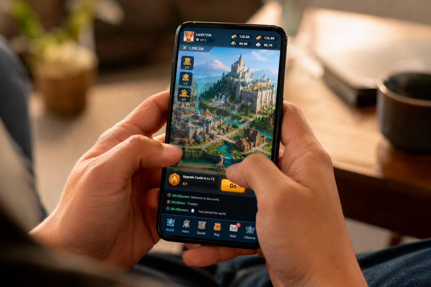
What This Looks Like in Practice
Buildbox is a no-code game creation platform used by millions of people, backed by a former Riot Games CTO. The product was genuinely powerful. That was the problem.
The original experience presented all of that power to new users the moment they signed in. People opened it, got lost, and left before they built anything. The platform's entire value proposition was invisible, not because it was not there, but because nobody made it far enough in to encounter it.
The redesign was organised around a single question: what does a meaningful first success look like for a new user? Everything that was not that got moved later. The first thing a new user does is make something. Not watch a tutorial, not complete a profile. Make something and feel good about it. That change moved the number of users reaching the first-success milestone by 41%, which is a design outcome and a revenue outcome at the same time, since users who find the value are the ones who convert.
Nothing about the underlying product changed. What changed was what the interface chose to say first.
Final Thoughts: Game UI Design Is Measured in Players, Not Portfolios
The best compliment a game interface can receive is that nobody mentions it. Players do not praise UI that works. They notice UI that fails and they say so in reviews, and they quietly leave when it fails badly enough, without telling you why.
That makes game UI design a strange discipline to fund, because success is invisible and failure is deniable. It is always possible to blame retention on marketing, or the meta, or the market. It is always possible to look at a beautiful screen and conclude that the interface is fine.
The studios pulling ahead have stopped treating the interface as the surface of the game and started treating it as the way anyone reaches the game at all. It is the only part every single player touches, in the first ten seconds, before they have any reason to be patient. Getting it right is not the last 5% of the work. It is the part that determines whether the other 95% gets seen.
Find Out What Your Interface Is Costing You
If your game has a first-session drop-off you cannot explain, or a store that underconverts, or a redesign that keeps getting deferred, we can tell you what we would fix and in what order. Wandr has built interfaces for game creation platforms, real-money gaming products, and esports tools, and the patterns repeat enough that the answers usually come fast. See how our game UI/UX design team works, or send us the product and we will come back with the top friction points. No pitch attached.
