

Reading Time:
10 minutes
Category:
UI/UX Design
A practical guide to dashboard UI design that covers how to balance information density, reduce cognitive load, and create interfaces users can navigate with clarity and confidence.


A practical guide to dashboard UI design that covers how to balance information density, reduce cognitive load, and create interfaces users can navigate with clarity and confidence.
An effective dashboard UI design gives users a bird's-eye view of their work environment and helps them quickly select a course of action. It also provides a mental map of your application, so users always know where they are and what to do next.
But getting there is harder than it looks. Dashboards are one of the most complex surfaces in any digital product. They need to communicate a lot at once while keeping users oriented, focused, and confident. When the design gets it wrong, users feel overwhelmed, miss critical information, or simply stop opening the dashboard altogether.
This guide covers the core visual design principles we apply at WANDR when designing dashboard UIs — the ones that have proven themselves across every product category, from fintech to SaaS to enterprise software.
Dashboards tend to pack a lot of information into minimal space. This can make them look cluttered and leave users feeling overwhelmed.
At WANDR, clients sometimes ask us to include as much information as possible. We always push back — because more information is not the same as more useful information.
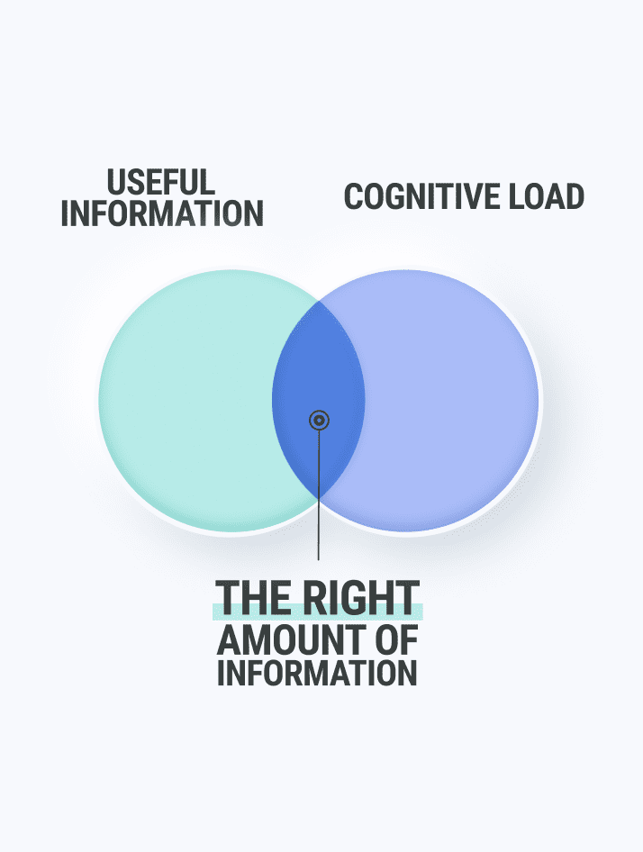
Humans have a limited capacity to process data. Most research puts working memory at around seven to nine elements at a time. The amount of mental effort a UI asks a user to expend is called cognitive load. Good dashboard UI design minimizes cognitive load at every turn, freeing users to focus on the decision in front of them rather than on decoding the interface.
The number one goal when designing a dashboard UI is striking the right balance between highly useful information and low cognitive load. Everything else follows from that.
One of the most powerful tools in dashboard UI design is visual hierarchy — using size, weight, color, and placement to guide the user's eye to what matters most.
Humans instinctively interpret larger, bolder, and higher-positioned elements as more important. A well-designed dashboard uses this instinct deliberately. The most critical metric sits at the highest visual weight. Secondary data recedes appropriately. Supporting detail is accessible but does not compete for attention with the primary signal.
When every element on a dashboard has equal visual weight, users are left to decide for themselves what to pay attention to — which means they spend cognitive effort on navigation instead of action. As Patrick Lencioni put it: "If everything is important, then nothing is."
In practice, this means:
A good test: cover your dashboard and ask a new user what they think they should look at first. If they hesitate, the hierarchy needs work.
White space is one of the most underused tools in dashboard UI design — and one of the most powerful.
Our brains process information through contrast. White space creates contrast around elements, defining them and making them easier to identify. It tells the eye "there's nothing to see here" and redirects attention toward the content that matters. Think of it as the guardrails on a road.
Without adequate white space, dashboards feel dense and anxious. Every element crowds its neighbors. Nothing has room to breathe, and the user's eye has nowhere to rest.
White space does several things simultaneously in a dashboard UI:
The most common mistake we see is reducing white space to fit more information. This almost always backfires. The additional data adds less value than the clarity lost by removing the breathing room around it.
Aim for as little as possible. The right question when designing a dashboard UI is not "what should we include?" but "what is the minimum amount of information the user needs to take action?"
The answer is almost always less than you expect — and testing with real users will confirm it.
Users are smart and they learn quickly. You do not need to label every button with a full sentence. Words are among the hardest elements for the brain to process in a visual interface. Use them sparingly, and replace them wherever possible with icons, colors, and micro-interactions that communicate function more efficiently.
Practical ways to apply less-is-more in dashboard UI design:
The goal is a dashboard where a trained user can assess the situation in under ten seconds. Every element that does not contribute to that ten-second read is a candidate for removal or demotion.
Color is one of the most powerful — and most misused — tools in dashboard UI design.
Used well, color communicates status, priority, and category without requiring any text at all. Used poorly, it creates visual noise that users learn to filter out entirely, including the signals you actually need them to see.
The core principle: use color functionally, not decoratively. Every color in a dashboard UI should mean something specific and consistent across the entire interface.
A common system that works across product categories:
Once you establish a color system, apply it consistently. If red means "critical" in one chart, it cannot mean "revenue" in another. Inconsistent color usage forces users to re-learn the meaning of each color in every new context, which is exactly the kind of cognitive load dashboard UI design should eliminate.
Also consider users with color vision deficiencies. Never rely on color alone to communicate status — pair it with an icon, a label, or a shape change so the information is accessible regardless of how the color is perceived.
Typography in dashboard UI design is not about elegance — it is about legibility and hierarchy at a glance.
Dashboards are typically scanned, not read. Users move their eyes quickly across the interface looking for specific signals, not absorbing prose. Typography choices that work beautifully in a marketing context can actively hinder usability in a dashboard.
Guidelines for effective dashboard typography:
The test for dashboard typography is simple: can a user find a specific number in five seconds without reading anything? If not, the typographic hierarchy is not doing its job.
The layout of a dashboard UI determines how quickly users can build a mental model of where things are — and how long they maintain that model over repeated use.
Consistent layout is more important in dashboard design than in almost any other UI context. Users who visit a dashboard daily develop strong spatial memory. They know where the conversion rate lives, where the alert count appears, where the date filter is. When layout shifts — even slightly — between sessions or between user roles, that spatial memory fails and users have to rediscover information they previously navigated by instinct.
Layout principles for effective dashboard UI design:
These principles are not independent. They reinforce each other.
A clear information hierarchy tells you which elements deserve the most white space. White space makes the hierarchy visible. Less-is-more reduces the number of elements competing for hierarchy positions. Color signals reinforce hierarchy without adding elements. Typography makes hierarchy legible at a glance. Layout encodes hierarchy spatially so users can navigate by memory.
When all six principles are applied together, the result is a dashboard UI that users can learn quickly, rely on daily, and navigate with minimal conscious effort — which is exactly what a dashboard should be.
Effective dashboard UI design is not about making things look good. It is about reducing the mental effort required for users to understand their situation and decide what to do next. Every visual decision — hierarchy, white space, color, typography, layout — either adds to that effort or reduces it.
The principles in this guide have worked across every product category we have designed for at WANDR, because they are grounded in how human perception and memory actually function rather than in aesthetic trends.
If you are designing or redesigning a dashboard and want a structured approach to applying these principles, the best place to start is with a UX audit of your current interface — identifying where users slow down, where they miss information, and where the cognitive load is highest. That audit becomes the brief for everything that follows.
Work With a Dashboard UI Design Team
WANDR has designed dashboard UIs for products across fintech, enterprise software, SaaS, and cybersecurity. If your dashboard is not performing the way it should, schedule a free consultation and let us show you where to start.

The biggest challenge is striking the right balance between displaying enough information to be useful and avoiding so much that users feel overwhelmed. Dashboards naturally need to communicate a lot at once, but the human brain can only hold roughly seven to nine elements in working memory at a time. Effective dashboard design works within that constraint rather than against it.
Cognitive load refers to the amount of mental effort a user needs to process and interact with an interface. The higher the cognitive load, the more brainpower users spend just figuring out the interface instead of doing their actual work. Reducing cognitive load through clear hierarchy, white space, and minimal text frees users to focus on making decisions rather than decoding the screen.
Information hierarchy uses size, weight, and placement to guide users' attention toward the most important elements first. When the most critical data is visually prominent and secondary information recedes appropriately, users can scan a dashboard quickly, find what they need, and dive deeper only when necessary. Without hierarchy, everything competes for attention equally and nothing stands out.
White space acts as a visual guide, telling the eye where to look and where to move on. It creates contrast around key elements, making them easier to identify and process. It also helps group related information together, a technique known as chunking, which makes complex dashboards feel more organized and far less overwhelming.
Start by identifying the minimum amount of information a user needs to take action or make a decision. Then test with real users to see how they interact with the interface. What feels insufficient internally often turns out to be more than enough for users in practice. The goal is not to display everything available, but to surface what is most relevant and actionable.

