



Open your security company's homepage in an incognito window and run a stopwatch. Time how long it takes to answer three questions with zero prior context: what does this product do, who is it for, and what proof exists that it works. If you cannot answer all three inside ten seconds, neither can the SOC lead, the CISO, or the procurement analyst who landed there this morning. That gap is where deals quietly die, and closing it is what the tactical work of cybersecurity website design best practices is really about.
This is the hands-on companion to the strategy conversation. It is less about why trust matters and more about the specific page structure, signals, forms, and technical thresholds that make a security site convincing to a technical buyer. Think of it as a build spec you can hand to a designer, a developer, and a content lead and have them all know exactly what "good" looks like. The examples and framing here assume you already sell something real to a paranoid audience, and now you need the site to hold up under inspection.
Page Structure and IA Best Practices for a Cybersecurity Website Design
Start with the homepage skeleton, because most security sites get the ordering wrong. A buyer reads top to bottom and forms a verdict at each section. The reliable structure runs like this: a plain-language value proposition and one primary call to action first, a real product screenshot immediately after so the thing is proven to exist, then named proof, then how it works, then deeper role-specific paths, then a repeated call to action near the bottom for the people who scrolled the whole way. Every section earns the scroll to the next. When you bury the screenshot below three paragraphs of vision copy, you are asking a skeptic to trust before you have shown anything.
Information architecture is the layer above the homepage, and for security companies it is usually the weakest link. Vendors that sell across endpoint, cloud, identity, and network tend to expose the entire catalog and let the visitor sort themselves out. That fails because a buyer who is not already fluent in your taxonomy has no way to self-sort. The best-practice move is to organize around the buyer's mental model, which is problems, roles, and use cases, and to keep your internal product hierarchy as a secondary path for the evaluators who already know what they want. A clean sitemap for a security company usually needs a solutions layer keyed to problems, a products layer keyed to tools, a proof layer that pulls customers and case studies into one obvious place, and a resources layer. Anything past four top-level categories starts diluting the ones that matter.
The reason this ordering works is not aesthetic, it is behavioral. Instead of guessing what a security buyer wants to see first, watch what they do. As Claudia Mérigo, a UX researcher at WANDR, puts it in her talk on the importance of user research, "Instead of designing based on assumptions, we design based on real challenges, needs, and problems." Card-sorting your navigation with three or four actual security buyers will tell you more about the right IA than any internal debate about how the product team slices the roadmap.

Credibility and Compliance Signals: Cybersecurity Website Design Best Practices for Trust Badges
Compliance signals are the single most misused element on security websites. A SOC 2 seal, an ISO 27001 mark, and a recent penetration-test badge are meaningful evidence to a buyer who is building a vendor-risk case, and most sites waste them by dropping a row of small gray logos into the footer with no context. Treat each attestation as an argument, not a decoration. A SOC 2 Type II badge with a short line stating the report is available under NDA and names the audit period does real persuasive work. The same badge floating in a footer strip gets ignored, because it looks like every other footer strip.
Placement follows the buyer's evaluation sequence. A named-customer logo bar and third-party validation belong high, near the value proposition, because they answer the "who else trusts this" question before the buyer has to hunt. Formal attestations like SOC 2, ISO 27001, and independent test results can sit slightly lower, ideally consolidated onto a dedicated trust or security page that a procurement reviewer can send straight to their risk team. That page is not marketing fluff. It is a tool you hand to an internal champion so they can defend the purchase, and designing it well shortens your sales cycle.
The credibility research backs the instinct to make these signals concrete and specific. The Stanford Web Credibility Project found that people judge a site's trustworthiness heavily on surface signals and visible evidence of real-world legitimacy, which for a security vendor means named references, verifiable certifications, and specifics beat vague reassurance every time. "Trusted by leading enterprises" with no names reads as something to hide. "SOC 2 Type II, ISO 27001, and annual third-party pen tests, report available on request" reads as a company that expects to be audited and is fine with it. Match the honesty level your buyer brings to the table.

Navigation Best Practices for a Multi-Stakeholder Cybersecurity Website Design
A security purchase involves at least three people who want completely different things from your site, and good navigation serves all of them without collisions. The economic buyer, often a CISO or VP of Security, wants outcomes, risk reduction, and proof that peers trust you. The technical evaluator, a SOC analyst or security engineer, wants architecture, integrations, and the actual interface. Procurement and vendor-risk want compliance documentation, data handling, and pricing signals. One generic menu that speaks to none of them is the default failure. The best practice is to give each persona a clear on-ramp from the top navigation without making any of them wade through the others' content.
In practice that means a top-level structure like "Solutions" organized by problem or role, "Product" or "Platform" organized by capability, a "Customers" or proof hub, a "Security" or trust page, and "Pricing" or "Request a demo" as a persistent action. Keep the mega-menu disciplined. Nielsen Norman Group's usability research has shown for years that overloaded navigation and too many parallel choices increase the cognitive cost of every decision, and their work on navigation and information scent is worth reading before you design a menu with fourteen items in it. Fewer, clearer paths let a buyer feel oriented within a click or two, which is the whole point.
Persistent utility navigation matters just as much as the primary menu. A demo-request action should follow the buyer down the page and appear in the header at all times, because you never know which section finally convinces someone. Secondary but high-intent links, documentation, a status page, and a security or trust page, signal maturity to a technical audience that expects them. When a security engineer cannot find your docs or your status page, they assume you do not have them, and that assumption costs you credibility you did not need to lose.

Message Hierarchy Best Practices in Cybersecurity Website Design
Message hierarchy is how you satisfy the skimmer and the deep reader on the same page. Security buyers arrive in two modes, sometimes in the same session. The executive skims headlines and proof and decides whether to keep the tab open. The engineer reads everything, because evaluating the details is literally their job. A well-layered page gives the skimmer a clean spine of headlines, outcomes, and evidence, and gives the reader the depth underneath each claim. Lead every section with the outcome, follow with the mechanism, and save the exhaustive feature matrix for the bottom where the committed evaluator will happily find it.
Language discipline is part of the hierarchy. Security is dense with acronyms, and some are load-bearing because a fluent buyer expects them, while others are just fog. Write "we correlate alerts across your stack so one analyst chases a single incident instead of forty" rather than "AI-driven cross-domain telemetry orchestration." The first sentence a human can picture. The second is buzzword bingo that a technical reader will quietly hold against you. When you do use a precise term like zero trust, EDR, or SIEM, use it correctly, because a single sloppy usage tells an expert reader that you do not actually understand the space you are selling into.
Headline structure carries more weight than most teams admit. The homepage H1 should name the product category and the outcome in plain words, not a slogan. Section H2s should each advance the argument, so that reading only the headings still tells a coherent story. This is also good for how machines read your page, which increasingly matters as buyers ask AI assistants to summarize and compare vendors before a human ever visits. A page whose headings state real claims gets summarized accurately. A page built on abstractions like "redefining resilience" gets summarized into nothing, because there was nothing concrete to extract.
Performance and Core Web Vitals Best Practices for Cybersecurity Website Design
For a company that sells security, a slow or janky website is a live contradiction of the pitch, and technical buyers register it instantly. Performance is therefore a credibility signal, not just an SEO input. The practical targets are Google's Core Web Vitals: Largest Contentful Paint under about 2.5 seconds, Interaction to Next Paint kept low so the page responds immediately to input, and Cumulative Layout Shift near zero so nothing jumps around as the page loads. These are measurable thresholds you can hold a build to, and they map directly to how competent your site feels under a fast connection and a slow one alike.
The usual culprits on security sites are heavy hero animations, uncompressed screenshots, bloated tag-manager stacks, and third-party scripts that block rendering. Each one is a place where marketing convenience quietly taxes the buyer's first impression. Compress and lazy-load imagery, defer non-critical scripts, and be ruthless about how many analytics and chat widgets you load, because every one of them costs you milliseconds and, ironically for a security vendor, adds third-party code that a careful visitor can see in the network tab. A security engineer who opens dev tools and finds a dozen trackers firing before your content paints has learned something about how you treat their data, and it is not flattering.
Speed also compounds with everything else on this list. A fast site ranks better, converts better, and reads as more trustworthy, which means performance work pays for itself across acquisition and conversion at once. Treat Core Web Vitals as a standing acceptance criterion for the site, checked on every meaningful release, rather than a one-time audit you run before launch and forget.
Accessibility Best Practices for Cybersecurity Website Design
Accessibility has moved from a nice-to-have to a procurement line item, and for security vendors selling into enterprise and government it can be a gating requirement. Building to the Web Content Accessibility Guidelines is the concrete standard, and the fundamentals are not exotic: sufficient color contrast, full keyboard operability, visible focus states, real semantic HTML, alt text on meaningful images, and labels tied to form fields. Many security sites fail the easy ones, especially contrast, because the fashionable dark palette with dim glowing accents often does not meet the minimum ratio between text and background.
There is a direct commercial reason to care beyond compliance. An accessible site works better for everyone, ranks better because search engines reward the same semantic structure that assistive technology depends on, and signals a team that sweats details. To a technical evaluator, attention to accessibility reads as attention to quality, the same way clean code or good docs do. It is a competence signal aimed squarely at the thorough buyer who reads everything, which is exactly the buyer you most want to impress. Government and large-enterprise buyers may also require a VPAT or an accessibility conformance statement, so having one ready removes a procurement roadblock before it appears.
Demo-Request Form Best Practices in Cybersecurity Website Design
The demo-request form is where all the trust you built either converts or leaks away, and it is astonishing how many security sites sabotage themselves here. The single biggest fix is to cut fields to the minimum that sales genuinely needs to route and qualify the lead. Every extra field measurably reduces completion, and security buyers, who are privacy-conscious by trade, are especially quick to abandon a form that demands phone number, company size, job title, and "how did you hear about us" before they have even seen a demo. Ask for work email, name, and company. Enrich the rest from your data tools instead of taxing the visitor.
Form design mechanics carry the rest of the load. Use clear inline labels rather than placeholder-only fields that vanish on focus, validate in real time with helpful error messages, and never reject a legitimate work email because your regex is overzealous. Baymard Institute's extensive form-usability research documents how small friction points, unclear errors, and unnecessary required fields drive abandonment, and a security demo request is a high-intent moment you cannot afford to lose to a confusing field. Set honest expectations near the button, a short line about what happens next and how quickly someone will respond, so the buyer knows they are not dropping a request into a void.
Trust cues belong right at the point of conversion. A brief privacy reassurance next to the submit button, a link to how you handle the data, and no dark patterns around consent all matter more for a security buyer than for almost any other audience, because scrutinizing data handling is their profession. If you want a fuller teardown of the pages and forms that get this right, our roundup of cybersecurity website design examples that convert breaks down the specific conversion choices strong security sites make at the form and the fold.
Security-Proof Content Best Practices for Cybersecurity Website Design
Security-proof content is the material that shows your product working against a real problem, and it is the heaviest evidence you can put on a site. Named customers lead. If recognizable security teams trust you, their logos, placed high and with permission, do more than any adjective. Where confidentiality blocks names, use anonymized-but-specific framing, because "a Fortune 100 financial institution" carries texture that "a large enterprise" does not. Then back the logos with substance: quantified outcomes where you have them, and honest qualitative results where you do not.
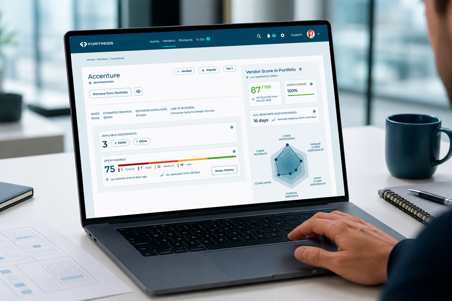
Case studies are the strongest form of this content because they narrate the product in a real environment. This is where we point to our own work. When WANDR designed Vectrix, the Zero Trust SaaS security product later acquired by Cloudflare, the design had to make complex SaaS visibility and control legible to security teams at a glance, and that clarity was part of what made the product credible to both buyers and an acquirer. We have done the same category of work with security companies including Tenable and Fortress Information Security, which is the difference between an agency that has designed security products and one that has only read about them. The bar your own case studies should clear is not "trust us," it is "here is exactly what we built and what it did."
Screenshots and short product walkthroughs are security-proof content too, and most sites underuse them. A crisp image of the actual dashboard proves the product exists and hints at how it feels to operate, which for a well-designed tool is free marketing. A thirty-second clip of an analyst triaging an alert in your interface answers questions no paragraph can. Nielsen Norman Group's research on trust and credibility consistently finds that concrete, specific evidence outperforms vague reassurance, and nowhere is that gap wider than with a buyer whose entire job is to doubt what they are shown. If the interface is not good enough to show, that is a product-design signal worth acting on before you touch the marketing site, and it is exactly the kind of end-to-end problem a specialized cybersecurity website design agency is built to solve.

Final Thoughts on Cybersecurity Website Design Best Practices
None of these practices are cosmetic. Page structure decides whether a skeptic keeps scrolling. Compliance signals decide whether procurement can defend the purchase internally. Multi-stakeholder navigation decides whether three very different people all find their answer. Message hierarchy, Core Web Vitals, accessibility, form design, and security-proof content each remove a specific reason a technical buyer would bounce or hesitate. Put together, they turn a site from a brochure into an instrument that survives inspection by the most demanding audience in software. For the strategic reasoning behind why these choices build buyer trust in the first place, the companion guide on the best practices that build buyer trust in cybersecurity website design is the piece to read next.
Treat the list as a standing spec, not a launch checklist you run once. Security buyers get more sophisticated every quarter, competitors copy whatever works, and the thresholds that felt sharp last year become table stakes. The teams that win keep measuring their site against how real buyers behave, revisit the proof as new customers land, and hold every release to the same performance and accessibility bars. That discipline is what makes a security website compound into your most consistent salesperson.
Build a Cybersecurity Website Design That Meets Every Best Practice
If your site is missing half this checklist, the fix is design that understands both security buyers and security products. WANDR has shipped real security-product and website design for companies like Tenable, Fortress Information Security, and Vectrix, so we know what convinces a technical evaluator. See how our cybersecurity website design agency turns these best practices into a site your buyers trust on the first scroll, and let's make yours pass inspection.
