


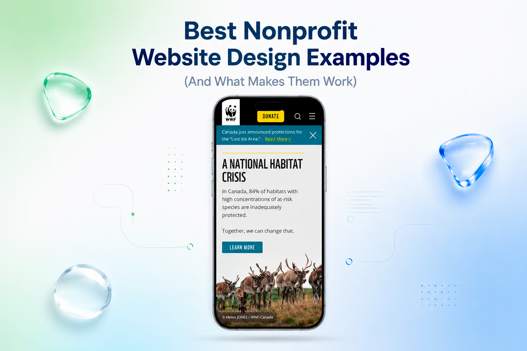
Not all nonprofit website design is created equal. Some sites make you want to donate before you've even scrolled. Others make you wonder how the organization is still operating.
The difference comes down to a handful of design decisions: most of which have less to do with visual talent and more to do with strategic clarity. What's the primary goal? Who's the primary user? What's the shortest path from landing to action?
Here's our annotated breakdown of what the best nonprofit website design looks like in 2026, drawn from our work at Wandr and from patterns we've observed across the space.
What "Best Design" Means in the Nonprofit Context
Before we get into examples, we need to define the standard.
In commercial design, "best" often means most visually impressive. In nonprofit design, "best" means most effective: and effectiveness is measured in donations raised, volunteers recruited, partnerships formed, and advocacy actions taken.
Beautiful design that doesn't convert is an expensive decoration. The best nonprofit websites earn their visual investment by producing measurable results.
The design principles we evaluate:
- Trust architecture: Does the design establish credibility within the first screen?
- User clarity: Can each user type find their path in under 10 seconds?
- Conversion efficiency: How many steps from intent to action?
- Mobile performance: Was this designed for mobile first, or just not broken on it?
- Information hierarchy: Is the most important thing the most prominent thing?
- Copy integration: Does the copy and design work as a unified system?
What Great Nonprofit Website Design Looks Like in Practice
WWF Canada: Conversion Design at Scale
The WWF Canada redesign, one of our own projects, demonstrates what happens when research drives design rather than the other way around.
Before a single visual element was created, the team mapped four distinct user types, rebuilt each user's flow from entry to conversion, and identified the specific friction points where donations were being abandoned. The design followed those flows: not the other way around.
Design elements worth noting:
The hero section works on multiple levels simultaneously. WWF's photography creates immediate emotional impact. The navigation is organized around user goals, not organizational departments. A primary donation CTA is prominent without being pushy.
The donation flow itself is notably lean. Impact statements appear at the moments of highest decision weight: right before a user is about to enter payment information. Recurring donation is surfaced naturally at a logical moment in the flow rather than forced upfront.
Every page is bilingual (English and French) without creating a fractured experience: a significant design challenge that was solved through systematic content architecture rather than patchwork.
Results: Transactions +37%. Unique users +25%. Time on page +18%.
See the WWF Canada case study →
Mercy For Animals: System Thinking for Global Complexity
The MFA redesign, also ours, is a different kind of design challenge from WWF: not a single site but a global digital ecosystem that needed to feel unified across regions, languages, and dozens of simultaneous campaigns.
The design solution here was systematic rather than surface-level. Three flexible page templates replaced 12+ inconsistent campaign pages. A design system was established that allowed individual campaigns to have distinct visual personalities while maintaining organizational brand coherence.
Design elements worth noting:
Campaign pages have a single primary action. This sounds simple: it's not. When an organization is running complex advocacy, fundraising, and volunteer recruitment simultaneously, the temptation is to put every ask on every page. The discipline to keep each page focused on one goal is a design decision that requires organizational buy-in as much as visual skill.
Accessibility compliance is built in rather than retrofitted: full compliance was achieved across the site. This matters for the users who need it and as a signal of organizational seriousness.
The platform migration: arguably the highest-stakes design deliverable: preserved over 90% of the organization's existing SEO equity. That's not a design element you can see, but it's a result of design process discipline that's worth highlighting.
Results: Donations +32% year one. Full accessibility. SEO fully preserved.
See the Mercy For Animals case study →
Great design in this space is not proprietary to any one studio. A handful of nonprofits, none of them our clients, have set benchmarks worth learning from, and each illustrates a specific design principle rather than a general aesthetic.
charity: water
charity: water makes transparency the structure. The 100% model is not a talking point tucked into an About page; it shapes the whole site, supported by an interactive map of funded projects and a donation flow reduced to a single clear choice. Principle: build trust into the architecture, not the copy.
Feeding America
Feeding America designs pathways instead of pileups. Data visualization conveys scale, a local food bank finder makes it personal, and a "Take Action" menu sends volunteers, donors, and food drive hosts down separate, purpose-built routes. Principle: give each audience its own clean path.
DonorsChoose
DonorsChoose makes the unit of giving tangible. Donors browse specific classroom projects, filter by subject, grade, or urgency, and fund an itemized need with a note from the teacher. Principle: attach the gift to a concrete, verifiable outcome.
The Trevor Project
The Trevor Project keeps the primary action persistent. A "Reach a Counselor" anchor follows the user on every page, distinct journeys separate youth from supporters, and a "Quick Exit" protects a user's safety. Principle: the most important action, and accessibility, are non-negotiable.
World Central Kitchen
World Central Kitchen pairs storytelling with urgency. Strong photography and video carry emotional clarity while the ask is framed around the urgency of the moment, with a short, prominent donate path. Principle: let imagery do the emotional work, and never bury the primary action when timing matters.
Design Patterns That Separate Great From Good
Impact Numbers Above the Fold
The best nonprofit website designs put specific, current impact statistics where users can see them without scrolling. Not "we've helped thousands of animals" but "$3.2M in additional donations generated across 15+ engagements" or "4,200 animals rescued in 2024."
Specificity is the credibility signal. Vague impact claims read as marketing. Specific, verifiable numbers read as accountability.
Single Primary CTA Per Screen
The best designs resist the temptation to put multiple equally-prominent calls to action on the same screen. When everything is equally important, nothing is important. The visual hierarchy should make it clear: this is what we want you to do next.
This doesn't mean hiding secondary options: it means making the primary path unmistakably clear while keeping alternatives accessible without competing for the same visual weight.
Donation Button Placement and Design
The donate button should be:
- Visible without scrolling from any page on the site
- Persistent in the navigation
- Visually distinct from all other UI elements (different color, different weight)
- Not buried in a menu or footer
The copy on the donate button matters more than most organizations realize. "Donate" is functional. "Give Now" creates mild urgency. "Protect Wolves This Month" (for a wildlife org) creates both urgency and impact specificity. Test it.
Photography That Shows Real People and Real Outcomes
The best nonprofit photography shows the organization in action: beneficiaries being helped, volunteers doing real work, staff engaged with the cause. Not posed, stock-looking imagery that could belong to any organization.
When original photography isn't available, the selection and treatment of stock images matters. The best nonprofit designs use photography with restraint and specificity: one powerful image rather than a collage of generic ones.
Testimonials With Attribution and Specificity
"This organization changed my life": heard, but generic.
"I've volunteered with MFA every weekend for two years, and the training and community are unlike anything I've experienced.": specific, attributed, actionable for a prospective volunteer.
Testimonials work best when they're tied to a specific user type (donor testimonials for potential donors, volunteer testimonials near volunteer calls to action) and include enough specific detail to be credible.
Common Nonprofit Website Design Mistakes
Designing for the Organization, Not the User
The most common design failure: organizing the site around how the organization thinks about itself rather than how the user navigates toward their goal. Menus labeled with internal department names, homepages that tell the full organizational story before establishing user relevance, flows that require users to understand organizational structure before they can take action.
Great nonprofit design is radically user-centric. It asks constantly: what does the user need right now, at this exact moment?
Over-Designing the Homepage, Under-Designing the Conversion Paths
Nonprofit homepages often get the most design attention: and they should be strong. But the pages that actually drive conversions are often donation pages, volunteer application pages, and campaign landing pages. If those get less design investment than the homepage, you're putting design energy in the wrong place.
Ignoring Load Speed
A beautifully designed nonprofit website that takes six seconds to load on mobile is losing a significant portion of its potential conversions. Page speed is a design consideration, not just a technical one. Image compression, font optimization, and script management are design decisions.
Using Design to Compensate for Weak User Research
The most expensive version of this mistake: an organization invests in a visually impressive redesign based on internal assumptions about who their users are: and the beautiful site doesn't move the needle, because it was designed for the wrong people.
Design amplifies. If the research is wrong, great design amplifies that wrongness. The research comes first.
How to Get to Great Design for Your Organization
Start with a conversation about users, not screens.
Before any design work begins, get clear on who you're designing for and what each person needs to accomplish. If you don't have that clarity yet, a discovery engagement: stakeholder interviews, user research, persona development: is the right first investment.
Audit what you have before you build something new.
We spend real time up front, from a few days on a simple site to several weeks on a large or complex one, just understanding what's there before we recommend anything. The audit shapes everything that follows. Sometimes the problems are different from what was assumed.
Choose an agency that measures results, not just aesthetics.
Portfolio screenshots tell you what an agency can build. Case studies with specific, verified metrics tell you whether what they built actually worked.
Book a free nonprofit website diagnostic with Wandr →
Wandr Studio has generated over $3.2M in additional donations for nonprofits across 15+ engagements. See our services →
Related WANDR case studies: WWF-Canada · Mercy For Animals
