3 Good Looking Websites Made GREAT with a UX Boost
Go beyond UX! Master visual design too! 3 key elements & 3 stunning websites that get it right.
Do you know what is more impressive than having good UX for your website? Having both good UX and good visual design. In this post, we dive into the 3 fundamentals of visual design and the 3 good-looking websites that nail these design elements.
Here’s the thing: if you can master design fundamentals and find innovative solutions around the boundaries of technology, you can create an online experience other brands wish they had.
Before diving into the 3 good-looking websites made exceptional with a UX boost, I want to first review the fundamentals of visual design.
Why is visual design important?
Achieving good aesthetic and visual design is a vital component in your websites’ overall user experience. Similar to UX design, visual design requires we learn about the behaviors of people, including where the person’s eye goes (i.e. their focus and attention, both conscious and subconscious).
“You cannot understand good design if you do not understand people; design is made for people.” – Dieter Rams
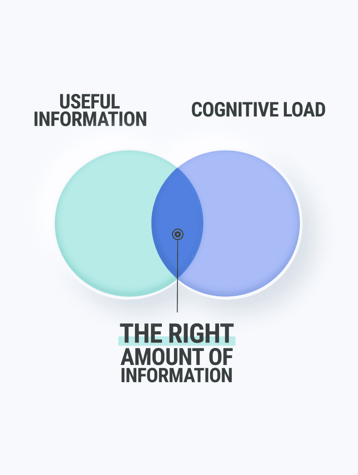
Because both UX and visual design cover similar ground, they are sometimes used interchangeably. However, UX design is different than visual design in that it focuses more on the usability and the interactions of various functions of the website.
You can think of it like UX design covers the living, breathing part of the product, whereas visual design is more focused on the static portion of the product.
Perhaps, it’s safe to say that all visual design is a part of UX design, but not all UX design is visual design. In other words, the visual design will always be under the umbrella of overall UX design and UX design will always cover more than just the visual design.
What is Good Visual Design?
The main components of good visual design are:
- typography,
- contrast, and
- color.
In the examples below, I will go into detail about why each of these three elements is important when it comes to UX, by showcasing the 3 good looking websites for each visual design element.
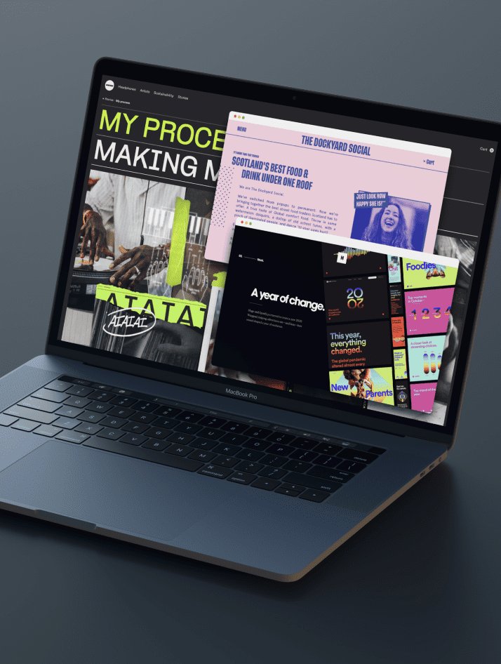
1. AIAIAI AUDIO for Typography
Typography controls what words the viewer sees + reads.
AIAIAI Audio has an award-winning website design. We think the main reason for the praise on their design is due to their killer typography. Wikipedia defines typography as the art and technique of arranging type (i.e. words & letters) to make written language legible, digestible, and visually appealing when presented. Type treatment involves selecting typefaces, point sizes, line lengths, line-spacing, and letter-spacing, and altering the space between pairs of letters.
Here are the aspects of good typography to habitually remind yourself of:
- TREAT TYPE AS ANY OTHER OBJECT OR SHAPE.
- In Western culture, people read from top to bottom, left to right. Justify type left so the eye can find the edge and read the words more easily and naturally.
AIAIAI Audio does a great job with the typography on their website. Even though all text here is bold, somehow they have achieved it being eye-catching, making you want to read it.
- GO BOLD. When changing font weights, go from light to bold, or from medium to extra bold. If you only change the weight slightly, it may be difficult to notice a difference. Coming back to the key of great design is contrast.
- GO BIG. When changing point sizes, a great place to start is to double or half the point size you are using. For instance, if the headline type is 20 pt., use 10 pt. for the body copy. If you are looking for a more dramatic way to have the copy stand out, use 3x, or 4x the point size. Look at the example of AIAIAI Audio below to see this principle in practice.

- Align your type to a primary axis. In other words, build your copy along this axis. For your vertical axis, line up the left edge of your type. For your horizontal axis, align type on the strongest horizontal element.
- Avoid putting text in the corners. Negative space is your friend and is a crucial principle to embrace if you want a beautiful design. Every space counts.
Lastly, typically you
- DON’T want to (1) force justified type and (2) have a single word as the last line of your paragraph.
- DO want to (1) use a single space after the punctuation in a sentence and (2) pay attention to the shape the text creates to avoid undesired shapes and harsh angles.
2. HUGE For Contrast
CONTRAST controls what the viewer is looking at first, second, + third.
Add contrast to size, weight, value, and color. By adding contrast to these elements, you are able to control the eye, define the hierarchy, movement, and meaning, and ultimately, tell a better story with your frames.
When adding contrast, start extreme and then pull it back/tone it down from there.
Huge does a fantastic job with the contrast in their design on their website, both with the size of the content and color pairing.
Let’s say you have two elements. Start with adjusting the size of one much larger than the other, and making more contrast between the two, you are able to make a much clearer relationship between the two.
Adjusting Values
Things that are in the foreground will have more contrast (brighter brights and darker darks). As elements recede into the background, they have a lot less contrast and lighter values.
It is important to adjust the scale and values of the two. Then, you are able to tell a much clearer story.
Defining Hierarchy
What is the viewer looking at first? Second? Third? You can control these by clearly establishing a hierarchy within the frame.
- First, think about the thing you want to be the most important in the frame.
- Next, make it the most prominent, applying the darkest values, most extreme contrast, making it the largest in size, etc.
Create Movement in the Frame
Adjusting the weight can create rhythm and movement in the frame. More dynamic compositions make for a better visual design.
3. THE DOCKYARD SOCIAL For Color
Color can guide the viewers’ eyes to what is important.
The Dockyard Social uses basic color pairings and duotone photography tastefully to create a unique experience that shows the personality of their establishment.
The color is skillfully transitioned into different tonalities to separate the sections of the long scroll.
Humans like complimentary colors. Complimentary colors are opposing colors of the color wheel. Our brain knows exactly what color is when it is placed next to its complementary color. There is little effort. (Again, UX design is all about making the human brain NOT work harder).
The complementary color for yellow (the background) is…? Purple (the text). ✔️
One important aspect of color theory is the proportion of the colors. So in complementaries, we get a lot of one color and a little bit of the complementary color. In the double complementary, you get a lot of one color, and equal parts of the two complementaries that create that color.
Another important thing to note is, when using colors effectively, it can set the mood or atmosphere of the design.
Saturation and Value
Saturation is the intensity or purity of a color. This is also one of the biggest culprits for ugly colorwork.
Next, value adjusts the brightness and vibrancy of the color.
When it comes to both saturation and value, don’t overdo it. Instead, use it to:
- Guide the viewer
- Tell the story
- Change the mood (desaturated tends to set a sadder, darker mood)
- Draw attention to something | Highlight areas of interest
The Dockyard Social does a great job of implementing using color to bring static images to life.
Here at WANDR, integrating great design with functional and ideal UX is our specialty.
These are the 3 good looking websites that have great UX due, in part, to their modern graphic design.
What Are Your Favorite Good Looking Websites?
Share with us by leaving a comment below!