SaaS Dashboard UI: Trends & Fundamental Guidelines
Explore the latest trends and guidelines in SaaS dashboard UI design. Transform data into intuitive insights.

To transform the data into understandable content, designers need to create an intuitive dashboard user interface (UI).
Designing a quality SaaS dashboard UI is not a simple task, but the following trends, guidelines, and fundamentals should help steer you in the right direction.
The Basics of SaaS Dashboard UI Design
The dashboard UI for SaaS applications needs to quickly provide users with access to the most relevant data or features. Users should also enjoy the overall visual design of the interface. To achieve these goals, the best dashboard UI should include the following fundamental features:
- Effective navigation
- Clear data visualization
- Clean layouts and designs
- User research and analysis
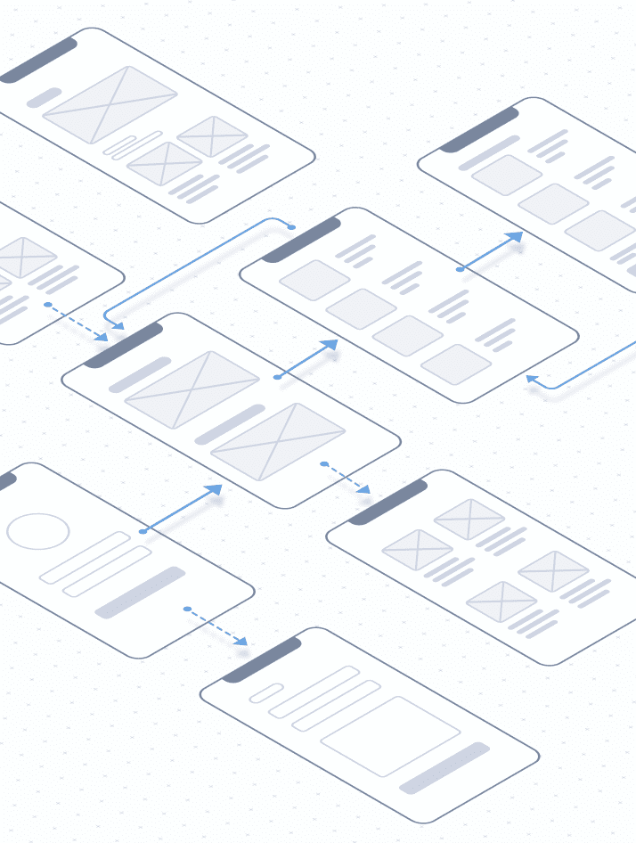
Effective Navigation
Effective navigation starts with the global information structure of the application. Global navigation includes links to the main features, tools, and settings of the SaaS product.
Users should not need to dig through multiple menus to find the information they require. Every page or feature should fit into a category represented in the global menu.
The global navigation menu is typically located at the top of the dashboard UI design or placed vertically along the left or right side.
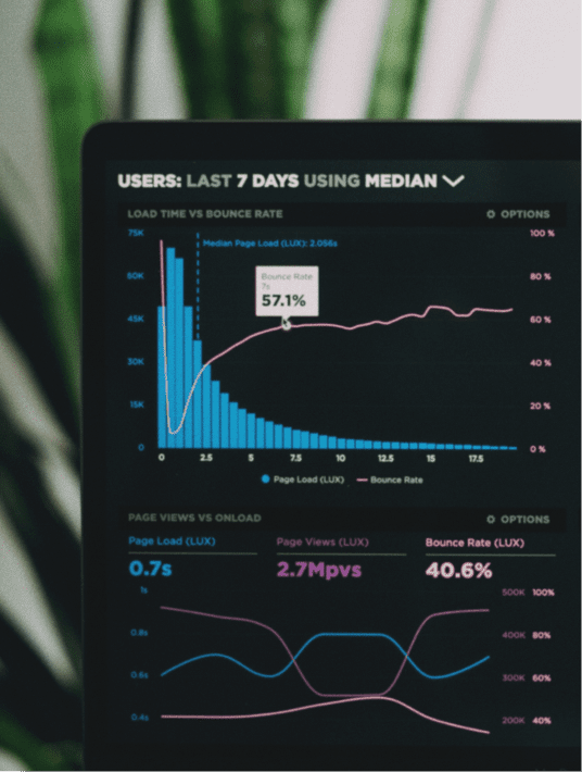
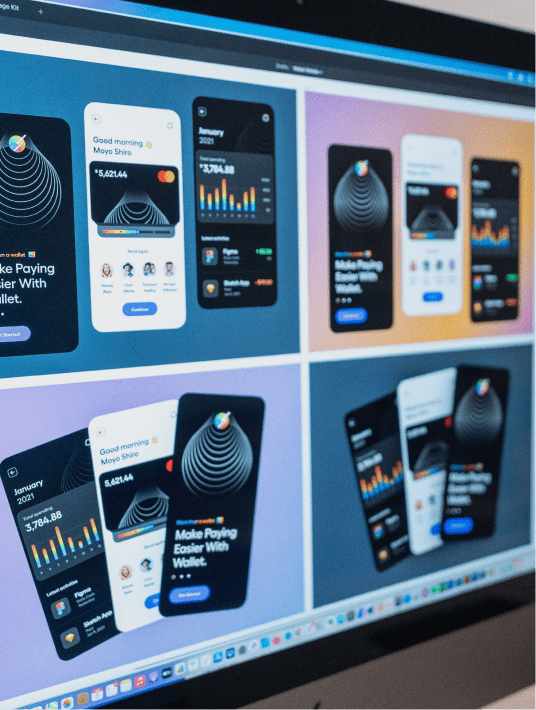
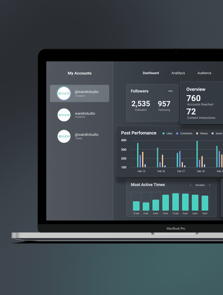
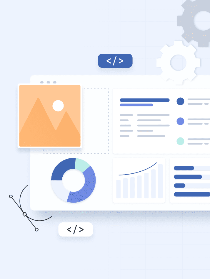
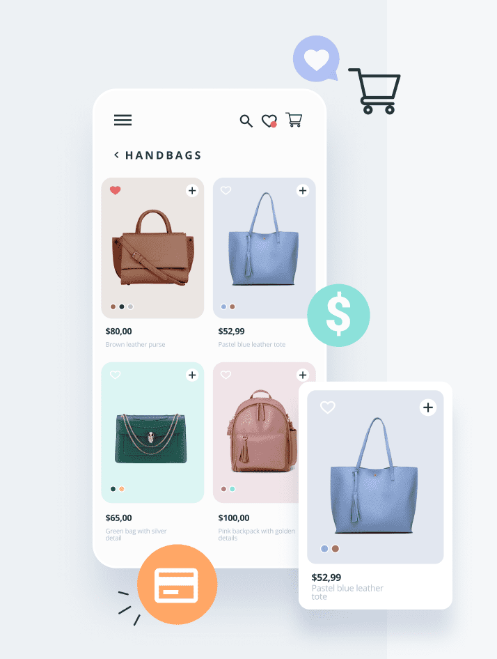
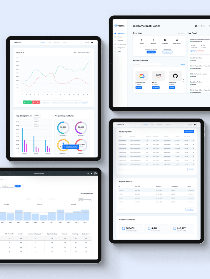
Clear Data Visualization
Many SaaS dashboards present users with lots of data. Without clear data visualization, the information becomes difficult to quickly scan and analyze.
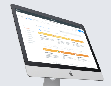
Instead of simply presenting rows and columns of data, the best dashboard UI designs visualize the data using various charts, graphs, and tables.
For example, the keywords, number of visitors, traffic sources, and other metrics are well-organized, with key data presented on a single page.
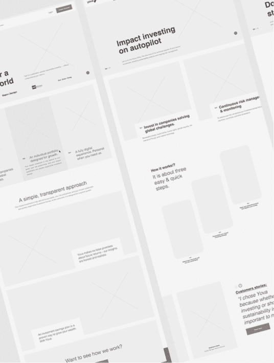
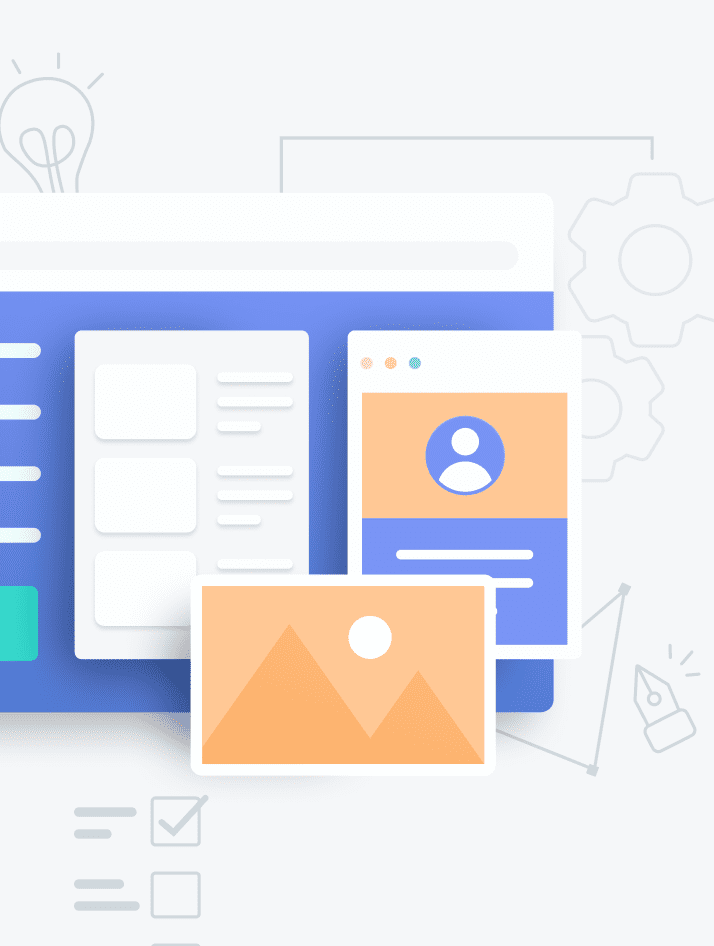
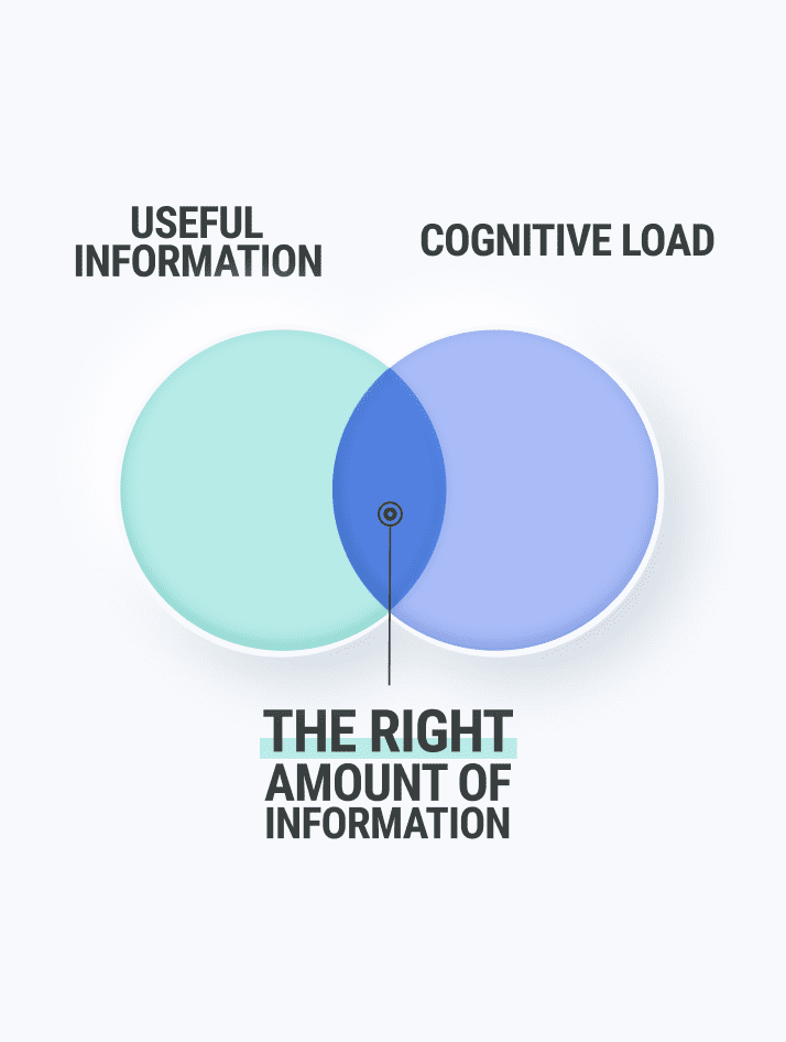
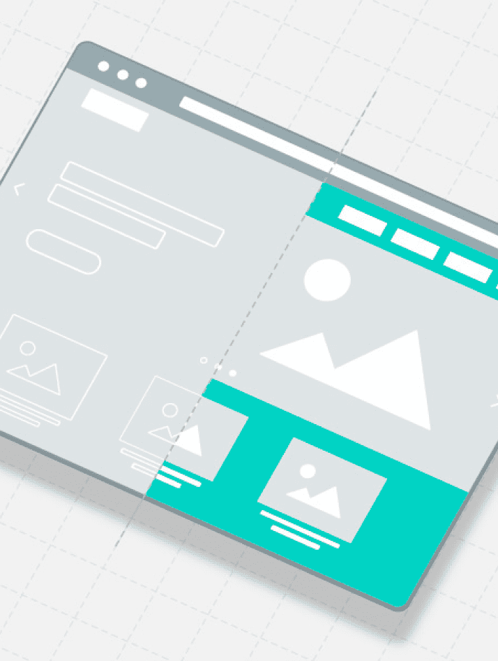
Clean Layouts and Designs
A clean layout makes it easier for users to scroll through the dashboard and quickly find the data or links they want. Poor dashboard UI design tends to be full of clutter. This keeps users from finding information or making the interface incomprehensible.

One dashboard UI strategy for keeping the layout simple is to analyze every element on the screen to determine its relevance to the overall application.
Every word, image, and chart should provide a specific function or benefit the interface. Remove any unnecessary text or graphics to create a simple layout.
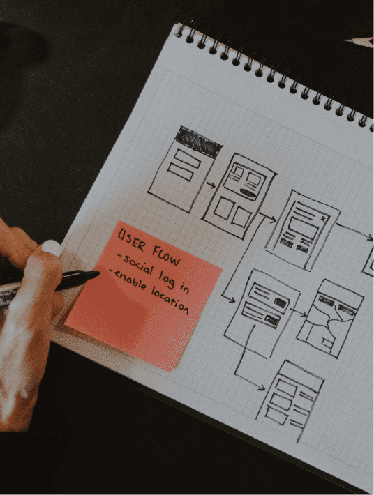
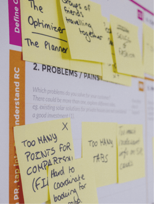
User Research and Analysis
Detailed user research is essential to a good SaaS dashboard UI design. In fact, it is often the first step in designing a quality dashboard UI.
User research often requires multiple sources, including:
- Questionnaires
- Field studies
- Card sorting
- User personas
- User testing
- Market research
Through a combination of analysis and user feedback, we can gain a better idea of the features that users want most. Usability testing is a common approach. This allows real users to test features before or after launching a product.
How Much Does UI Cost for a Dashboard?
The total production cost of a SaaS product directly impacts potential profits. However, creating a stellar user interface helps deliver a greater ROI.
So, how much does UI cost for a dashboard? This depends on many details, including the size and scope of the SaaS dashboard.
For example, it costs more to design a complex dashboard UI with dozens of pages and sub-menus compared to a single page dashboard UI design.
You can also expect to pay more to receive the best dashboard UI for your project. Although, most design agencies will try to work within the budget that clients provide.
If you have more resources, the designers can spend more time on each stage of the project. Designers can only deliver results based on the scope of your amount of work, how long it will take to execute, and your budget.
What Are the Latest Dashboard UI Trends?
As mentioned, the best dashboard UI designs tend to include innovative features, helping the interface stand out from the competition.
Some of the best trends to follow include:
- Dynamic sorting
- Mobility
- Color blocking
- Interactivity
Dynamic Sorting
Users can easily compile relevant data through dynamic sorting. This dynamic sorting should include multiple criteria for filtering information.
Dynamic sorting is an alternative to static sorting. With static sorting, the software sorts search results based on preset filters. With dynamic sorting, you allow users to define how they want the results sorted.
Many eCommerce sites employ dynamic sorting. These sites include options for filtering results based on price, shipping, and other criteria.
Dynamic sorting is another example of customization. Whenever users can choose options to suit their specific needs, we increase the overall usability and accessibility of the design.
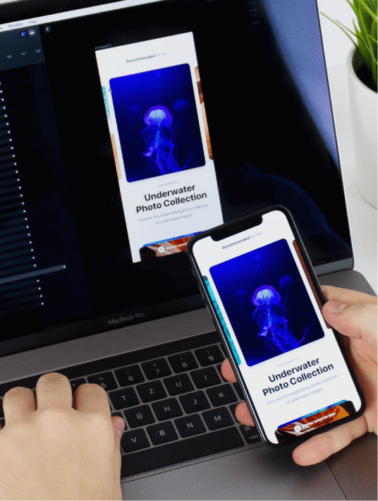
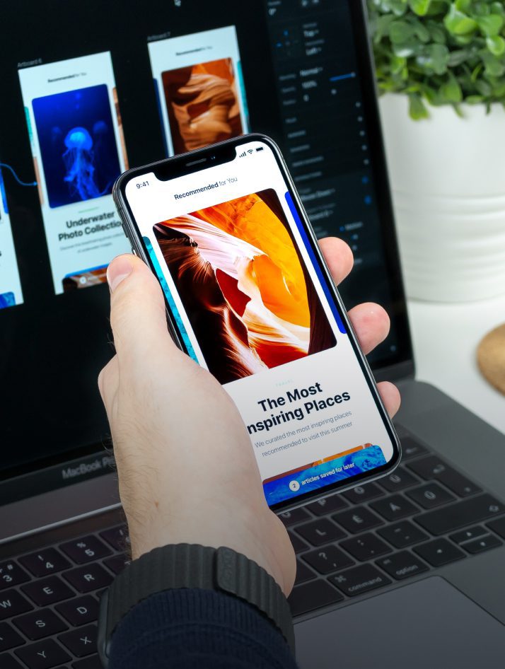
Mobility
Designing a mobile dashboard UI is essential for modern applications, as more people now use smartphones and tablets to complete tasks.

Additional suggestions for mobile dashboard UI design include:
- Keeping users informed
- Maintaining a clean interface
- Starting with the smallest screen
When viewing information on a smaller screen, users may struggle to keep track of the actions they just performed. Always provide feedback for any activity, such as clicking on a button or opening a menu.
It also helps to maintain a clean, simple interface, as mobile devices provide less real estate for adding elements to the screen. Every graphic or text block limits access to the information that users want or need.
When designing for mobile devices, start with the smallest screen and work your way up. It is easier to scale elements up compared to trying to shrink the layout and remove elements.
Starting with a smaller screen also forces you to focus on only including relevant elements, reducing clutter, and creating a streamlined UI.
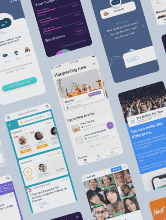
Color Blocking
Color blocking is a dashboard UI design strategy for creating a more visually appealing interface.

Avoid monochrome color schemes or designs that incorporate too many colors. Dashboards without any color appear dull and boring.
However, if you add too much color, the interface becomes difficult to browse.
Color blocking provides an alternative. With color blocking, you use bright colors to help balance the use of monochrome background colors.
Not only does this look more visually appealing but it also helps draw users' attention to important data.
Interactivity
Users tend to enjoy interactive elements in a design. Adding sliders, overlays, and filters increase user engagement.
When users remain engaged, they spend more time using the application. This tends to lead to increased satisfaction with the product, resulting in greater customer retention and referrals.
Closing Thoughts
Along with the dashboard UI guidelines and trends discussed, your product may benefit from the expertise of a skilled UI design agency. Working with professional SaaS designers ensures that your application includes the fundamental components needed to create a quality user interface. However, it also gives you a competitive advantage by a collaborative team of experts at the same cost as a single in-house designer.
We'd love to learn more about the best dashboard UI for your project.
Contact us and we'll see how we can help!
Talk to us on LinkedIn, Instagram, Facebook, or Twitter
Posts We Think You'll Like
How to Hire the UX Designer you Need
UX Audits & the Secret to Stronger Faster Sales
5 Examples of Bad Website Design & How to Do it Better
SaaS Dashboard UX: Trends, Guidelines, & Fundamentals