10 Best UX Websites of 2023
Website redesign? Get inspired! Explore top UX examples from QuickBooks, Mural & more.

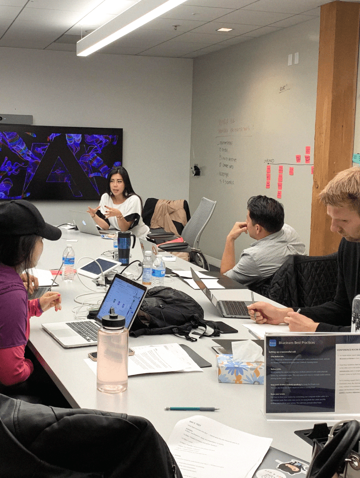
Review best practices and examples of the best UX websites. Brought to you by the award-winning WANDR– the leader in product strategy and UX design services.
Let’s be honest — we’re in the world of online business. Without one of the best UX websites, your product or service will suffer. You may not achieve the sales or customer retention rates that you hope for.
However, when we pair the website user experience best practices with your industry, you’re up with a competitive advantage.
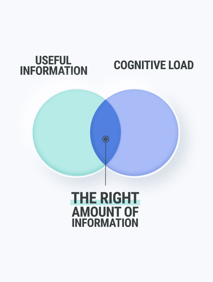
But what is website UX? What are UX best practices?
Learn more with an overview of our 10 best user experience websites.
What is Website UX?
Before diving into these examples of the best UX websites, you should have a general idea of what it takes to build an effective user experience. A website user experience (UX) covers more than just the user interface (UI). It includes the overall function and usability of the site.
What are UX best practices? Designing an effective UX requires designers to find the most efficient solutions for meeting the needs of the end-user.
Website user experience best practices for creating a successful UX are centered around the user. For example, the best websites make it easy for users to find features. It makes it easy for users to complete a desired action without requesting too much information. It loads quickly.
If your site is failing to meet your goals, WANDR CAN review your typical customer and their user journey through your site. This is called a UX audit. Read UX Audits and the Secrets to Stronger, Faster Sales, or contacts us about our services for User Experience and Audits.
In the meantime, check out some of our favorite UX websites for 2023.
The Best UX Websites of 2023
1. QuickBooks
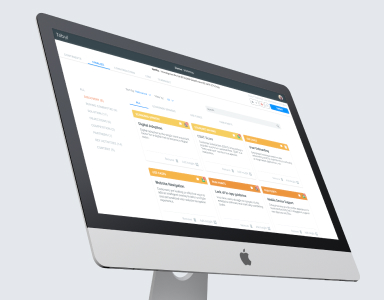
QuickBooks, the best-selling financial software, has an impressive web-based interface. Users can access a convenient dashboard from the home page that provides more information about the features found within the rest of the product. This is a great example of how to seamlessly insert ways for users to explore more.
One of the many reasons we love Quickbooks is that it works on any device. This means users have access to their key financial data from a desktop, laptop, smartphone, or tablet.
More importantly, while it offers an extensive list of features for businesses and individuals, it provides an easy to navigate interface. This ease is the #1 reason Quickbooks is a top contender in the best UX websites.
2. Mural
Mural is both a platform and a professional service that enables innovative teams to think and collaborate visually to solve problems. It’s a real-time whiteboard where the users can share notes, be creative, organize and prioritize thoughts faster, and dive into its collection of frameworks and templates to guide sessions.
- They are cloud-based. It can be used anywhere, from any device.
- They are headquartered in Buenos Aires and San Francisco, but their teams are spread across the world. They follow the saying “we practice what we preach” by working remotely.
- The same onboarding “Getting started in MURAL”, has icons that help the user to understand where they are. Those icons will guide them throughout the whole experience.
- Whenever you are invited to experiment with one of the features of the platform, a clean window pops up explaining the step-by-step in a clear and simple way.
3. Airbnb
AirBnb is an American online marketplace company based in San Francisco, California, United States. They offer arrangements for lodging–primarily homestays– or tourism experiences.
- The first thing the users will see when entering the web, it’s a message regarding the COVID-19 cancellation policies, as it’s the main “issue” that the company has had to face because of the current situation. It has a whole section for users to get the latest information on their COVID-19 response, from policy updates to resources for hosts and guests.
- Browser with the main actions of how to get a place to stay and experiences clear. A third category was added due to COVID-19, which has led to change their whole strategy as there aren’t people traveling.
- The menu remains in the header (because it’s the most important CTA that the user needs/can do on the site), but it changes from the original to give more importance to the “Introducing Online Experiences” section.
- As they are offering experiences, they play with striking images that highlight the actions the main actors are doing.
- They use a short amount of words, as the images tell us everything we can experience by clicking there.
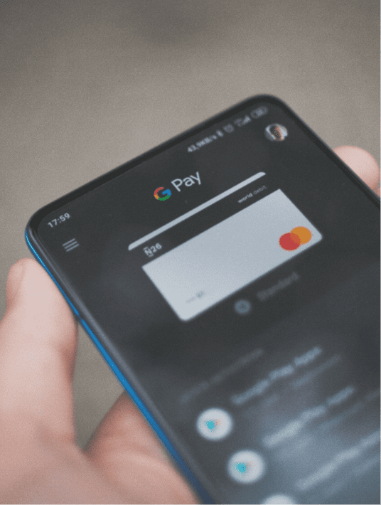
4. PayPal
PayPal is not the first site that people think of when it comes to the best UX websites. However, PayPal has updated its site in recent years with several of the website user experience best practices. The site now has a more streamlined interface, making it easier for users to find specific functions, such as copying invoices or generating reports.
PayPal now stands out as one of the best user experience websites in fintech. The website and mobile app design is clean, presenting information without the need for fancy graphics or unnecessary features.
5. Credit Karma
Credit Karma is an American multinational personal finance company founded on March 8, 2007.
It offers everyone no-cost, frequently updated credit reports and scores from two big-name credit reporting agencies (Equifax and TransUnion).
On February 24, 2020, Intuit announced that it planned to acquire Credit Karma for $7.1 billion.
- Credit reports help users catch problems early, improve their credits, and boost their financial knowledge.
- It helps you keep an eye on your credit report more frequently, keeping up with any potential errors. It also provides credit scores, which you do not get for free through other methods.
Here are a few things we love about Credit Karma’s UX:
- The clear financial dashboard of information is separated by categories with relevant information on the latest interactions and/or actions that need to be taken.
- They have tailored suggestions based on the provided information.
- Comparative credit scores with a visual and colored overview, accompanied by a copy, make the user immediately understand the situation.
- A clear description of where the information was taken and the system used provides a sense of security and trust for the user, who shares personal information with the site.
6. Rover
One of the best UX websites is a network helping connect pet owners with pet sitters and dog walkers. Rover provides an incredibly easy-to-follow interface. First-time visitors can quickly find someone to help with their pets across the U.S. or around the world.
When presenting users with questions or input fields, the best user experience websites tend to limit the entries. For example, Rover only requires visitors to answer a few simple questions to start using its services.
7. The Year of Greta
The year of Greta is an illustrated timeline of how Greta Thunberg rose from a solo campaigner to the leader of a global movement in 2019. The site is created by Superhero Cheesecake Agency in Amsterdam. They used Greta’s pose from the cover of TIME magazine as the transparent background image of the site because “this was a moment that conjured a lot of emotion.”
When the user scrolls down, the month changes from January to December, as if it were a timeline. There are no words– only animations and videos that are highlighted when the user is passing by one.
The website’s goal is to inform users about Greta’s life in 2019. Nothing more, nothing else. It achieves this goal as it is designed in a way that tells a story by highlighting the important moments of someone’s life.
At the end of the timeline, the user sees Greta closer to them, facing forward, in a way that shows a big future ahead for this girl and her visions.
Lastly, a final message appears if the user wants to know more about her. This is a clear CTA, showcasing great UX. The site is a concise, simple, and interactive way to show the life of someone.
8. Notion
Notion Labs Inc. is a startup based in San Francisco, founded in 2016. It’s a tool that blends your everyday work apps into one. Users can access a convenient way to write, plan, collaborate, and get organized – all in one tool.
Notion is a workspace, collaboration, and platform with markdown support that integrates kanban boards, tasks, wikis, and databases. It is available on desktop, laptop, and mobile: iOS and Android.
Their onboarding on mobile is amazing. They have interactive step-by-step and clear information about the main actions that can be done in the app.
Here’s what I want to point out about their website UX:
- Their site shows the app and website view at the same time. This gives users an idea of what to expect and also shows its versatility.
- Also, it has clear icons and an index of what the user is viewing.
- They use simple, direct, and valuable language, providing clear CTAs.
- Interactive animations of how the product works show their capabilities more than words can.
- Use of known icons to refer to their categories.
- Clear explanations with illustrative overviews.
9. Google Store
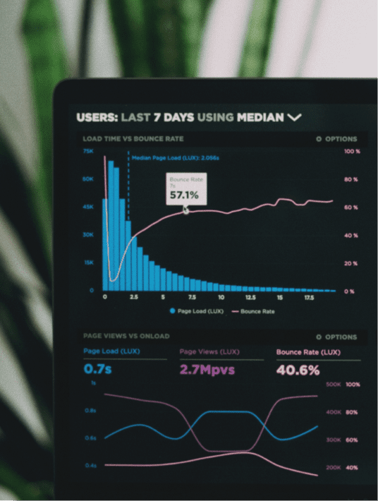
As with most of the best UX websites, the Google Store has a minimalist design, making it easier for users to find the options they want. However, the main reason why the Google Store appears on a list of the best user experience websites is the speed of the site.
The Google Store typically loads within one or two seconds, as Google understands the importance of fast-loading websites. Every second that a user waits for the screen to load increases the chance of the user leaving the site.
Google also simplifies the checkout process, eliminating unnecessary questions. These details appeal to users, resulting in greater satisfaction with the store and more repeat customers.
10. Duolingo
The final entry in this list of the best UX websites is Duolingo. The website provides a simple solution for learning a new language. It includes many website user experience best practices, such as minimalist design, responsive layouts, and customized learning experiences. However, the top feature that helps make Duolingo one of the best websites is the simple introduction for new users.
After signing up, you simply answer three questions, starting with the selection of the language you want to learn. Duolingo maintains its spot as one of the best websites for making learning fun and easy.
What do You Think the Best 2023 UX Websites Are?
Let us know in the comments below.
Product goals? Let’s make it happen. Book a free consultation call with our team.